
![]()
We’re excited to unveil a fresh new look for The Phillips Collection! The museum’s new visual identity pays homage to our rich legacy while keeping an eye toward the future and the promise it holds. We feel this aesthetic better illustrates our values, goals, and strengths as a curious, connected, and personal institution. Here’s a little bit about the process:
THE DESIGN FIRM
The Phillips worked with the St. Louis-based, award-winning creative firm TOKY Branding + Design for a year to develop its new visual identity.
THE LOGO
The new logo reflects the ahistorical nature of our collection and renowned exhibition style. The vertical lines emulate our commitment to connectedness—to creating visual conversations between works on paper, paintings, and sculpture—and to encouraging personal experiences with visual arts of different centuries and different countries, as well as a diverse array of music.
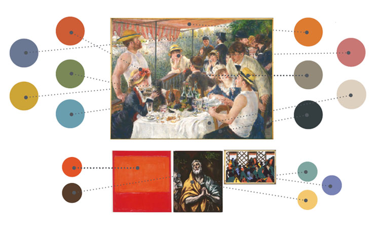
The logo draws its color palette from some of the museum’s most well-known masterpieces
THE COLOR PALETTE
Duncan Phillips was fascinated by bold color, and we wanted to reflect this love in our new visual identity. The new logo’s palette draws 15 individual colors from some the museum’s most well-known masterworks, including Renoir’s Luncheon of the Boating Party, Rothko’s Orange and Red on Red, and Jacob Lawrence’s The Migration Series, Panel No. 1.
THE (PIVOTAL) TIMING
This new identity is unveiled just as the Phillips prepares to celebrate several milestones in our history, such as the 5th anniversary of the Intersections contemporary art program (2015), the 75th year of the museum’s Sunday Concerts series (2015-2016 season), and The Phillips Collection’s Centennial Celebration (2021).
How refreshing and contemporary!
Thank you for your feedback!