Our latest Intersections project, Sanford Biggers: Mosaic, includes a site-specific floor installation made with sand. Five of the Phillips’s Museum Assistants—Rachel Cecelski, Jorge Vara Hernandez, Shawn Lindsay, Andreia Silva, and Emma Sweeney—were selected to help Biggers produce the work. Jorge and Rachel share their impressions of the project.
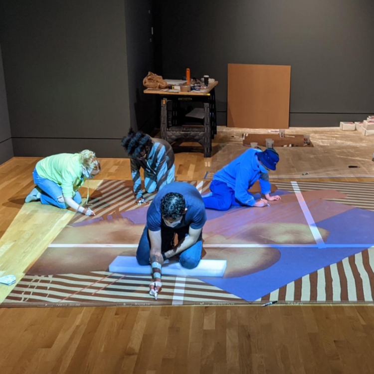
Creating Sanford Biggers’s floor installation in Mosaic. Photo: Robin Bell
Jorge Vara Hernandez (@j.varah), a graduate of University of Maryland’s BA Film Studies program, is a painter.
“Initially my reason for wanting to help with the project was to gain more experience with the process of art installations, and to have a closer look at a curator’s duties within a museum setting. However, after doing more research on Sanford Biggers’s work before starting the project, my reason for participating changed dramatically. His sampling of other cultures into his own work really identified partly with my own philosophy on creating art. As a painter I felt that although the medium is not connected to my own work, it would definitely be an experience that I could learn from.
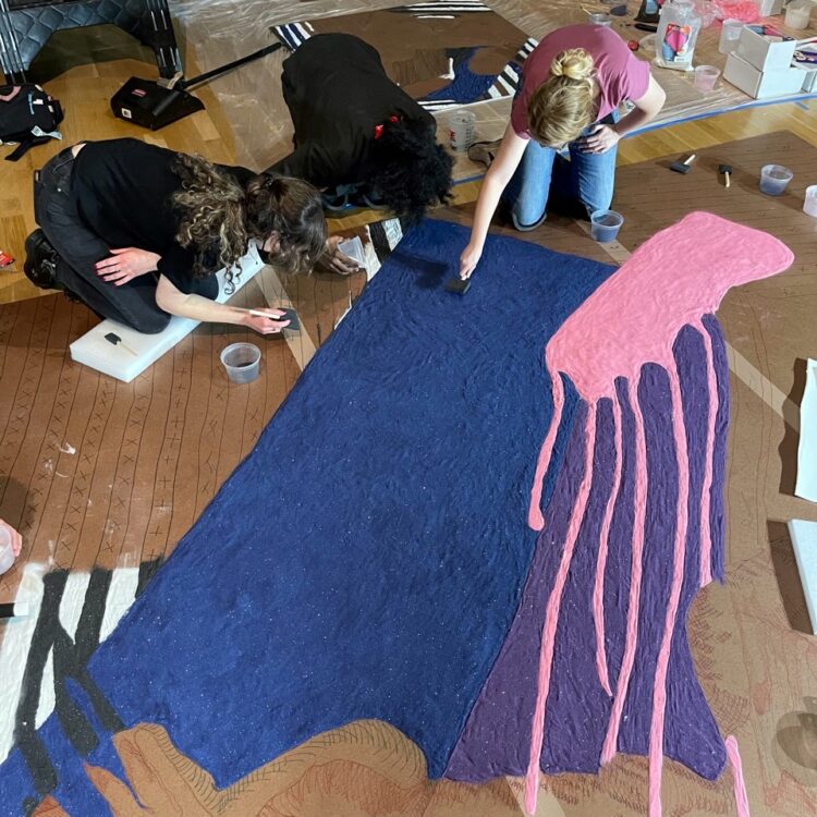
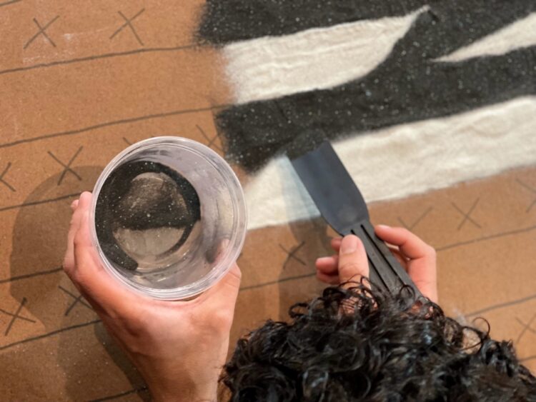
Communally working on this project with fellow artists was much more challenging than I expected. The process of pouring sand to realize Biggers’s design was unexpectedly painful—both mentally and physically. More than a few hours on your knees will start to take a toll on your body. A manic focus is needed to properly apply the sand while also ignoring the physical pain of your body. There is also a struggle with one’s ego as the learning curve of a new medium is experienced. Sand is not easy to control. The dispersive nature of the sand requires very intense, slow, and concentrated action. Working on this project forced me to slow down and enjoy that struggle again.
Creating Sanford Biggers’s floor installation in Mosaic. Photo: Robin Bell
While working, the ephemeral quality of the piece was mentioned; it will be “destroyed.” That part of this project really impacted me—the fact that with certainty the work that we put in will be reduced to our mere memory of it. Which is where I think the true worth of art actually lies; in the impact and remaining memory of said trauma. Which was very interesting considering a lot of Mr. Biggers’s work references historical traumas. Also there was something playful and humorous about putting in so much work for what some would consider to be “for nothing.” I think that irony is purposeful as the piece is titled Fool’s Folly. A title which I think is suggestive about the act of making art. One could consider the ephemeral quality of the sand quilt to cause the act of making it a fool’s folly. However, that ephemeral quality is exactly what gives it meaning and purpose, because of our will to create it.”
Creating Sanford Biggers’s floor installation in Mosaic. Photo: Robin Bell
Rachel L. Cecelski (@miss.rachel_studios), a graduate of the Pennsylvania College of Art and Design, is a freelance illustrator and art teacher.
“I learned so much helping with the installation of Sanford Biggers’s Mosaic exhibition. I have used many mediums in my artwork, but never sand. Sandford taught me to slow down, learn the meditative state, trust yourself, trust the process of the installation. As always, I love watching an art come together and the thrill of the finished piece.”
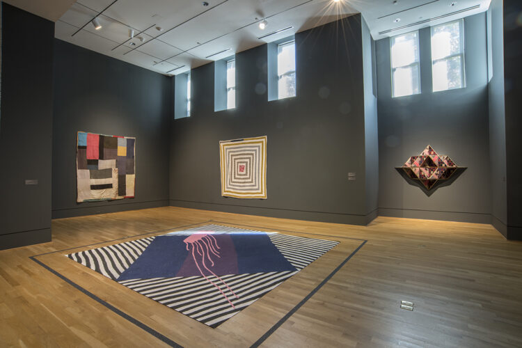
On the wall, left to right: Aolar Mosely, Blocks, c. 1955; Malissia Pettway, Housetop, c. 1960; Sanford Biggers, Mosaic, 2021. On the floor: Sanford Biggers, Fool’s Folly, 2021. Photo: Lee Stalsworth