Learning to Unlearn Art: Twachtman’s Glimpse of Summer

john-henry-twachtman_summer

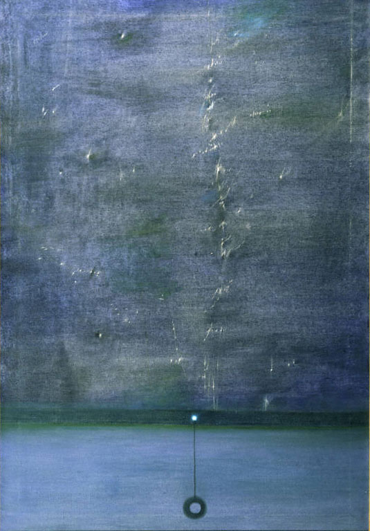
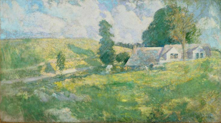
John Henry Twachtman, Summer, late 1890s. Oil on canvas, 30 x 53 in. The Phillips Collection, Washington, DC, Acquired 1919

“It’s a pretty painting,” I thought, looking at John Henry Twachtman’s Summer in a first floor gallery at the Phillips.

But no, I couldn’t say just that about a painting. I had to come up with a deeper analysis of it; I had to identify features that pertained to the style of the painter’s period, the symbolism that spoke to the culture of his own time, and the significance it had on the history of art in a bigger picture.

I racked my brain as I struggled to come up with a more specific analysis of the painting, getting closer to the work to capture details.

“The brisk brushstrokes of paint, the interplay of natural light, and the use of bright colors all contribute to the vibrancy to this plein-air painting. The well-blended layers of sky blue and hazy white create soft edges of the sky. As for the symbolism…”

Then I got stuck.

When I’m in a gallery, I often find myself struggling like this to apply academic and stylistic terms to the works. Of course, these are all important components to the general understanding of art history, but was this really what Twachtman was getting at?

“I feel more and more contented with the isolation of country life. To be isolated is a fine thing and we are all then nearer to nature,” Twachtman writes in a letter to fellow artist Julian Weir. Unlike myself, who tried to do an extensive interpretation of the work, Twachtman sought to immerse himself in nature, focusing on the momentary impression of color and light of the landscape.

What’s your first impression of Twachtman’s work? Throw out any words that come to your mind when you see the painting. No need for any fancy, technical terms—”pretty” was all I came up with. After all, it’s not fair that we do a lengthy, grandiloquent interpretation of Twachtman’s work, when what he really wanted to do was share an immediate glimpse of what he saw.

Come visit the Phillips and indulge yourself with Twachtman’s snapshot of the view; the serene colors, natural beauty, or anything about it that catches your eye. Don’t struggle; just marvel.

Summer Park, Marketing & Communications Intern

What’s in a Title?

pb_loren

Loren MacIver, The Window Shade, 1948, Oil on canvas 43 x 29 1/8 in. The Phillips Collection, Washington, DC, Acquired 1951

In art, we often think of abstraction and representation as being complete opposites. We think of Jackson Pollock’s drip paintings, titled with numbers, as being polar opposites to Paul Cézanne’s still lifes, labeled exactly what they are: apples, oranges, and flowers. But what if something is both abstract and representational? Is it possible? Currently on view is Loren MacIver’s painting, The Window Shade. At first glance, the work appears completely abstract, but upon closer inspection of both the painting and the wall text beside it, we learn that it does in fact represent something from real life: a window shade.

Walking past MacIver’s work, I recognized that I liked the aesthetic, but it didn’t necessarily evoke a specific emotion from me. Circling back, I decided to look at it more closely. When I approach a piece, I tend to ignore the wall text at first and look instead at the surface texture. I liked that the artist applied the grayish blue color very thinly, leaving specks of the canvas showing behind it. To me, that reveals more of the process, which is something I like to be aware of when studying a work of art. Scanning the painting, I then noticed a recognizable object in the bottom fourth of the canvas: a string hanging down with a hollow circular pendant attached. I wondered why this would be there given the abstract nature of the work. It was only then that I turned to the title, The Window Shade. Suddenly, the piece had so much more meaning for me. I began to think of the specks of untouched canvas as illumination from street lamps coming through the rips of a worn piece of fabric. The slightly different hue in the bottom quarter of the canvas, separated by a darker border, became the color of twilight filtered by the glass on top of it. These are conclusions I would not have come up with had I not stopped to read the wall text beside the piece and inspect it more closely.

So what is in a title? A title can help us pull meaning from a seemingly non-representational work of art. It can turn thinly painted canvases, almost monochromatic in nature, into old window shades, evoking a sense of nostalgia for a passing day.

Annie Dolan, Marketing and Communications Intern

(b)logs for the Fire: Part 2

Yesterday, I posted about the details that can emerge if you focus on what is around (or specifically, below) the art on the walls. Here are some more examples of the tiny stories told by the tiny details and embellishments on the fireplaces sprinkled throughout the museum.

blue tile detail

Over eighty ornate blue and white tiles depict scenes of castles, ships, and farmers. Each tile is different from its neighbor, showing the artistry of this work on a fireplace in an upstairs room of the original Phillips house.

secret face detail

Is that a face hidden in the East Parlor fireplace andiron, or just an artful arrangement of leaves?

Roig detail

Bernardi Roig’s An Illuminated Head for Blinky P. (The Gun) cuts off a bright yellow fireplace from closer observation. What other artworks, and what other shoes, have come and gone before this yellow brick fireplace?

Emily Hurwitz, Marketing and Communications Intern