Finding a Lost Van Gogh: Technology in the Art World

two paintings of the same subject by vincent van gogh side by side

(Left) Vincent van Gogh, The Road Menders, 1889. Oil on canvas, 29 x 36 1/2 in. The Phillips Collection, Washington, D.C. Acquired 1949 (Right) Vincent van Gogh, The Large Plane Trees (Road Menders at Saint-Rémy), 1889. Oil on fabric, 28 7/8 x 36 1/8 in. The Cleveland Museum of Art. Gift of the Hanna Fund, 1947

Vincent van Gogh has been popular in headlines around the world this week, after it was confirmed that a painting stowed in an attic for years is an authentic van Gogh original.

The revelation begins an interesting dialogue about the impact of science and technology on the art world. There’s no doubt it’s opened innumerable doors of opportunity as a medium, but it’s also created an opportunity for new questions to be asked. In the case of the discovered painting, technology (among other resources) helped us answer a question. Is this painting by Vincent van Gogh? Yes, we can decidedly say it is.

But in the Phillips’s upcoming exhibition Van Gogh Repetitions, science and technology may leave us with more questions than answers. We’re able to examine van Gogh’s works at a level never before known. We can tell what elements make the blues hiding inside the gap of Madame Roulin‘s sleeves vary from portrait to portrait, or how many millimeters the distance between her eyes changes, but it can’t tell us what compelled the artist to make five paintings of the same woman, or which changes he even intended to make. Were some just error? Are there more limbs on a tree in the background of the Phillips’s The Road Menders than there in the Cleveland Museum of Art’s The Large Plane Trees (Road Menders at Saint-Rémy) because it was more true to life, or because van Gogh found it more visually appealing?

As Director Dorothy Kosinski notes in this Washington Post article by Emily Yahr, art history isn’t static; “there’s so much that’s changed and continues to change, and it’s a wonderful revelation—especially to the layperson—of the importance of the work we do.”

Amy Wike, Publicity & Marketing Coordinator

What is a Cyanotype?

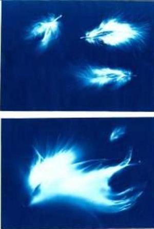
Cyanotypes of feathers made by Amanda Jirón-Murphy.

Cyanotypes of feathers made by Amanda Jirón-Murphy.

We’ve been talking cyanotypes here with Snapshot in the galleries. The show features a few photographs of that process by Henri Rivière and last week we held a workshop. So what is a cyanotype?

Cyanotype is a 170 year old photographic printing process that produces prints in a distinctive dark greenish-blue. The word cyan comes from the Greek, meaning  “dark blue substance.”

The process was invented by Sir John Herschel, a brilliant astronomer and scientist, in 1842. (His father was the astronomer Sir William Herschel, who discovered the planet Uranus. Interestingly, Uranus, due to mostly methane gas in its atmosphere, appears cyan blue.)

However, Herschel did not use cyanotype for photography, but for reproducing notes. It was a family friend, the botanist Anna Atkins, who used the cyanotype printing process in 1843 to create an album of algae specimens. She created the images by placing objects directly on photosensitive paper; this process is called a photogram (unless you are Man Ray, in which case you call it a rayograph). She is regarded as the first female photographer.

Compared to other photographic printing processes, cyanotype is easy and inexpensive. No darkroom is needed, instead it uses the power of the sun and iron salt solutions rather than the silver salt solution of black and white photography. Ferric ammonium citrate and potassium ferricyanide are combined, and exposure to UV light creates ferric ferrocyanide, also known as Prussian Blue (named for the color of the Prussian military uniforms.) The cyanotype process was also used to create copies of technical and architectural plans, and these copies were called blueprints; even though the cyanotype process is no longer used, any construction document or detailed plan is still referred to as a blueprint.

Although most of today’s digital cameras have settings like “black and white,” “sepia,” and “blue,” the “blue” is clearly not a cyanotype. Mixing up your own home alchemy is not recommended, since the chemicals are, as chemist and photographer Mike Ware writes, “toxic if ingested . . . and it will obviously stain skin, wood, clothes, textiles, household pets and any other absorbent surfaces.” However, there are easier ways to work your own cyan magic.

You could do-it-yourself. Even Martha Stewart has instructions online that make me want to Do It Now!

Or you can buy ready-to-print supplies online.

Or, for instant gratification, our Museum Shop carries a Sunography kit, containing six pieces of 5″x7″ coated-on-both-sides archival paper. You don’t have to use a whole sheet but can cut it to make smaller images. All you need is your inspired creativity and our friend the Sun.

Finally, here’s how to care for your cyanotypes.

And remember, if you make a photogram, you can always rename it after yourself, just like Man Ray.

Ianthe Gergel, Museum Assistant

A Geologist Painter Goes to Brussels

A retrospective of Danish artist Per Kirkeby’s extensive body of work opened in February at the Centre for Fine Arts (BOZAR) in Brussels at the heart of its Let’s Dansk! program to mark the Danish EU Presidency.

Over 40 tireless years, Kirkeby has produced a huge body of work. He has mastered expression in painting, sculpture, film, poetry, and other media. With training in both art and arctic geology, thorough knowledge of art history, and familiarity with the philosophy of another renowned Dane–Søren Kirkegaard–Kirkeby is a rare polymath.His artistic range seems only natural given his expertise across disciplines, and his sense of continuity between art, science, and philosophy is embodied in paintings like Inferno V (1992) in The Phillips Collection.

The  retrospective in Brussels features more than 180 of Kirkeby’s works–including early Masonite “blackboards,” paintings, architectural models, sculpture, watercolor, and illustration–capturing the shifts and changes in his work as well as pervading thematic links. Kirkeby’s art is complemented by the “forbidden paintings” of Kurt Schwitters–realistic landscapes revealing a range beyond the artist’s typical dadaist style.

The exhibition touches on Kirkeby’s dialogue with art and nature: important and inevitable shifts and changes in material, sensitivity and responsiveness to the surrounding world, and continuity through time. Every shift draws from the past and fuels the future. Retrospective Per Kirkeby and the “Forbidden Paintings” of Kurt Schwitters is on view at BOZAR in Brussels through May 20, 2012. And that’s not all–another Kirkeby exhibit is on view in Germany through May 28 at Museum Küppersmühle für Moderne Kunst, and the Phillips looks forward to bringing his work to D.C. audiences this fall with Per Kirkeby: Paintings and Sculpture, 1964–2010 (Oct. 6, 2012-Jan. 6, 2013).