A Technical Examination of Breeze Rustling Through Fall Flowers

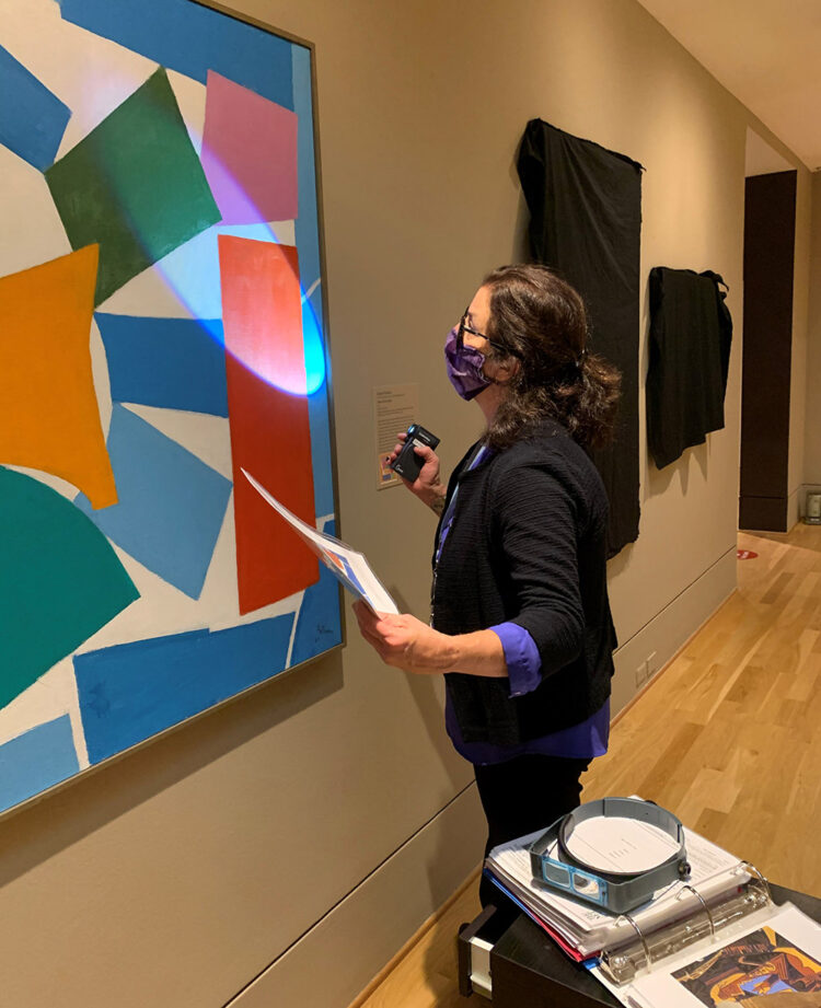
In 2019, Smithsonian American Art Museum conservator Gwen Manthey and researcher Sydney Nikolaus examined the Phillips’s work Breeze Rustling Through Fall Flowers by Alma Thomas. Read an excerpt from their report to learn about Thomas’s process and join us on January 13 for a talk with Gwen Manthey and Amber Kerr.

In 2019, the Smithsonian American Art Museum began analyzing 40 of Alma Thomas’s paintings, including works from its own collection, The Phillips Collection, the National Museum of Women in the Arts, and the National Gallery of Art. Research focused on the tools and techniques that Thomas employed throughout her career from the early 1950s to her death in 1978. Using a modified Nikon D810 digital multispectral imaging camera that captures images across the electromagnetic spectrum, conservators identified the art materials and determined the layering construction of Thomas’s paintings. On November 18, 2019, SAAM conservator Gwen Manthey and researcher Sydney Nikolaus examined Thomas’s acrylic painting Breeze Rustling Through Fall Flowers at The Phillips Collection.

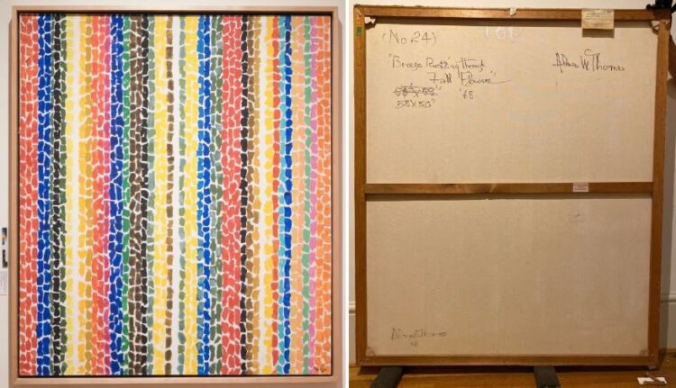
Figure 1 (left) Breeze Rustling Through Fall Flowers, normal light illumination, and 2 (right) verso.

INFRARED REFLECTOGRAPHY (IRR)

They gleaned new information using infrared reflectography (IRR), a process where infrared wavelengths penetrate paint layers and are absorbed by carbon-containing pigments and drawing media, and then reflected by underlayers of white ground and paint. They learned that Thomas defined each color row in Breeze Rustling Through Fall Flowers by drawing vertical lines with a sharp graphite pencil on the prepared canvas. The evenness of these lines (spaced 1 inch apart), guided by short tick marks, suggest the use of a straight edge ruler (Figure 3a-b). Thomas also made straight lines at the inner top, left, and right edges of the painting’s edge to indicate the perimeter of the composition.

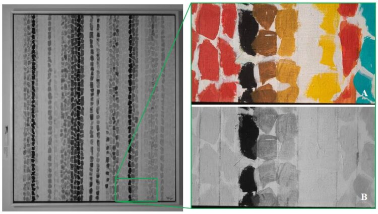
Figure 3 (left) infrared reflectograph overall image. Details in normal light (A) and IR (B) show Thomas’s graphite pencil lines for each vertical row of color pats.

ULTRAVIOLET-INDUCED LUMINESCENCE

Using UVA-induced luminescence from a Labino UV Light, the conservators found a strong autofluorescence in the rich orange paint that Thomas applied in several of the orange rows seen in the top right corner of the painting. This provides more insight into how Thomas layered her paint pats in each row (Figure 5).

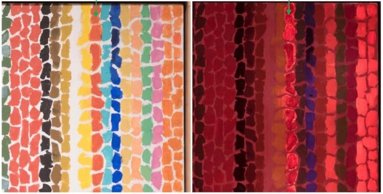
Figure 4 (left), detail of top-right corner in normal light and 5 (right) in UVA-induced luminescence. The strong autofluorescence of the orange paint reveals how Thomas layered several of her rows.

SUPPORT – CANVAS AND STRETCHER

Thomas chose a basket-weave medium weight fabric with an average thread count of 36 x 32 threads/inch for her canvas; it is attached to the stretcher with staples (Figure 6). The stretcher consists of four wooden stretcher bars, with mitered slot and tenon joints, and a horizontal crossbar. Impressed stamps (Anco bilt, Glendale, N.Y. and Grumbacher Artists’ Materials, New York) shown in Figure 7, were found on the stretcher bars. Each join contains a pattern of four large holes (Figure 7), possibly the location of previous metal plates added by the artist to increase the strength of the support; they have since been replaced by keys fixed with cord and screws. The painting’s verso contains several inscriptions by the artist in a black felt-tipped marker, her signature, the title, date, and dimensions of the work (Figure 2). The artist wrote “TOP” in a white paint or acrylic primer.

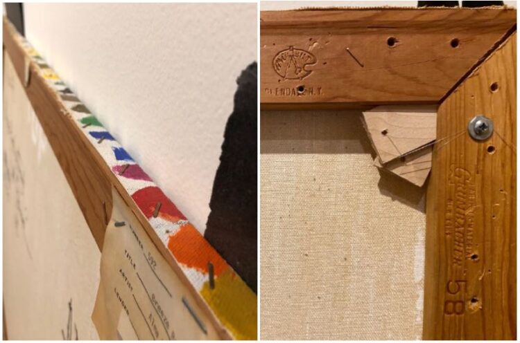
Figure 6 (left), detail of top-right corner tacking edge and 7 (right) of the same corner shown on the verso.

PAINT

The painting is comprised of vertical rows of colorful acrylic paint, applied by brush, on top of the white ground. Examination of the painting’s edges show that the ground was applied by the artist. The ground has seeped through the canvas in some areas of the verso (Figure 7). Thomas applied additional layers of paint to several of her color rows. Often, they match the initial color, but there are instances where Thomas layered a different color such as blue gray over green and blue paint pats. The paint pats are formed from multiple brushstrokes, measuring about an inch wide. Thomas used a thinner brush to reinforce the white spacing between the pats with white paint. There are many downward drips of paint located between the yellow rows (Figure 8) and in the nearby orange row (Figure 9). The downward paint drips shown in Figures 8-9 indicate that Thomas did not work flat and that she watered-down her acrylic paints.

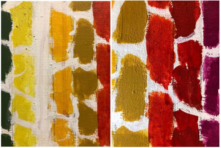
Figure 8 (left), detail of downward paint drips in the yellow center rows and 9 (right) in the orange center row.

To learn more about Thomas’s process, join us for a conversation with Gwen Manthey and conservator Amber Kerr on Janaury 13 at the Phillips about their research.

Collections Care During Closure

Head of Conservation Lilli Steele shares the how the collection has been cared for while the museum has been closed.

While the doors have been shut to The Phillips Collections due to covid-19, the Phillips staff has still been busy caring for the permanent collection and the artworks in the special exhibitions. Every day since mid-March, our security staff has conducted daily checks throughout the entire museum and our building engineers have closely monitored the climate control system. Once a week, someone from our conservation department has walked through the galleries to inspect all of the works of art on view to check for any changes in condition, with particular attention to the loans included in Riffs and Relations: African American Artists and the European Modernist Tradition and Moira Dryer: Back in Business. Since both exhibitions closed so soon after they opened in February, the generous lenders have agreed to extend the exhibitions until January 2021 and December 2020, respectively. In order to prevent over exposure of light to works that are vulnerable to fading—such as drawings, watercolors, prints, and photographs, which are generally only placed on view for three months a year—the galleries were kept dim as much as possible. In addition, preparation staff carefully covered light sensitive works of art under dark fabrics to ensure that they received no additional exposure during the extended exhibition period.

Conservator Lilli Steele examines Alma Thomas, Watusi (Hard Edge), 1963, Acrylic on canvas, Hirshhorn Museum and Sculpture Garden, Smithsonian Institution, Washington, DC, Gift of Vincent Melzac, 1976. Adjacent to the painting, several prints have been covered with a dark cloth to eliminate additional light exposure.

The museum’s outdoor sculptures have also been carefully tended to during the shut down, After the long rainy spring, the sculptures were due to be washed to remove pollen, bird droppings, and other dirt residues that had accumulated over the winter. Periodic cleaning of Angela Bulloch’s Heavy Metal Stack, Fat Cyan Three (located at the corner of 21st and Q), Seymour Lipton’s Ancestor (located in front of the Phillips House), and Barbara Hepworth’s Dual Form and Ellsworth Kelly’s Untitled (EK927) (in the Hunter Courtyard) has continued during the summer and into the fall to ensure their preservation.

Wearing masks and socially distanced on a warm September afternoon, conservators Lilli Steele and Patti Favero and preparator Laylaa Randera wash Ellsworth Kelly’s Untitled (EK927).

While it was strange to be in the museum for many months with virtually no colleagues present and certainly no visitors, I felt comforted to be able to enjoy old friends from the permanent collection and be reminded of the Phillips’s exceptional exhibitions. We are so excited to finally carefully remove the coverings over the artworks and welcome visitors back into our galleries and also to enjoy our newly cleaned sculptures.

Moira Dryer’s Unusual Choice of Casein

Associate Conservator Patti Favero explains Moira Dryer’s unique choice of paint medium.

The works on display in Moira Dryer: Back in Business are remarkable for the artist’s distinctly individual style which includes unique structures, vibrant colors, and evocative paint layers.

Moira Dryer, The Debutante, 1987, Casein, lacquer on rubber, wood, 48 in. diam., Collection of Marguerite Steed Hoffman © Estate of Moira Dryer

As we installed the show in early February, I learned that Dryer’s unique approach extends also to her materials. Many of the works in the exhibition are painted on thin plywood panels, not more than 1/8-inch thick, that are shaped or mounted to come forward off the wall and into the space. One panel is even bent into a free-standing form, while another is combined with found objects in a sculptural assemblage. But it was Dryer’s unusual choice of casein as a paint medium that really interested me.

What is Casein?

Samples of casein paints and mediums. Left to right: Richeson “Shiva” casein tube paints, pure casein powder from Rublev Colours (“For Making Paint and Adhesives”), Richeson “Shiva” casein emulsion medium, and Pelikan Plaka “All-purpose paint.”

Casein paints are based on caseinate, a protein found in milk. To make casein, the protein is separated from the whey and butterfat, then an alkaline material is added to break it down and allow it to mix with water. Casein has been used in a variety of forms for centuries. One medieval manuscript describes washing milk curds until the water runs clear, then mixing with quicklime into “cheese glue” for joining panels for altars and doors. [1] Another recipe for “milk paint” mixes casein powder, soaked in water, with Borax (sodium tetraborate) to make a water-thinned paint medium. [2]

Homemade casein will spoil after a few days, and it can be difficult to get consistent mixtures. Fortunately, artists have been able to buy stable, commercially-made casein paints for decades. This is probably the most reliable option and most likely what Dryer did.

Why Casein?

Casein is commonly associated with commercial artists and decorative painting—it is not a paint typically used by fine artists (with notable exceptions [3]). So why did Moira Dryer paint with casein?

In interviews, Dryer discussed how her early work building theater sets and props influenced her art: “I was always very transfixed by the play before the actors came on or after they left the stage. That was my job and that was what I focused on. The lighting would be there, the tension and the audience would be there, but not the actors. Those props had an incredibly provocative effect.”[4]

Dryer saved this color card for Gothic Scenic and Theatrical Paints in one of her notebooks. Gothic Color Company, Inc., made paints especially for theater and other scenic artists. They sold pure pigments and a variety of binders, along with a line of “Casein Fresco Colors” specifically developed for television studios.

While she doesn’t mention casein specifically, Dryer’s use of this medium also seems to come out of the scenic artist’s tradition. Scenic artists had particular criteria for their paints, including ease of use, vibrant color, and a flat, non-glossy surface that would evenly reflect stage lighting.[5] Casein paints have many of the properties valued by scenic artists. They can be thinned with water, which makes them practical and relatively safe to use, and they dry quickly. A high pigment load gives vivid color even when the paint is diluted, and the paint dries to a matte, even surface.

Painting with Casein

Casein dries quickly, but unlike acrylic the dry paint can still be manipulated somewhat. Dryer used these qualities to explore a number of visual effects in her striking compositions, such as the diaphanous washes of Suburbia or the opaque layers and dry-brush effects in Group Portrait.

(LEFT) Moira Dryer, Suburbia, 1989, Casein on wood, 66 x 84 in., Collection of Michael Straus (RIGHT) Moira Dryer, Group Portrait, 1985, Casein on wood, 24 x 26 1/2 in., Collection of Nancy Morawetz © Estate of Moira Dryer

To learn more about what it’s like to work with casein, I made small mock-Moira Dryer paintings. I experimented with both casein and also Flashe acrylics, which Dryer used near the end of her short career. I explored techniques seen in some of her paintings, such as sanding or layering over dry paint, and creating layered washes to approximate her surfaces.

Mock-up panel, 8 1/4 x 7 x 1/8 in., primed with Liquitex acrylic gesso and painted with Richeson “Shiva” Casein paints, in blue at right and dark green at lower left, and Flashe acrylic color in blue and light green at upper left

The casein was a lot of fun to work with. I tried using it straight from the tube and thinned, with water, to different strengths. Because of the heavy pigment load, the paint doesn’t lose its brilliance when diluted, and a little goes a long way. The dry casein was readily soluble again in water. This allowed me to easily create a series of wash and drip effects. When I tried to re-create Dryer’s even, dark veil of black over blue in Suburbia, however, I found it was difficult to avoid disturbing the thin blue layers beneath the black.

Making mock-ups is usually an exercise in appreciating the artist’s mastery of their materials, and this experiment was no exception.

(LEFT) Detail of Suburbia, bottom center (RIGHT) Detail of Mock-up panel, upper right corner

Notes on Preservation

Although casein has a reputation for being durable, casein paint surfaces are in fact quite fragile. They are susceptible to fingerprints, scuffs, and burnishing if not handled carefully. Ideally (and contrary to the artist’s instructions) they would be stored and transported with nothing touching the surface. The dried paint also remains sensitive to water to some degree, despite what is written. A water droplet left on the surface will leave a tideline, and even a carefully rolled conservator’s swab can pick up color.

Moira Dryer’s handwritten notes on installation and handling, which are found on the backs of many of her paintings


Notes

[1] Theophilus, On Divers Arts, John G. Hawthorne and Cyril Stanley Smith, trans. New York: Dover Publications, Inc. 1979.

[2] Kremer Pigments Catalog: “Raw Materials for Fine Arts, Conservation, Woodfinishing, Design,” New York: Kremer Pigments, 2002. P58.

[3] See Elizabeth Steele “The Materials and Techniques of Jacob Lawrence” in P. Nesbett and M. DuBois, eds., Over the Line: The Art and Life of Jacob Lawrence. Seattle: University of Washington Press, in association with Jacob and Gwendolyn Lawrence Foundation, 2001. 247-265.

[4] Moira Dryer in conversation with Klaus Ottmann, Journal of Contemporary Art, Spring/Summer 1989

[5] Gothic Color Company, Inc., Scenic Artist’s Handbook, ca. 1965.