Dueling Pac-Men

In conjunction with recently opened Karel Appel: A Gesture of Color, Marketing and Communications Intern Olivia Bensimon responds to one of the works of art featured in the exhibition.

Appel_Floating Like the Wind

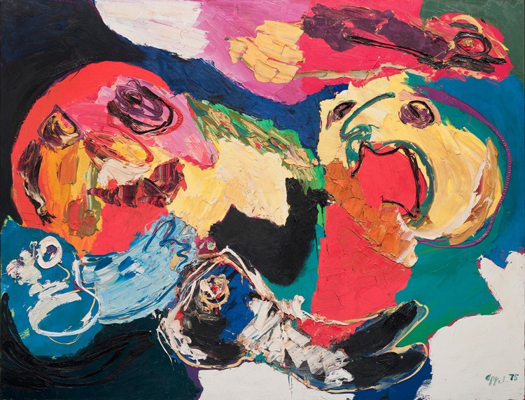
Karel Appel, Floating like the Wind, 1975. Oil on canvas, 78 3/4 x 102 3/4 in. Private Collection

What struck me first when I saw this painting was how much it reminded me of two people bickering. The yellow Pac-Man-like shape on the right has its mouth open, as if it was yelling, whereas the red Pac-Man-like shape on the left seems scared or disgruntled. The surrounding shapes might be identified as legs and arms, but I see these “faces” as the focal point. Letting my mind wander, I begin to imagine a more full story for these two characters: the red shape has been taking a nap in some sort of suit, with a blue shirt, white pants, and black shoes. The yellow shape walks in to see the the other lounging around and begins to yell and shake its arms above its head. That’s when the red shape wakes up, confused and also very sleepy.

The title of this painting, Floating like the Wind, could be interpreted in many different ways, but what comes to my mind is that the emotions articulated in the painting are floating like the wind—the dark blue representing sleepiness, the black and red pouring out of the yellow shape’s mouth representing anger and frustration.

Olivia Bensimon, Marketing & Communications Intern

The Dancing Trees of Milton Avery’s Imagination

Avery_Dancing Trees

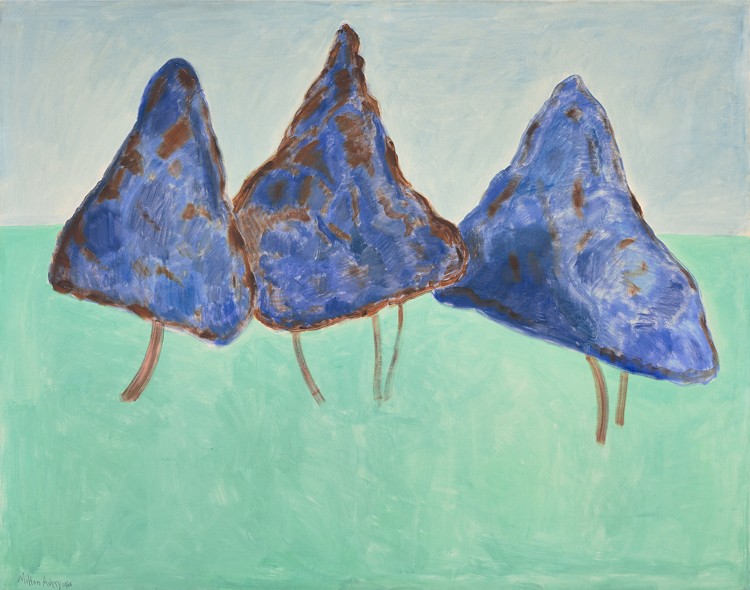
Milton Avery, Dancing Trees, 1960. Oil on canvas, 52 x 66 in. Paul G. Allen Family Collection © 2015 Milton Avery Trust / Artists Rights Society (ARS), New York

In his mid-seventies, Milton Avery brought decades of visual experience to bear on his perceptions of the world and an inclination toward simplification that may have intensified with his advancing age. At times, the artist’s late paintings veer so close to pure abstraction that only their titles enable the viewer to recognize the scene that has stirred Avery’s imagination. Such is the case here: three monumental cones swaying in the wind take flight as trees en pointe, their girth making for a comic ballet.

A few weeks ago, prompted by a free-writing exercise based around this piece, we asked visitors to Seeing Nature and social media followers what they saw in this work without providing the title. Answers included floating pizza slices, icebergs, a gnome village, stingrays, and more. What do you see?

A Closer Look at Color

Color Studio Matisse

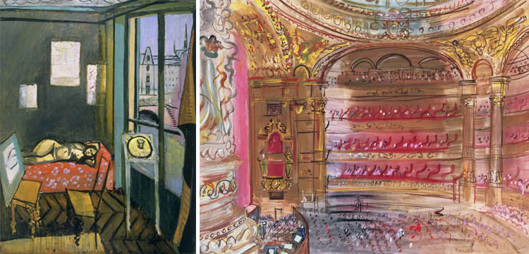
Henri Matisse, Interior with Egyptian Curtain, 1948. Oil on canvas, 45 3/4 x 35 1/8 in. Acquired 1950. The Phillips Collection, Washington, DC (Right) Raoul Dufy, The Opera, Paris, early 1930s. Gouache on paper, 19 3/4 x 25 1/4 in. Acquired 1939. The Phillips Collection, Washington, DC

Last Wednesday, I got the chance to attend a Spotlight Talk on Henri Matisse’s Studio, Quai Saint Michel, where we discussed the artist’s characteristic use of Fauvist color to define space. At first these color choices coupled with the skewed perspective can feel a bit aggressive (or in the words of a young Duncan Phillips, “unworthy of the mere ignorance of children and savages”), but after spending some time viewing the painting in person, I started to recognize the frenetic colors for the way they represent the experience of inhabiting the space; the light purple shadow cast by the curtain, vibrant red fabric that frames the reclining model, and rhythmic teal highlights on the walls throughout the room are in essence abstract gestures, but somehow they come together to create a vivid environment.

As I browsed the collection afterwards, I found myself recognizing the way other artists structure their color choices to manipulate the viewers’ perception of subject and space; Georgia O’Keeffe’s somber My Shanty, Lake George, Edouard Vuillard’s intimately composed Woman Sweeping, and Raoul Dufy’s intricate The Opera, Paris. Even works that are purely abstract seem relevant; Piet Mondrian’s Painting No. 9 uses primary color to visually dissect our three-dimensional world, while Mark Rothko’s Green and Maroon uses chromatic fields to envelop the viewer in atmospheric color.

Elaine Budzinski, Marketing Intern