In this series, Assistant to the Education Department Emily Bray highlights participants in the 2015 James McLaughlin Memorial Staff Show, on view through October 4, 2015.
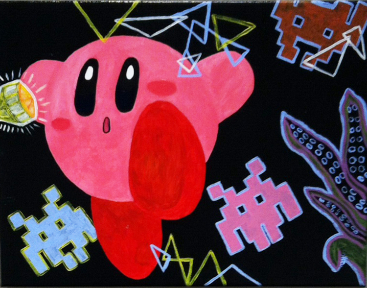
Intergalactic Ode, August 2015, Acrylic on canvas
(c) Francesca Downs
A native of Washington, DC, Francesca graduated Notre Dame of Maryland University in Baltimore with a Bachelor of Arts in 2011. After graduating, Francesca began taking courses toward a master’s degree in painting at George Washington University. Her artworks are heavily influenced by video games, comic books, and a variety of cartoons such as Arthur, Looney Toons, Dr. Katz, Bob’s Burgers, and King of the Hill. Francesca’s works are whimsical, flat, and combine representational and non-representational subjects. She transforms 3-dimensial objects into solid forms, where shapes and line dominate the space.
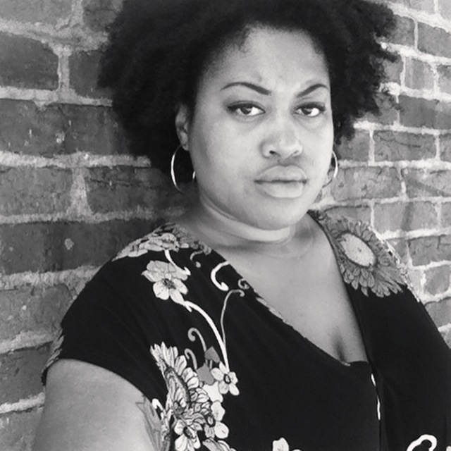
What do you do at The Phillips Collection?
I am currently a full-time Control Room Operator for our Security Department. I started out as a Museum Assistant in 2012 and had a brief stint as a part-time Museum Supervisor.
Are there any unique/interesting parts about your job that most people might not know about?
During my control room shift, I play an integral role in helping facilitate art deliveries, controlling access to the museum buildings, and/or assisting visitors. Since nobody can physically see me, it’s almost like it’s happening with magic!
What is your favorite gallery/space within The Phillips Collection?
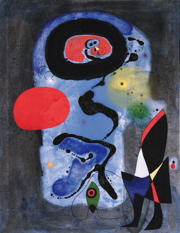
Joan Miro, Raoul Dufy and Morris Louis are a few of my favorite artists. During my first visit to The Phillips Collection, a Morris Louis show was on display and I fell in love his painting, Seal. My favorite gallery space is probably the larger of two galleries near the courtyard.
What would you like people to know about your artwork on view in the 2014 Staff Show (and/or your work in general)?
I have sort of been out of the painting and drawing game for about 3 years now. When I saw the 2015 Staff Show call for art, I saw it as the perfect opportunity to push myself and churn out a fun, little painting. I do not have a complicated process for creating my art, and most of the good stuff I’ve made was probably made under pressure. My work is fun, funny, or cute; otherwise I won’t do it. The piece I entered was just for fun, a way to dust off the old brushes, and warm up my dominant hand to prepare for new work in the near future. In 2015 (or early 2016), I’ll be launching a new website featuring my latest work.
The 2015 James McLaughlin Memorial Staff Show is on view September 2 through October 4, 2015. The show features artwork from The Phillips Collection staff.