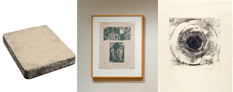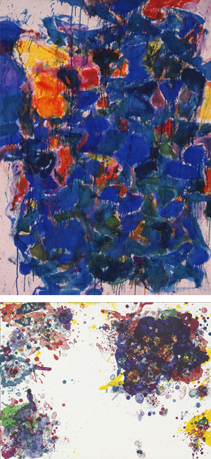
(Top) Sam Francis, Blue, 1958. Oil on canvas, 48 1/4 x 34 3/4 in. The Phillips Collection, Acquired 1958 © 2009 Samuel L. Francis Foundation, California/ Artists Rights Society (ARS), NY (Bottom) Sam Francis (1923-1994), Speck, 1971. Lithograph in colours, on wove paper, 864 x 1175 mm, Image courtesy Christie’s
Do you ever consider the medium behind a work of art? Does the question of how artists are able to retain such a consistent style across so many different techniques ever cross your mind?
During my first week at the Phillips, I attended a Spotlight Talk where we discussed abstract works in the collection. Walking around the second floor galleries, I was drawn to a canvas covered in blue. It looked familiar, but I couldn’t remember the artist or title right away. As I walked closer, I saw that it was a painting by abstract expressionist Sam Francis. I knew I had seen his work before, but it took me a few minutes to figure out where and when. Soon after, I realized it was over the summer during my time at Christie’s, where I interned in the Prints & Multiples department. We sold a bunch of color lithographs by Francis; these prints were some of my favorites from the sale, just as Blue is one of my favorite paintings in The Phillips Collection. Comparing Francis’s oil painting to the lithographs I’d interacted with several months before made me reflect on the difference of a medium. How is it that Blue can evoke the same aesthetic feeling as do other works made of an entirely different material and by a completely different process?
Despite the relatively spontaneous application of the oil painting process compared with the step-by-step, planned process of printmaking, the mediums of painting and lithography create a similar style in Francis’s work. Falling somewhere between the aggressive strokes of abstract expressionists like Jackson Pollock and the tranquil fields of color by Mark Rothko, Francis’s large-scale works allow the viewer to escape in the washes and drips of paint or ink. When I look at Blue, I feel the same sense of calm that comes over me in The Rothko Room combined with the excitement of Pollock’s action paintings. And just like Blue, the Francis lithographs that Christie’s sold this past summer evoked the same kind of feeling. With even more blank white surface, his lithograph Speck similarly offers a chance for the viewer to get lost in the space between the splotches of vibrant color bleeding into one another.
Sam Francis’s work thus exemplifies how through different mediums, artists can retain a consistent style. Whether he was preparing a lithograph stone or a stretched canvas, the way that the artist applied color to a working surface throughout his career was truly unique. In each of his lithographs and paintings, Francis left his identifiable stamp of innovation.
Annie Dolan, Marketing and Communications Intern