This installment of the Phillips-at-Home Summer Series features the artist Marjorie Phillips and her work Night Baseball. For this art activity, you are going to create a watercolor painting of your favorite summertime scene.
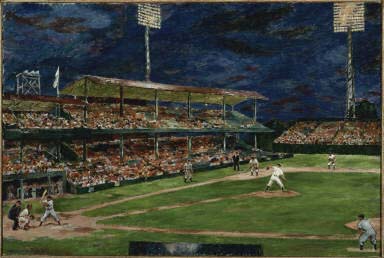
Marjorie Phillips, Night Baseball, 1951, Oil on canvas, 24 1/4 x 36 in., Gift of the artist, 1951 or 1952, The Phillips Collection, Washington, D.C.
Look closely: What is happening in this painting? Duncan Phillips introduced his wife, Marjorie, to the world of baseball after they got married. What do you like to do during the summer? What kind of summer activity would you turn into a painting?
About the artist: Marjorie Acker Phillips was founder Duncan Phillips’s wife and his partner in developing The Phillips Collection. She was born on October 25, 1894 and began drawing at the age of five. By 1918, she was commuting from her family home in upstate New York to New York City to take classes at the Art Students League. She met Duncan Phillips in 1920 during the Century Club exhibition of his collection. Marjorie felt that she and Duncan were kindred spirits and they were married in 1921. She became associate director of the new Phillips Memorial Art Gallery in 1925, and stayed in that position for the next 41 years. During this time she was an active painter while being Duncan’s partner in selecting works of art for the museum. When Duncan passed away in 1966, Marjorie became the director of the Phillips. She passed away in Washington, D.C. in 1985. The Phillips Collection has 60 oil paintings and 2 watercolors by her.
WHAT YOU NEED: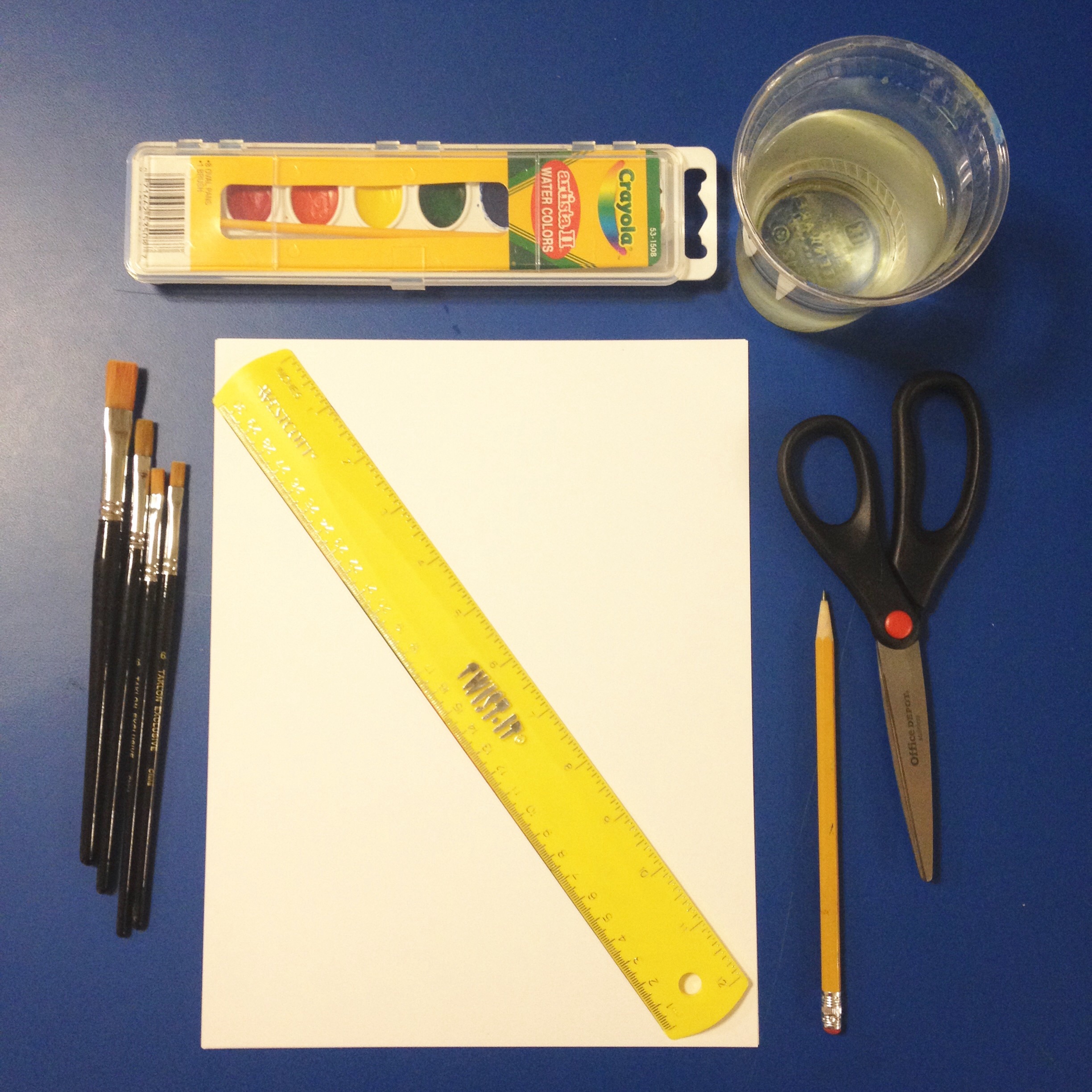
- 8.5″ x 11″ Cardstock
- 4 1/4″ x 5 1/2″ Picture of your favorite summertime scene
- Ruler
- Pencil
- Watercolor set
- Watercolor brushes
- Cup of water
- Paper towels
SUGGESTED AGE:
- Ages 8 and up
TIME FRAME:
- 4 hours
STEPS:
1. Print out a picture of a scene from your favorite summertime activity.
2. Cut out the picture and fold in half one way, then the other way to create a 4-square grid on your cardstock paper. Make a dash at 4 1/4″ on the 8″ sides. Make a dash at 5 1/2″ on the 11″ sides. Connect the lines to make a grid. These will be your reference lines.
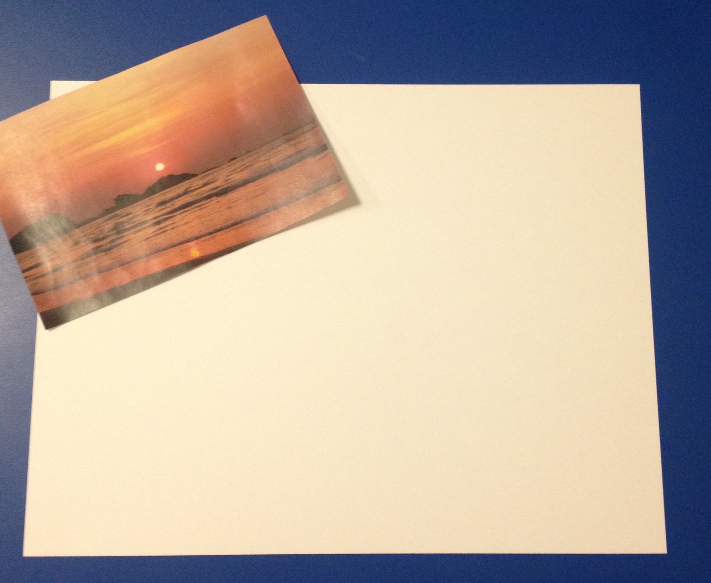
Step 2 – I chose going to the beach
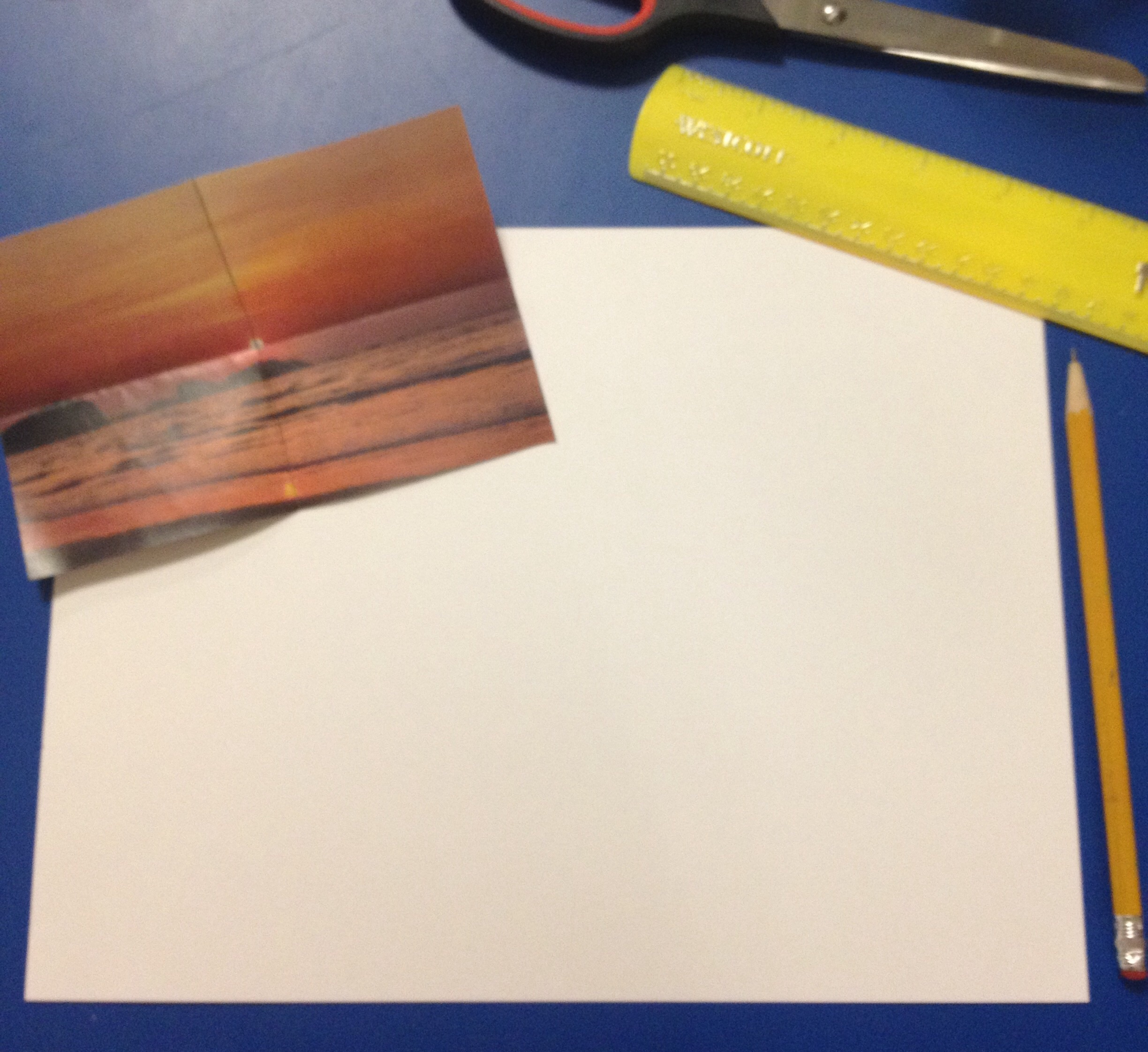
Step 2 – Setting up the grid
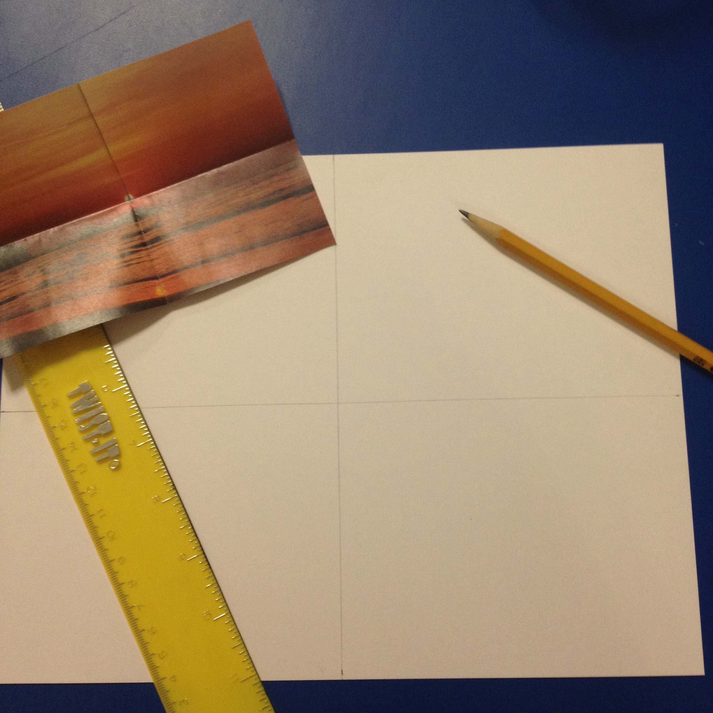
Step 2
3. Place the picture in the corner of your paper and place your ruler from corner to corner on your picture. Draw a diagonal line through the center of your grid. Continue the diagonal line where the picture was placed.

Step 3 – Making the diagonal
4. Now, you have a better idea of where things are placed in your picture. Begin to lightly draw what is in your picture by using your laid-out grid as reference.
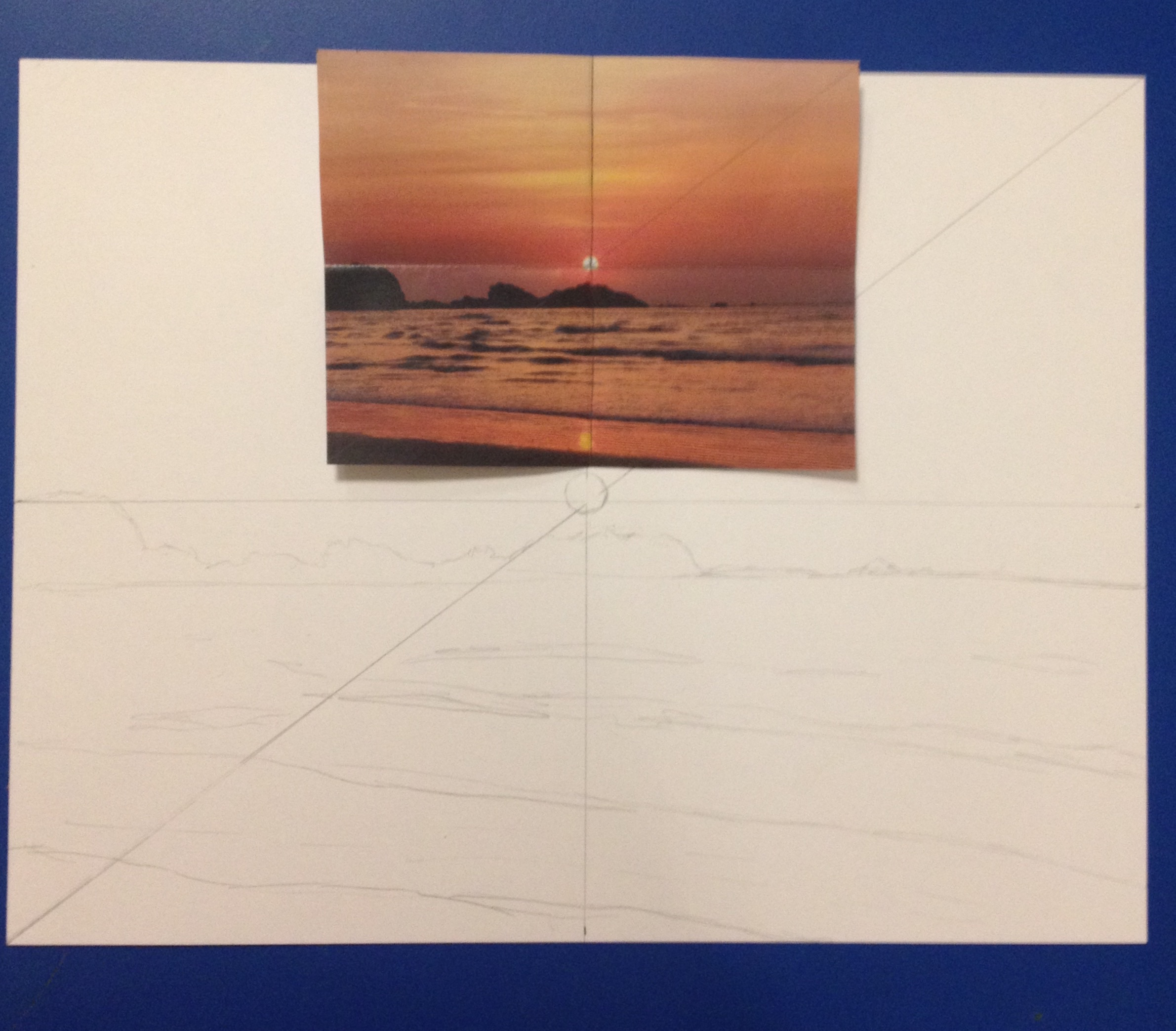
Step 4 – Draw out scene
5. Once you have drawn your picture, erase your reference lines and set out your watercolor set, brushes, cup of water, and paper towels. Begin to paint your picture; the amount of water you use relates to how bright your colors will be. More water = lighter colors, less water = brighter colors.
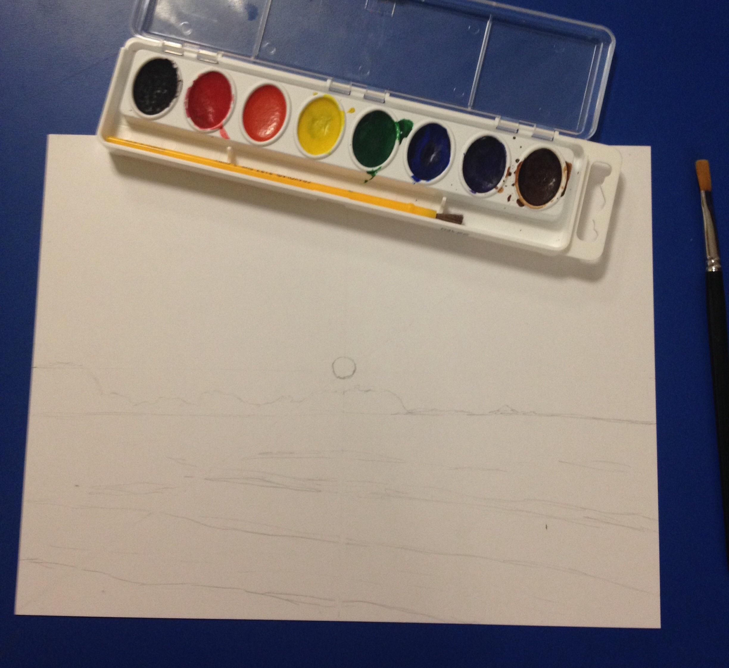
Step 5 – begin to use watercolors
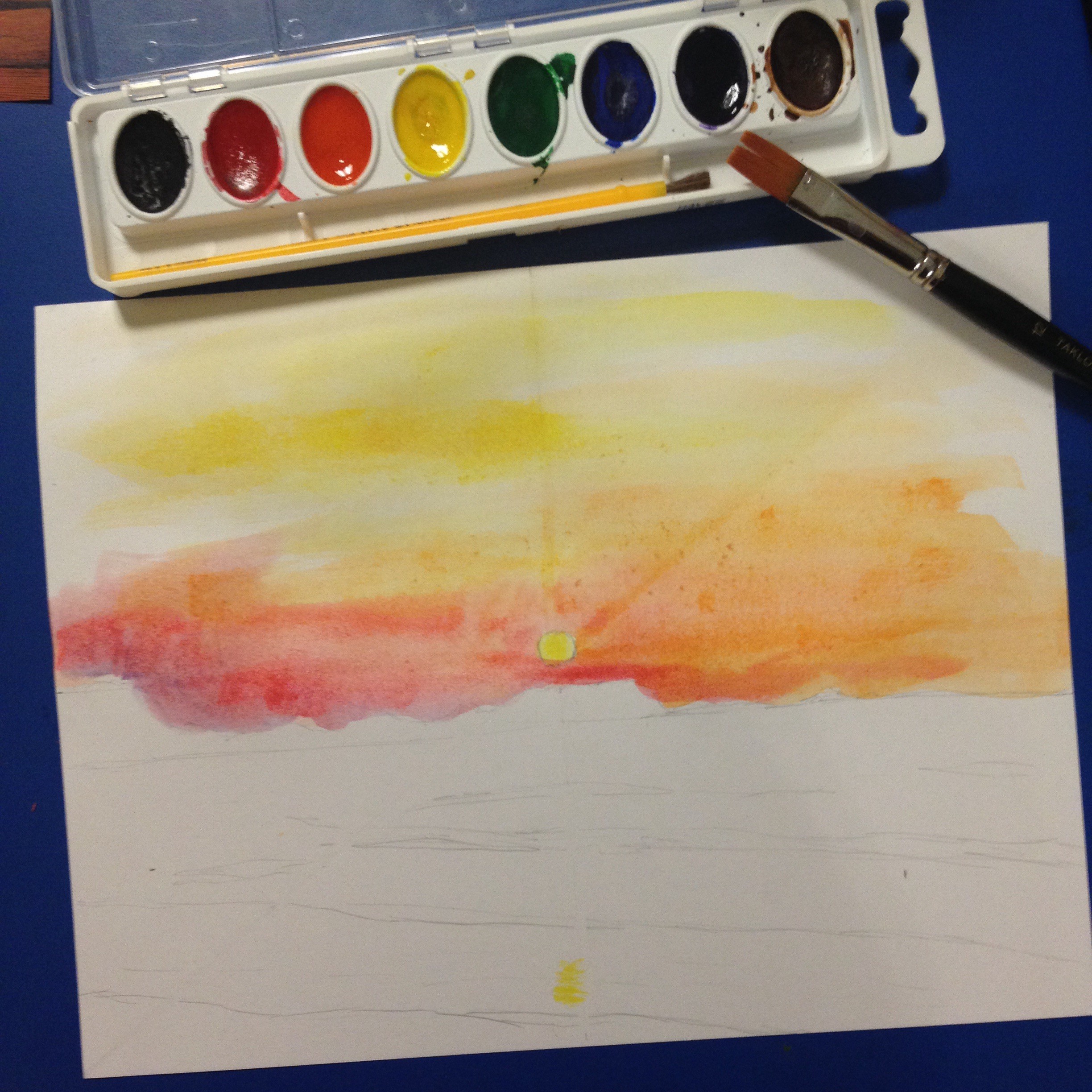
Step 5
6. Feel free to keep adding to your watercolor as it dries. You can even add detailed lines with a pen. Once you are happy with your painting, give yourself a pat on the back because you just created a beautiful piece of artwork.
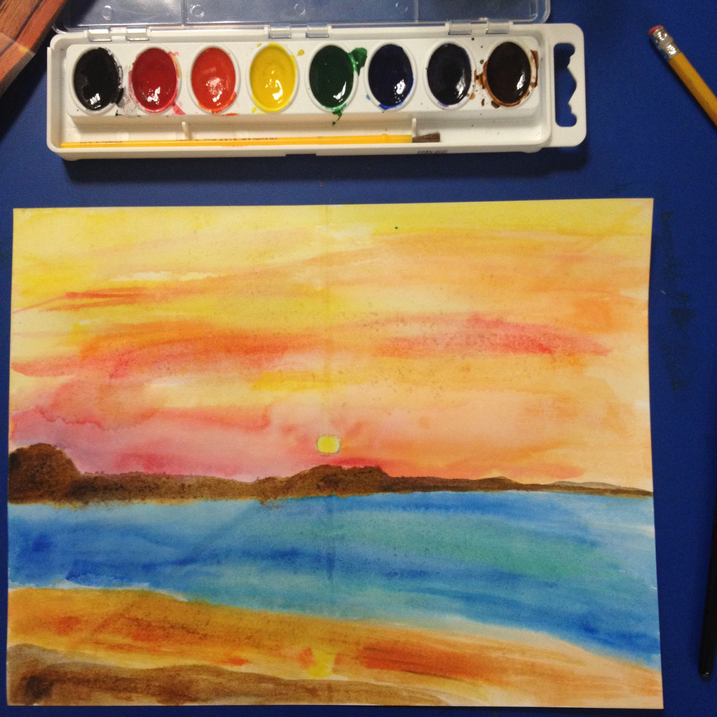
Final Painting
Tune in regularly for more art activities inspired by artwork in The Phillips Collection.
Julia Kron, K12 Education Intern