If you’ve wandered through our galleries recently and seen the gorgeous Georges Braque and the Cubist Still Life, 1928-1945 exhibition, you likely marveled at the masterpieces on display, expertly hung for your viewing pleasure. For each special exhibition, works come from all over the globe and are united in beautiful harmony on our walls and in our galleries. In my completely biased opinion, these works, no matter where their permanent home may be, always look their best in the Phillips gallery spaces. Why here, you ask? Because in addition to our intimate galleries and our extraordinarily talented staff of curators, preparators, and registrars who hang each show, the Phillips has a secret weapon: exhibition designer Val Lewton.
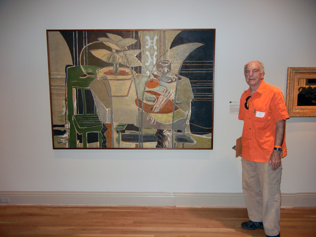
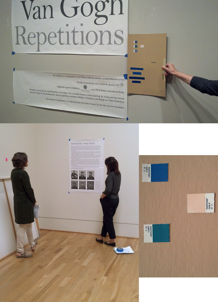
Exhibition Designer Val Lewton stands by one of his favorite paintings in the Braque exhibition. Photos: Liza Key Strelka
Val began working with the Phillips on a freelance basis in 1996, just one year after retiring as Chief of the Design Office at the Smithsonian American Art Museum. His first exhibition design at the Phillips was for the 1996 exhibition, Americans in Paris: Man Ray, Gerald Murphy, Stuart Davis, Alexander Calder (1921-1931). Since then, Val has been a constant and integral part of our exhibitions, and the unsung hero of many an installation, carefully constructing a design layout and paint scheme for most of our special exhibitions, and transforming our spaces for each new exhibition to highlight the inherent qualities of artists and their work on display. He’s also the reason why I can differentiate between various shades of white and know so many different names and shades of Benjamin Moore and Duron paint colors.
Following his recent work on the Braque show, Val kindly allowed me to ask him a few questions about his process and his opinions on color design in exhibitions:
What are the first steps you take to determine the color scheme of an exhibition?
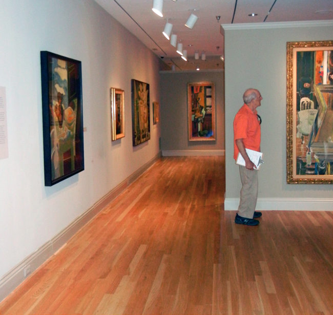
Wall colors are usually chosen late in the exhibition design process. By that time, I have carefully studied reproductions of all the work to be exhibited. When we get down to a serious discussion of colors I usually have a good idea of what atmosphere the curator wants. For instance, with the Braque show, although white walls were becoming the norm for nineteenth century moderns, it seemed that the paintings’ sophisticated design, domestic scale, and subtle coloration called for mid-value gray walls. Two grays, one darker than the other, were chosen to compliment as best as possible the variety of the exhibited work. In the darker galleries, base and crown molding was painted the lighter grey and visa versa in the lighter galleries.
Val Lewton in the Braque galleries.
How does your choice of wall color correspond to how you design the layout of an exhibition?
Although wall color can be crucial to a viewer’s experience, my first consideration is with gallery space and traffic flow. Certainly the difference between very light and very dark colors can radically alter perceptions of space, but interior architectural considerations come before choice of colors. So as I stated, considerations of color come after the curator and I determine gallery sequence and a coherent path through the show.
Do certain artists/art movements require different color palettes (such as abstract expressionism vs. impressionism, etc.)? Do you notice any new trends in the museum world relating to exhibition design and wall color?
Of course–most abstract expressionist paintings were conceived for large white corporate spaces. And that kind of work probably looks best against a white wall. However, be aware that white is not just one color. The particular white, whether warm or cool, can be critical to the proper ambiance of the galleries. Recently, the Phillips has been using a generic China White for many of its modernist galleries. That white leans toward a high value, neutral gray that works well with art made across generations of twentieth-century artists. To properly display works by earlier nineteenth-century artists such as Daumier or Monticelli, the walls need colors that are far richer. Even with these richer, darker colors it is important to avoid getting the colors too lurid. The colors in the paintings should be the star attraction.
The very first installation I ever worked on in the early 1960s, The Muse and the Ego under Bates Lowery at Pomona College, called for a clear demarcation in color between late nineteenth-century French salon paintings and those paintings conceived in nature, outside the studio by impressionists. The effect of moving from the salon to the Salon des Refusés was as if a heavy, dark red velvet curtain had been pulled aside to let in the light of day. As an art student, that exhibition had a profound influence on my future work in exhibition design.
As for new trends in exhibit design, most involve accommodating new methods of interpretation provided by digital media. While audio and video presentations can enhance the museum visitor’s experience, it can, if not handled properly, interfere with the primary experience of looking at art.
What are some of your favorite past exhibition wall color designs?
I think the noted curator, Walter Hopps, devised the most unusual color scheme I ever worked on. The show was Made in Chicago at the Smithsonian American Art Museum in the late 1970s. It featured work by H.C. Westerman and Chicago artists of the roughly affiliated “Hairy Who”. This was a show that started out with wall color as its primary design element. Hopps wanted Westerman’s work displayed up front in a large white gallery. Surrounding that central gallery Hopps wanted individual cell-like galleries painted in colors of the “Hairy Who” artist’s choosing. Amazingly, all seven or eight artists, including Ed Paschke, Jim Nutt, and Gladys Nilsson, submitted garish but appropriate colors from radically differing points on the color wheel. That show, rightly, contradicted all my fusty designer instincts.
You can admire Val’s most recent design work and color choices in the Braque exhibition, on view through September 1.