American Craft: Spotlight on Stack and Scare

Stack and Scare_1

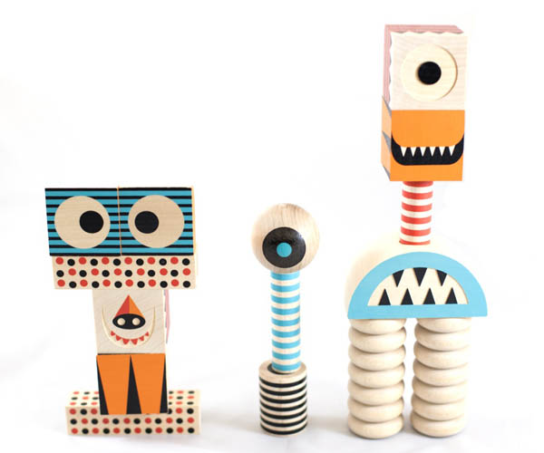
Stack and Scare children’s blocks. Photo: Rhiannon Newman

In conjunction with Made in the USA, we’re celebrating contemporary American ingenuity by highlighting some of our favorite American artisans featured in the museum shop. Today we interview Pete Bultman of Uncle Goose, the world’s premier manufacturer of wooden alphabet blocks, and designer Don Clark of Invisible Creature.

What inspired you to make these blocks?

Don Clark: My father is a woodworker and luthier, so woodcraft has been a big part of our lives, but honestly I’d have to say Uncle Goose inspired these blocks. I’ve been a big fan of their products and have purchased many sets over the years. We design lots of toys and characters here, but the idea for Stack And Scare! came after playing (and stacking) Uncle Goose blocks with my kids. I had never seen any sort of stackable wooden monster play set, and definitely not a refined and modern version…so I pitched the idea to Uncle Goose, and the rest is history I suppose. I now consider Pete a great friend and I’m thankful for our partnership—and his enthusiasm to make these amazing products with us.

Pete Bultman: When we first saw the designs, we fell in love instantly and knew we had to make them.

How do you feel about rise of technology in children’s toys?

PB: Ultimately technology will consume all aspects of our lives in one way or another…it’s unfortunate these days how obtrusive it is in children’s toys. Manipulatives and imaginative play are the hallmarks of brain development for young children, something smart phones and others can’t replicate (unless you’re using them to stack and make things). Some day the balance will be there, but right now we are doing a tremendous disservice to our kids by leaving them alone with the digital nanny!

DC: Technology is great. But many people forget that technology is a just a tool. When that tool hinders imagination and stifles the art of just getting lost in a book, painting, album, toy or game…then I feel it gets in the way of that true “magic” we experience as a kid—or adult, for that matter. In short, many interactive toys and games suck the creative whimsy and exploration out of creative play. I remember sitting and flipping through illustrated picture books as a kid and wanting to visit those beautiful worlds so badly—my imagine would soar! That’s what I fear gets lost with much of the interactive technology in today’s toys…can one be too engaged?

What was your favorite childhood toy?

PB: Lego was my favorite.

DC: Well, that’s easy. LEGO. No explanation needed on that one!

Do you have a favorite American artist? If yes, who, and why?

DC: That’s probably a tie between Charles Eames and Walt Disney. Amazingly beautiful, simple product design fused with my love of cartoons and toys…that’s where I want to exist!

PB: Not sure I have a favorite artist…certainly too many to choose. Probably Don Clark! Why? Stack and Scare, and Odd Galaxy (coming soon).

Mailing #MyAmericanArt Postcards

One of the art workshops at the festival will be #MyAmericanArt postcards. •#MyAmericanArt Postcards. Families can create and share their own American masterpieces and send them to someone special.

One of the art workshops at the festival will be #MyAmericanArt postcards. Families can create and share their own American masterpieces and send them to someone special. Photo: Racquel Keller

I have been spending the last few months as an intern in the Education Department. It is an exciting time to be a part of the team since they are in the midst of gearing up for this year’s Jazz ‘n Families Fun Days.  At the event, participants can create American art-inspired postcards, and we really wanted something cool to get them excited about mailing them. As a result, I was asked to design a custom mailbox! This was right up my alley because as an artist I build assemblages out of found pieces.

The things I wanted to take into consideration were that it should be kid-friendly, fun, largely made of recycled materials, and be something that The Phillips Collection would be proud to have on-site…for however brief a period!

Be on the lookout for the mailbox at Jazz n’ Families Fun Days on June 7 & 8. Come on down to the art workshop, make a postcard of your own, and drop it in the box.

Below is a look at my process and the finished mailbox.

Racquel Keller, Education Intern and Museum Shop Supervisor

It all started with a sketch! Photo: Racquel Keller

It all started with a sketch! Photo: Racquel Keller

Found a great big box in Education and went on a little trip to Community Forklift hunting for bits and bobs!  I found a few odds and ends there, including this great piece of recycled Plexiglass.  Plexiglass was key because I really want the kids to see where their mail was going! Photo: Racquel Keller

Found a great big box in the Education offices and went on a little trip to Community Forklift hunting for bits and bobs. I found a few odds and ends there, including this great piece of recycled Plexiglass. Plexiglass was key because I really want the kids to see where their mail was going! Photo: Racquel Keller

Then I wanted to make it relatable to our mailboxes.  That took a bit more cardboard (an old box kindly donated by the Museum Shop!) and a bit of creativity! Photo: Racquel Keller

Then I wanted to make it relatable to our mailboxes. That took a bit more cardboard (an old box kindly donated by the Museum Shop) and a bit of creativity. Photo: Racquel Keller

And finally, the beautification – the box is covered with pictures from our collection!  Photo: Racquel Keller

And finally, the beautification – the box is covered with pictures from our collection. Photo: Racquel Keller

What Happened to that Negative?

The image that Intersections artist Vesna Pavlović created with the deteriorated 8 x 10 negative from the museum archives is mysterious and fascinating to look at. But what happened to it?

Vesna Pavlović, Untitled (Swiss Peasant art exhibition, 1957.4) (2014), 40 x 50 in. Framed archival pigment print. Ed. of 5. Courtesy of the artist and G Fine Art

The installation shots of the Phillips’s 1957 show, Swiss Peasant Art, were taken using large format cellulose triacetate sheet film or safety film (so called because it was less flammable than the previously available nitrate film.) The film captured clear, detailed images but over time the acetate film base shrunk, pulling away from the emulsion and causing bubbles and an effect called channeling. Thankfully, the archives has a full set of 8 x 10 contact prints (created by sandwiching photographic paper and the negative, generating a print the same size as the negative and preserving detail).

Swiss Peasant Art exhibition at the Phillips, June 9-July 2, 1927. This is the print from the deteriorated negative appropriated by Vesna Pavlovic. Photo: The Phillips Collection Archives, Washington DC.

Swiss Peasant Art exhibition at the Phillips, June 9-July 2, 1957. This is the print from the deteriorated negative adapted by Vesna Pavlović. Photo: The Phillips Collection Archives, Washington DC.

Swiss Peasant Art might seem like an unusual show for the Phillips, and it was. Organized by the Smithsonian Institution Traveling Exhibition Services—or SITES—the show was called “one of the most heartwarming exhibitions to be seen in Washington in a long time” in a review from The Washington Post. The objects were selected from Appenzell and Toggenburg and focused on the ceremony of Alpenaufzug, the annual upward trek of herds to the springtime mountain pastures. The show included paintings, wooden milk pails, cut brass, a clock, and other decorative items.

Swiss Peasant Art exhibition at the Phillips, June 9-July 2, 1927. Photo: The Phillips Collection Archives, Washington DC.

Swiss Peasant Art exhibition at the Phillips, June 9-July 2, 1957. Photo: The Phillips Collection Archives, Washington DC.