On October 27 artist Pedro Lasch premiered his work Abstract Nationalism/National Abstraction: Anthems for Four Voices at The Phillips Collection as part of the International Forum Weekend in Washington. In this audio-visual performance, national anthems of specific countries are sung in the language of the country listed alphabetically after it in the World Almanac.
In a six part blog series, Curatorial Intern Lauren Reuter asks the artist about this work and how it fits into the Phillips, art, and politics. Read Part 1 here, Part 2 here, Part 3 here, Part 4, and Part 5 here.
Exploring themes of nationality and diplomacy during the International Forum Weekend will undoubtedly engender discussions on art and politics. What do you see as the relationship between the two? Do you see a tension, a playfulness, both?
To me, that’s very much tied in the title of the work. The title is a provocation. I’m bonding two words that we don’t like to see in relation to each other: abstraction and nationalism. As long as there has been art, there have been debates about whether it should be political or not. But whenever you speak of abstraction in art, there have been strong tendencies to assume that art must be separate from politics.
The Phillips shows a lot of this type of artwork—Rothko being the most famous example. In Rothko’s generation, many artists were blacklisted, very politically active. But in their work, you don’t see direct politics. They actually wanted that separation. The way I see that relationship between nationalism and abstraction is that it forces people to think, “Wait, isn’t abstract art also political? And aren’t some of the forms of nationalism also art?”
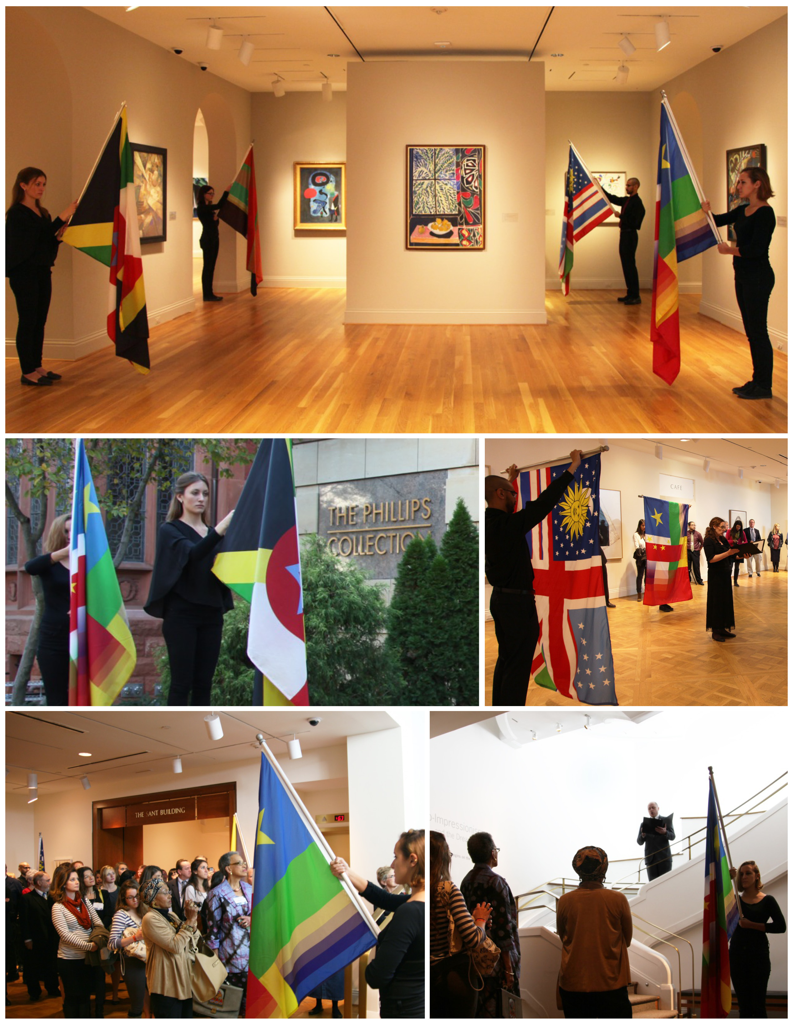
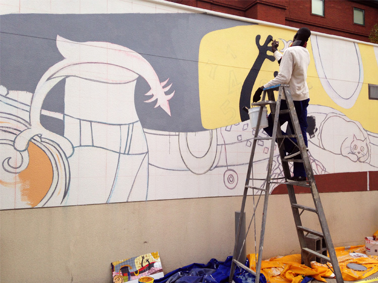
Performance of Pedro Lasch’s Abstract Nationalism / National Abstraction at The Phillips Collection
A few years after the occupation of Iraq in 2003, they tried to institute a new flag to eliminate the handwriting that had been put on it during Saddam Hussein’s reign. There was a national competition, and a contemporary Iraqi artist won. The artist chose the colors blue, white, and green. It was a nice half moon, a beautiful design—a very abstract representation of the Kurdish, the Suni, the Shi’ite. People were outraged: “You’re crazy! Our colors are red, white, and black with the green star. Those are the Arab Union colors, you can’t mess with that. The only other country in the region with white and blue is Israel.” Politically and from a national standpoint, it was a fiasco, all because of the choice of color. But if you say, “Who’s afraid of red, yellow, and blue in a Barnett Newmann painting?” It’s just this big colorfield painting with three colors. It’s a flag! Visually speaking, the two are not that far from each other. We just like to pretend that they are. The language of high modernism is deeply indebted to national symbols and vice versa. It’s not by chance that Jasper John’s most famous artwork is the US flag. Some will say the two should never mix, and some will say the two are always mixed and its nonsense to say they aren’t. I enjoy the pluralism and the huge range of artistic practices.