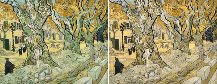
Vincent van Gogh’s The Road Menders from the Phillips’s permanent collection. At left, the original painting. At right, the same image after applying 60% protanomal simulation in Kazunori Asada’s Chromatic Vision Simulator. Of this comparison, Asada says “In the original, the color of the trees and ground is bit strange, and coarse lines are conspicuous in the stones. But after conversion, the trees and the ground begin to look solid, and depth is felt for the road.” (Vincent van Gogh, The Road Menders, 1889. Oil on canvas, 29 x 361/2 in. The Phillips Collection, Washington D.C. Acquired 1949.)
A recent essay by Japanese medical scientist Kazunori Asada proposes that Vincent van Gogh may have been colorblind—which, if accurate, would have influenced his color palette and might have resulted in the drastic, clashing hues for which he’s so well known (and admired). Asada compares side-by-side images of van Gogh’s artwork with the same image run through his Chromatic Vision Simulator (quite fun to play around with if you have a moment) and sees what he judges to be a normalizing effect. Artinfo.com’s Kyle Chayka was quick to poke some holes in Asada’s argument, pointing out that “the versions of the paintings he uses aren’t necessarily true to life.”
Whether true or not, I’m glad to have come across Asada’s research. It raises an interesting question about the artist’s role in relation to his or her work—if a piece speaks to you, does it matter what message the artist intended to send? Would van Gogh bang his fists and be upset that we’d all gotten it wrong, or would he smile for the fact that people are finding beauty and meaning where he himself didn’t even intend it?
Amy Wike, Publicity and Marketing Coordinator