Eye to Eye with Pollen and Egg Yolk

Joseph Marioni, Yellow Painting, 2003, No. 9. Acrylic and linen on stretcher 36 x 34 in. Photo: Charles Abdoo

On a recent Spotlight Tour, Joseph Marioni’s bright canvases left many in the group cold. Responses ranged from a resolute “not interested” to a searching, “what do they add to the history of art?” Gallery Educator Alice Shih pointed out that, for some, Joseph Marioni‘s paintings may be best brought into focus by the work of other artists hanging nearby. Alice pointed out sight lines from Marioni to Matisse, to Kandinsky, and along a river of blues and pinks in Gene Davis, to Morris Louis, Adolph Gottlieb, diving into two deep blue Marionis a few galleries beyond.

Alice built further context through metaphor. She told us that the feeling of “egg yolk” pops into her head when she looks at a particular yellow painting by Marioni. (I see pollen, which leads me to the work of another artist recently at the Phillips–Wolfgang Laib).

Later I asked Alice if this kind of color association happens for her with other works by Marioni. She shared this list:

*Red Painting (2002): lava

*Yellow Painting, (2011): the song Good Day Sunshine by The Beatles

*Blue Painting (1995): the night sky (it has spotty moments when it could seem like stars)

Joseph Marioni, Blue Painting, 1995, No. 26. Acrylic and linen on stretcher 28 x 24 in. Photo: Nicholas Walster

Does Marioni’s work bring up particular memories, sensations, references, or metaphors for you? Please comment and let us know.

Cecilia Wichmann, Publicity and Marketing Manager

Bonnard’s Experience of Twilight

See Karen’s previous post on Kandinsky and twilight here.

Pierre Bonnard is another artist in the collection who loved twilight, which he called l’heure bleue. Like Kandinsky, his work approached abstraction but did not let go of the visible world.

Bonnard’s sensitivity to the ways in which colors changed throughout the day was manifest in a letter to Matisse, in which he wrote about Matisse’s painting L’Asie (Asia), which the artist had lent him, “the red there is wonderful late in the afternoon. By day it is the blue that takes the lead. What an intense life the colors have, and how they vary with the light.”

Pierre Bonnard, The Palm, 1926, Oil on canvas; 45 x 57 7/8 in.; 114.3 x 147.0025 cm.. Acquired 1928.

The Palm and Twilight: Purkinje shift

Under conditions of reduced light, the violet figure in The Palm (above) has a spectral appearance and seems to come forward in the space. As light fades, vision shifts from the foveal cones, which are responsive to long wave yellows and reds that compose the daylight, to the peripheral rods. In twilight, short wave colors like mauve and blue increase in brightness and visibility relative to long wave colors. This phenomenon is called the Purkinje shift.

-Karen Schneider, Librarian

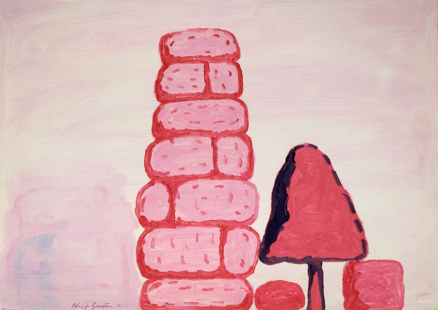
Think Pink (and Guston)!

Philip Guston, Untitled (Wall), 1971. Oil on paper. Private Collection. © Estate of Philip Guston; image courtesy McKee Gallery, New York, NY

PINK!
This is the first reaction of most visitors as they enter Philip Guston, Roma. Some can’t handle it, just too much pink. Personally, I don’t care for pink, but I love these paintings. A pink was chosen as the 2011 Color of the Year by Pantone, so you could say the Phillips is leading in trends.

Something to take into consideration:  When white is added to a color to lighten it, we usually call it by the name of the original color. Blue becomes light blue, or pale blue, but it is still blue. However, black becomes not light black but gray, and red becomes not pale red but pink. So these Gustons are not pink but red paintings.

RED!
The paintings are composed of primarily three colors–red, black and white. When artist Chuck Close was asked about this palette during a panel discussion here, he said that Guston’s friends used to joke that Philip went to the art store, and there was a sale on red, black, and white.

It is a handsome color combination, used for centuries. Guston had used it extensively in his paintings exhibited at Marlborough Galleries just before his stay in Rome. There is also a noticeable use in his earlier abstractions, frequently as pink. Come to think of it, a number of big macho abstract expressionists used pink. (See our Gottlieb Seer or Equinox, which also has the alchemical trinity at the bottom). It was as if pink was in the air.

Adolph Gottlieb, Equinox, 1963. Oil on canvas, 90 x 84 in. Acquired 1963. The Phillips Collection

Although Guston mixed black with white, or red with white, he never mixed all three together, for there is no violet in these paintings. Sometimes he painted black on top of red, or red on top of black, but the three colors mushed together would have introduced a different note, that of violet. His dark red comes from red straight up, rather than from the addition of black.

There are theories as to why Guston focused on red, but maybe it was just his favorite color. In the catalogue there are reproduced two pages of a letter he wrote; it is written in red ballpoint ink on blue lined yellow legal paper, an absolutely hideous color combination. But a red ink pen? He would have had to search that out from all the easily available blues and blacks. Red probably did gather certain meanings for him, but if so, he never revealed them. There are just some things you have to keep within the safe red chambers of your heart.

-Ianthe Gergel, Museum Assistant