
Summer 2021 Curatorial Intern Naimah Jangha shares her impressions of experiencing Alma Thomas’s work.
Recently, I had the immense pleasure of examining the work of Alma Thomas up close. Part of my internship entailed a visit to the Howard University Art Gallery which has five Thomas paintings in its collection: Phantasma from 1960, Blue Abstraction from 1961, Abstraction (Untitled) from 1967, Orange Glow from 1968, and Forsythia Among Spring Flowers from 1972. Previously, I have seen her artwork through images in textbooks and online, but after seeing her paintings in person, I can safely say that reproductions do not do her art justice.
There are nuances in her paintings that are more easily interpreted by the eye and not always captured on camera. Prime examples of these are her expert use of subtle layering to create luminosity and her use of color theory to create vibrancy in Blue Abstraction and Forsythia Among Spring Flowers. You will be able to see these paintings in the Alma W. Thomas: Everything Is Beautiful exhibition opening at the Phillips on October 30.
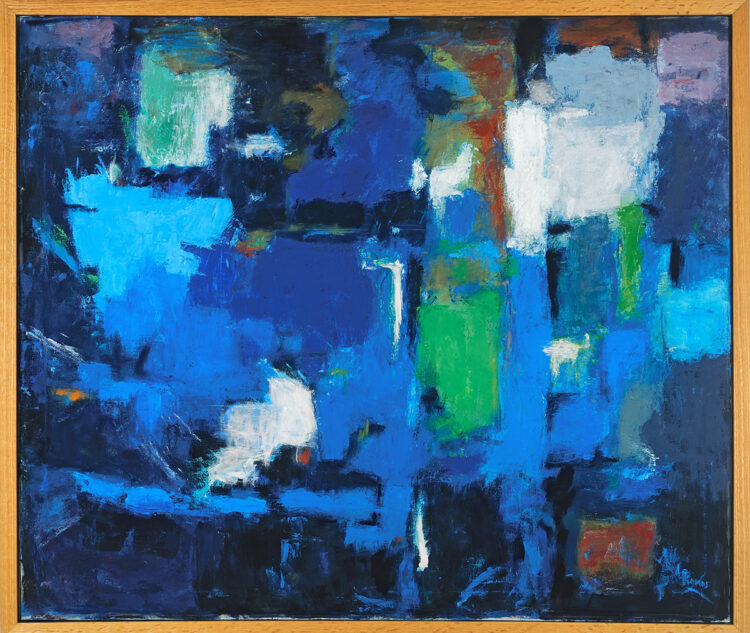
Alma Woodsey Thomas, Blue Abstraction, 1961, Oil on canvas, 34 x 40 in., Howard University Gallery of Art, Washington, DC / Licensed by Art Resource, NY. Photo: Gregory R. Staley
In Blue Abstraction, one is immediately confronted with various hues of blue, green, white, and red. Upon closer inspection, one notices the little dab of bright orange on the left margin of the painting. There is an energy created by her strategic color placement and layering. Among the sea of blues, there is a large island of green near the center of the composition and smaller patches of pink in the upper corners that add dynamism. One sees a careful placement of red and bright smears of bold white that also contribute to the energy of the painting. This translates on camera well, but the reason you must see it in person is the nuances found with close examination. For example, while I was looking at Blue Abstraction, I noticed that one area in the upper left corner was far more complex than I originally thought. There is a large swatch of white covered mostly by a pale green. This green gradually deepens in shade at the bottom of the modified rectangular shape created. There is a murky splotch of muted blues swirled with an orangish-brown right above the white-green swatch. What I found most interesting about this section is the perimeter of the colors. Thomas takes advantage of the textures of the canvas and the dark blue ground. The result is a beautiful translucent spattering of bright green and white. The layering of these thinner dabs of paint contrasts with the deep rich blue background and creates delicious pockets of luminosity that must be devoured in person.
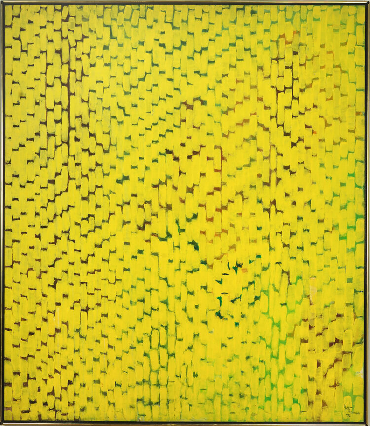
Alma Woodsey Thomas, Forsythia Among Spring Flowers, 1972, Acrylic on canvas, 60 x 52 in., Howard University Gallery of Art, Washington, DC / Licensed by Art Resource, NY. Photo: Gregory R. Staley
Much like Blue Abstraction, Forsythia Among Spring Flowers plays with layers and opacity to create luminosity. At first glance, one sees a lot of yellow with green and brown peeking through underneath. Then one notices a play on foreground and background. There are areas where what one originally thought was the negative space in the background is layered on top of the yellow to become the foreground. A chief example of this can be seen in the lower right quadrant. When looking closely in person, I noticed that the green marks, usually reserved for the background, were painted on top of the yellow. Thomas used the green to adjust the shape and size of her yellow “Alma stripes,” which made the green in this section appear more saturated. Through close looking, I also noticed differences in saturation within the yellow dabs. This is because Alma Thomas layered different opacities of yellow on top of each other. As a result, some dabs appear brighter than others, creating luminosity. She achieves delicacy in her paintings through this process. This delicacy is best digested in person.
When appreciating her work, I highly encourage you to stop for a moment and look for these nuances. Find the areas in Forsythia Among Spring Flowers where the dark brown background has a dot of two lighter brown shades between the yellow stripes, or where there is a small drip of white. Look for the dab of orange in Blue Abstraction. Pay attention to the edges of color Thomas paints and how her knowledge of color theory and her layering of colors creates luminosity and vibrancy. Pause and look closely at every beautiful detail in each painting. I can assure you that there are many to be found. I implore you to make a trip to The Phillips Collection to see Everything Is Beautiful this fall because pictures do not capture the nuances and details that distinctly define her work. You will not be disappointed.