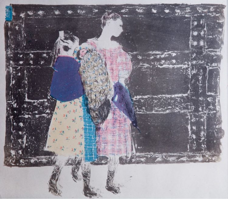
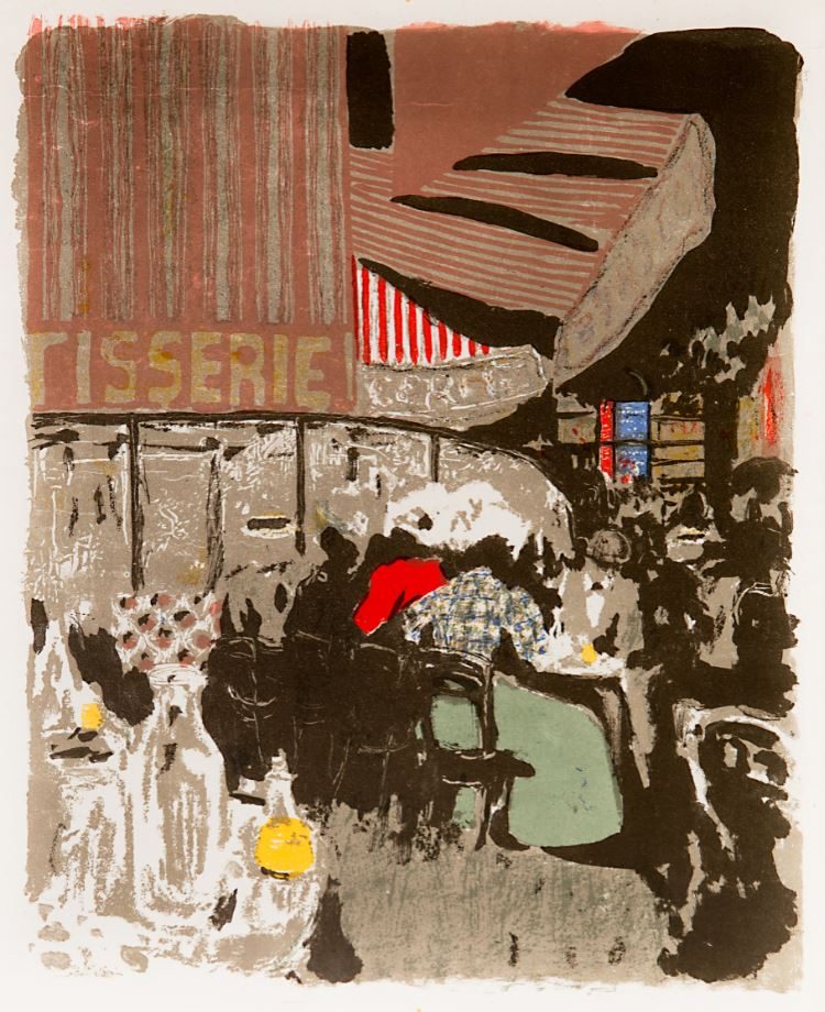
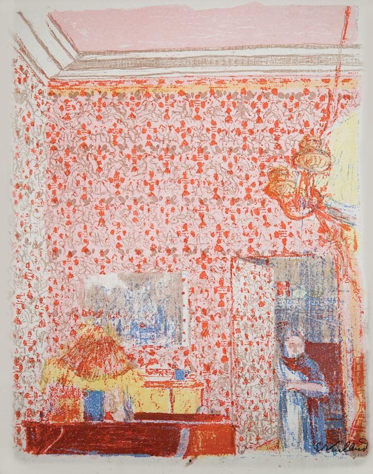
Bonnard to Vuillard: The Intimate Poetry of Everyday Life-The Nabi Collection of Vicki and Roger Sant (on view through January 26) demonstrates how the Nabis sought to break down the artificial barriers between the fine and decorative arts. Beyond painting and prints, the artist employed their aesthetic of flat colors, decorative patterning, and silhouetted forms on screens, wallpaper designs, tapestry, stained glass and more.
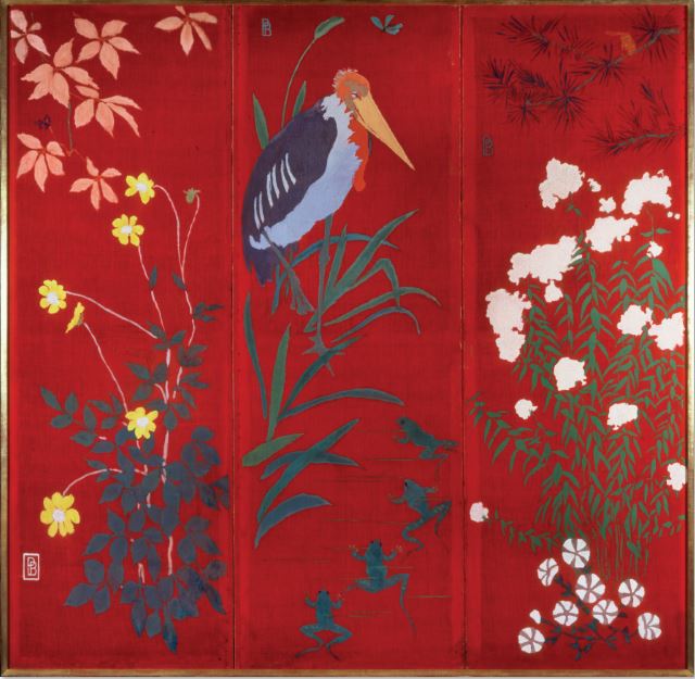
Pierre Bonnard, Stork and Four Frogs (Le Marabout et les Quatre Grenouilles), 1889, Three-panel screen, distemper on canvas, Each panel 62 3/4 x 21 1/2 in., overall 62 3/4 x 64 1/2 in., The Phillips Collection, Promised gift of Vicki and Roger Sant
This striking screen marks a major turning point in Pierre Bonnard’s adoption of the Nabi aesthetic. Just the year before, he had become one of the group’s founding members and a chief proponent of the group’s core belief in art as an extension of everyday life: “At that time I personally envisaged a popular art that was of everyday application: engravings, fans, furniture, screens.”
Bonnard’s choice of a bold vermilion ground and a palette of saturated, non-naturalistic colors owes a debt to the “magnificent example” of Paul Gauguin. Gauguin’s Vision of the Sermon (1888), which was shown in Paris earlier that year, left a lasting impression on Bonnard, who kept a postcard of it on his studio wall. Like many in the Nabis circle, Bonnard also found inspiration in Japanese art, especially 19th-century ukiyo-e prints. Bonnard later earned the moniker “le Nabi très japonard” (the very Japanese Nabis), and his screen bears the flat, unmodulated color, asymmetrical composition, and botanical motifs characteristic of Japanese art. Stork and Four Frogs is one of at least seven screens Bonnard made in the early years of his career.
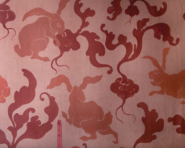
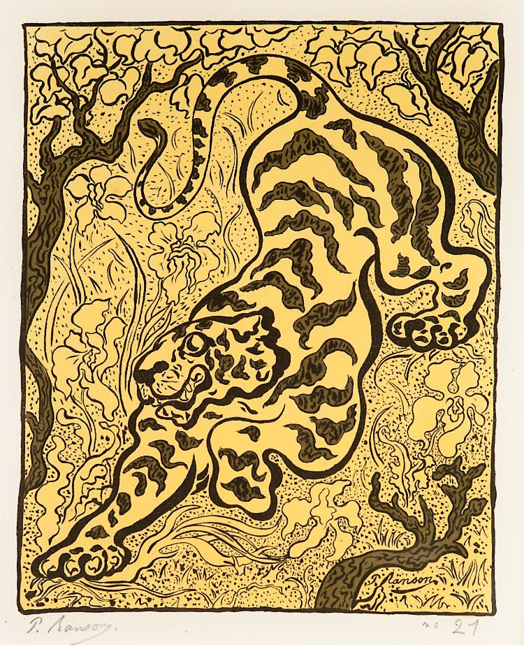
Paul Ranson, Rabbits (Les Lapins), c. 1893, Design for wallpaper; distemper on paper, 23 5/8 x 29 1/2 in., The Phillips Collection, Promised gift of Vicki and Roger Sant
During the 1890s, wallpaper was in vogue as an interior design element, and wallpaper manufacturers turned to artists to develop appealing designs. Paul Ranson and Maurice Danis were among the Nabi painters who worked with wallpaper motifs. In 1893, Ranson received a commission from Arthur Sanderson & Sons, a major London wallpaper manufacturer and exporter.
The playful composition of Rabbits, featuring a trio of bunnies feasting on radishes, is one of several wallpaper designs painted by Ranson. In choosing the rabbit as his subject, Ranson followed the advice of art critic Charles Blanc, who spoke of the charm of painting objects in wallpaper that “we see every day—those things that we can easily recognize, such as flowers, fruit, familiar birds, domestic animals, and common plants.” Nevertheless the company must not have considered Ranson’s design marketable and never fabricated it into wallpaper.
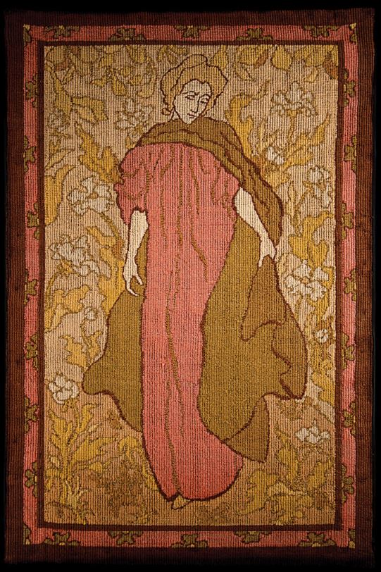
Paul Ranson, Woman in Red or Woman with Cape (Femme en rouge or Femme à la cape), 1895, Needlepoint tapestry; wool on canvas, 59 x 39 3/8 in., The Phillips Collection, Promised gift of Vicki and Roger Sant
Woman in Red is one of several tapestries Paul Ranson made in the 1890s, a time when the medium enjoyed a revival in France as part of a larger embrace of the decorative arts within the official art salons. Ranson, like Aristide Maillol, became an enthusiastic practitioner of tapestry design, joining William Morris and other English artists who were leaders in the international Arts and Crafts movement of the late-19th- and early-20th century.
In this design, Ranson conjured out of a few sinuous lines and subtle, broad tones a standing female figure surrounded by a field of flowers, a subject common in medieval millefleurs tapestries. Ranson frequently depicted women in nature, finding the subject rich with mythological and biblical associations. His tapestries were shown in public and private galleries throughout the 1890s, with Woman in Red being featured most often.
Like his fellow Nabi artists, Ranson created the initial design for his tapestries, but did not fabricate them. In most instances, Ranson relied on the weaving skills of his wife, France. She was known for her coarse stitching, as seen in Woman in Red, which enlivens the surface with an undulating textural pattern.
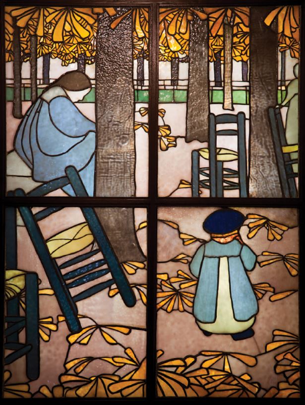
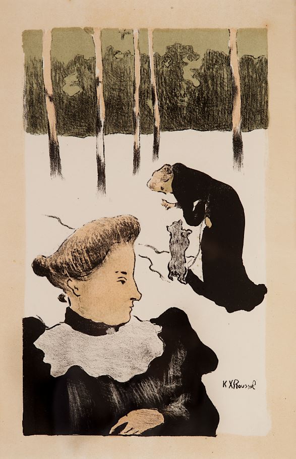
Ker-Xavier Roussel, The Garden (Le Jardin), 1894 (executed 1895 by Tiffany and Co.), Stained glass; 48 7/8 x 36 5/8 in. The Phillips Collection, Promised gift of Vicki and Roger Sant
Made after a preparatory study or cartoon by Ker-Xavier Roussel, this window was one of 13 commissioned by German-born Paris-based dealer Siegfried Bing in collaboration with American designer Louis Comfort Tiffany. Bing conceived of the idea for the commission soon after his return from the 1893 Chicago World’s Fair, where he admired a display of Tiffany’s stained-glass windows. Stained-glass design, revived from a grand tradition practiced by medieval guilds, provided a rich vehicle for the Nabi to reimagine their pictorial designs as light transmitted through color.
In addition to Roussel, Bing commissioned designs from other Nabi artists, including Pierre Bonnard, Maurice Denis, Henri-Gabriel Ibels, Paul Ranson, Paul Sérusier, Félix Vallotton, and Edouard Vuillard. Of the 13 commissioned windows, Roussel’s is one of only three surviving examples. Despite the valiant effort from Bing and Tiffany to introduce stained glass to the French market, the works met with mixed reviews and no further commissions followed.