Bonnard to Vuillard: The Intimate Poetry of Everyday Life-The Nabi Collection of Vicki and Roger Sant (on view through January 26) dives into the artists’ important contributions to the burgeoning field of color lithography. During the period of their close collaboration, they were widely celebrated for their graphic art. The careful process of transferring their sophisticated designs onto lithographic stones required a team of specialists at printing houses. This often included an artiste or dessinateur (draftsman) who translated the original work to the lithographic stone, a chromiste (color specialist) who honed the artist’s palette into a few colors and determined their order for printing, and an essayeur (proofer) who pulled test prints. The paper could vary from traditional French papers to imported Dutch laid papers to the Asian papers popular in Paris at the time.
The Nabis’ bold and inviting designs were much sought-after by commercial print shops, resulting in numerous commissions for posters, theater programs, sheet music covers, and illustrations in book and periodicals. These collaborations placed them at the center of the lively publishing explosion in Paris in the last decade of the 19th century. The exhibition Bonnard to Vuillard features two notable examples of Nabi print albums: L’Estampe originale and Paysages et Intérieurs.
L’Estampe originale, 1893
Complete set of 10 prints on handmade paper
Edition of 100; published by André Marty, printed by Delanchy, Ancourt et Cie
From 1893–1895, Parisian printer André Marty published an ambitious ninevolume series with no fewer than 95 prints by 74 artists in L’Estampe originale (The Original Print). To launch the series, Marty invited the Nabis and some of their associates to create the suite of 12 prints shown here. The color lithographs in L’Estampe originale were the most avant-garde and collectible prints of their day. The cover by Henri de Toulouse-Lautrec, not a member of the Nabis but very close to the circle, certainly increased the album’s desirability.
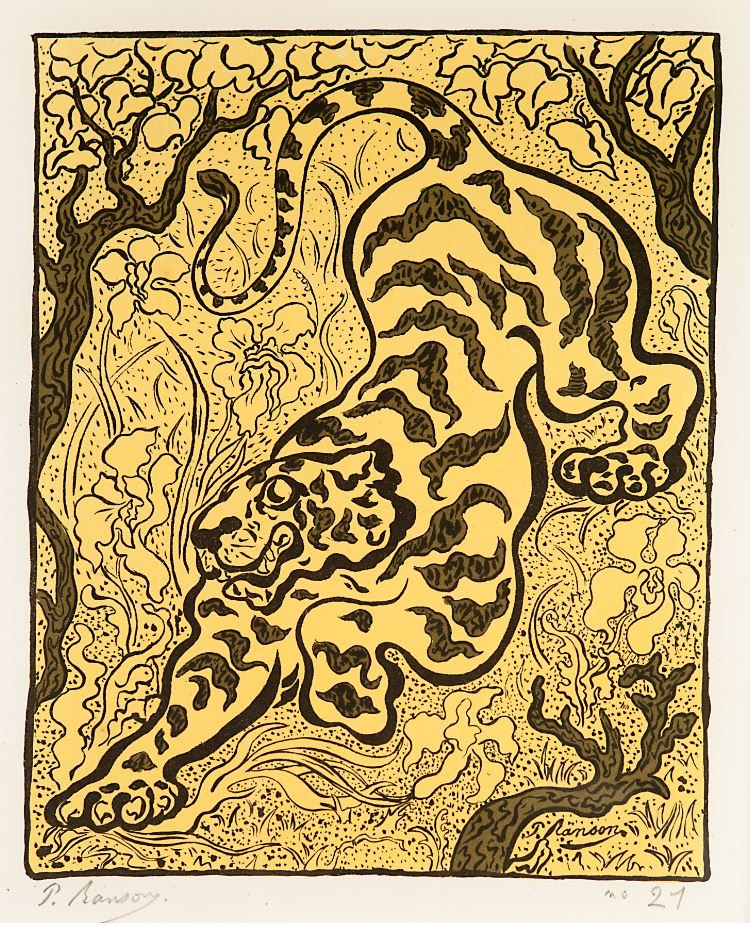
L’Estampe originale: Paul Ranson, Tiger in the Jungle (Tigre dans les jungles), 1893, Lithograph printed in three colors, 22 7/8 x 16 1/4 in., The Phillips Collection, Promised gift of Vicki and Roger Sant
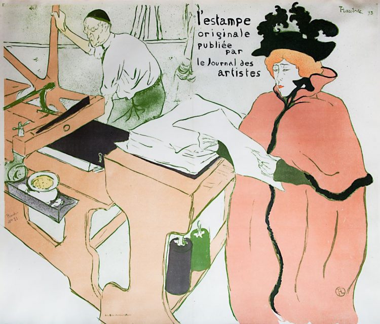
L’Estampe originale: Henri de Toulouse-Lautrec, Cover (Lithography [La Lithographie]), 1893, Lithograph printed in six colors 23 x 32 5/8 in., The Phillips Collection, Promised gift of Vicki and Roger Sant
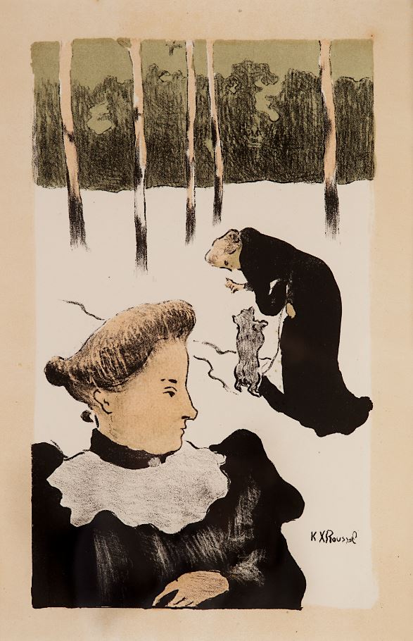
L’Estampe originale: Ker-Xavier Roussel, In the Snow (Dans La Neige), 1893 Lithograph printed in four colors, 23 1/8 x 16 1/8 in., The Phillips Collection, Promised gift of Vicki and Roger Sant
Paysages et Intérieurs, 1899
Complete set of 13 color lithographs on China paper
Edition of 100; published by Ambroise Vollard, printed by Auguste Clot
In the latter 1890s, color lithography continued to flourish under the patronage of Paris dealer and publisher Ambroise Vollard and his master printer August Clot. In 1899, Vollard commissioned Vuillard to create a series of 12 vibrantly colored lithographs for the album Paysages et Interieurs (Landscapes and Interiors). The artist worked closely with Clot and expanded his use of color with techniques that may have been unique to Clot’s shop at the time. Prized for their aesthetic qualities and techniques, prints such as these helped elevate the status of color lithography in the 19th century to an artistic medium on par with painting on canvas.
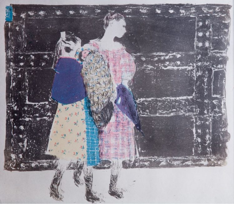
Paysages et Intérieurs: Édouard Vuillard, On the Pont de l’Europe (Sur le Point de l’Europe), 1899, Lithograph printed in four colors, 13 1/8 x 15 1/2 in., The Phillips Collection, Promised gift of Vicki and Roger Sant
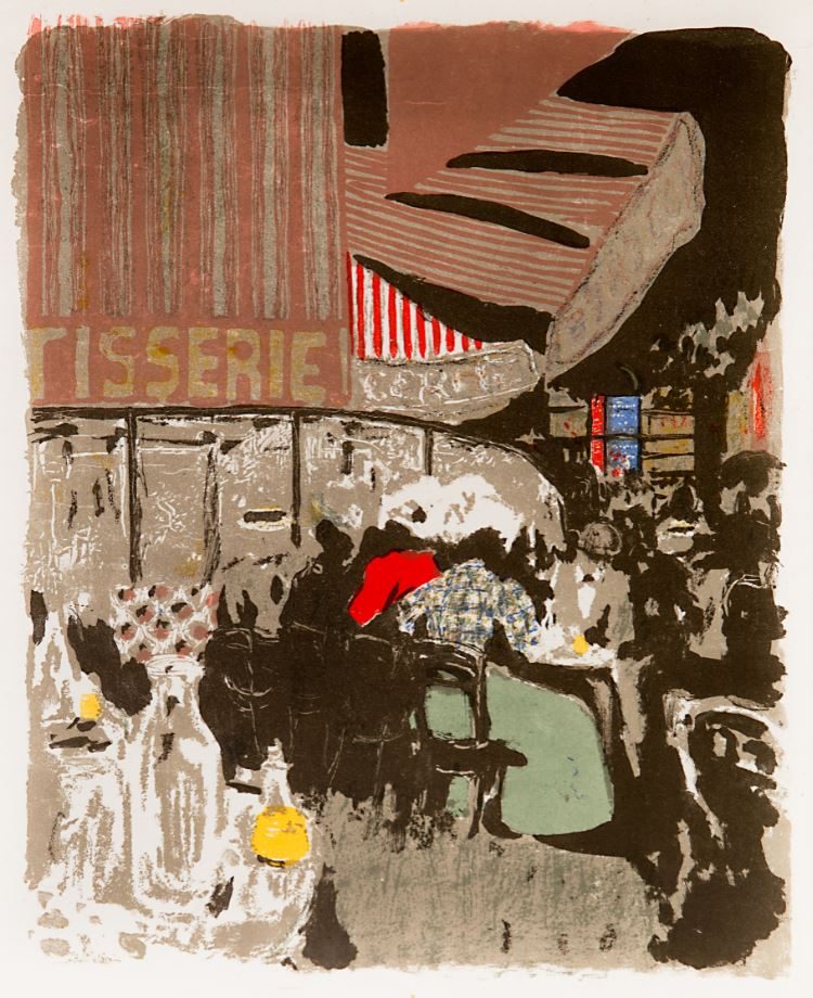
Paysages et Intérieurs: Édouard Vuillard, The Pastry Shop (La Patisserie), 1899, Lithograph printed in seven colors, 15 3/4 x 12 3/8 in., The Phillips Collection, Promised gift of Vicki and Roger Sant
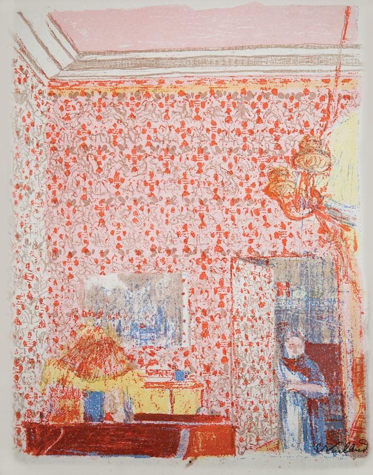
Paysages et Intérieurs: Édouard Vuillard, Interior with Pink Wallpaper I (Intérieur aux Tentures Roses I), 1899, Lithograph printed in five colors, 15 3/8 x 12 1/8 in., The Phillips Collection, Promised gift of Vicki and Roger Sant