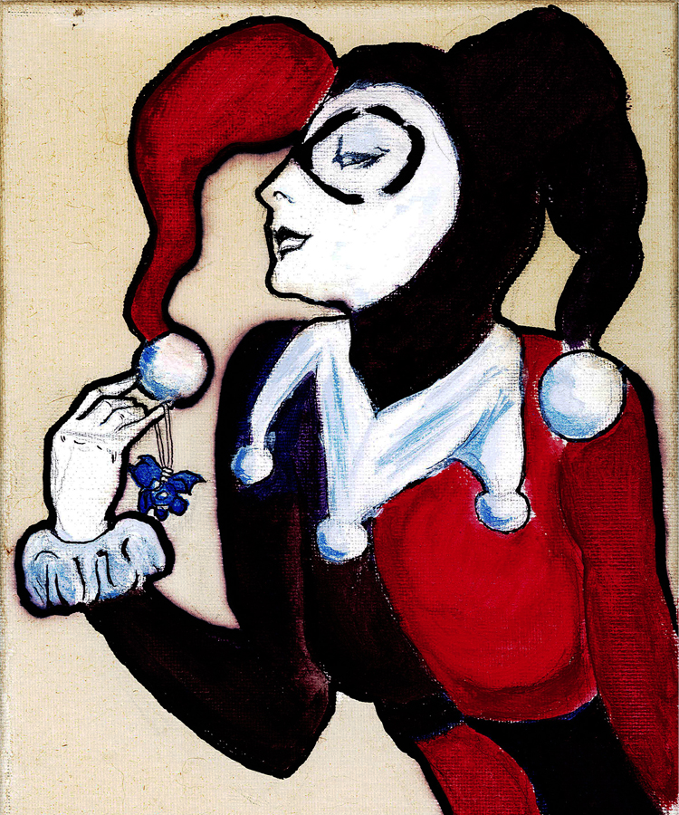
This project explores the artwork of an American icon, Roy Lichtenstein. Known for his contributions to the Pop Art movement and inventive use of the Ben-Day dot, Lichtenstein’s Imperfect series uses bright colors, thick lines, and bold patterns to subvert the concept of perfection. What do you think this means? Can you spot the “imperfection?”
According to Lichtenstein: “In the Imperfect paintings, the line goes out beyond the rectangle of the painting, as though I missed the edge somehow.” Each painting of the series incorporates this protrusion, creating a disruptive element within a geometric design. Keep this concept in mind as you begin your own Lichtenstein inspired piece!
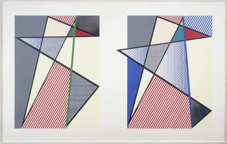
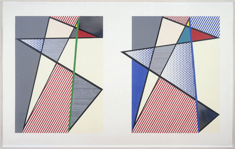
Roy Lichtenstein, Imperfect Diptych, 1988. Woodcut, screen print, and collage on museum board. Gift of Sidney Stolz and David Hatfield, 2009.
LOOK CLOSELY: What colors do you see? What shapes do you see? What kinds of patterns do you see? Are some lines thicker or thinner than others? How does this change the composition? Do you think the print looks static or dynamic? What makes you say that?
Now, let’s play “I Spy!” Roy Lichtenstein called this print Imperfect Diptych (it is part of the Imperfect Series) because there are slight differences between the two sides of the composition—can you find them? Hint: Look at the colors, shapes, lines and patterns of each side.
ABOUT THE ARTIST: In Roy Lichtenstein’s work, popular culture and high art collide. Using cartoon strips, magazines, and commercial advertisements for inspiration, his early artworks combined and enlarged images to create paintings that were both formally and narratively appealing. Lichtenstein’s artworks challenge the concepts of originality and reality. His “cartoon” style proposes the question: what is real and what is artificial?
Lichtenstein began the Perfect/Imperfect series in 1975 and continued to work in this theme through 1995. Often considered the most abstracted paintings in the artist’s portfolio, this series broke away from Lichtenstein’s former reliance on printed imagery. Instead, Lichtenstein allowed line to take precedence in the Perfect/Imperfect paintings, with thick, black lines dividing the compositions into flat planes of colors and patterns.
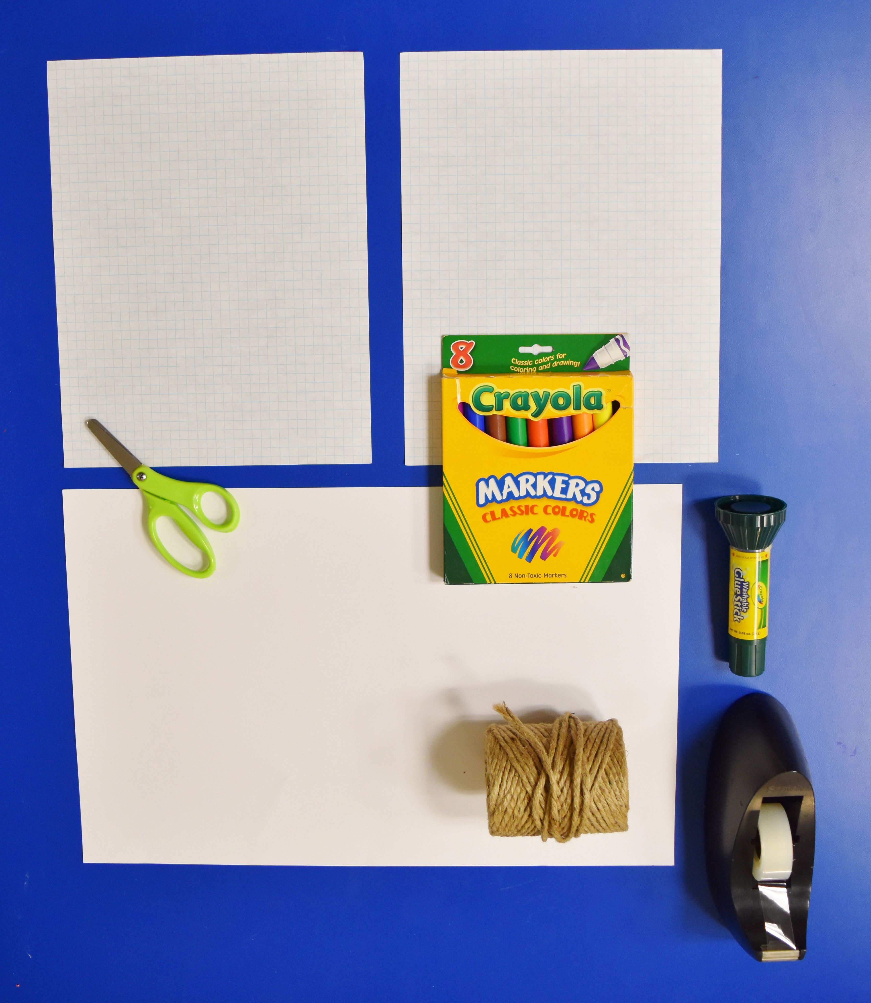
WHAT YOU NEED:
- String
- Tape
- Scissors
- 2 pieces of 8.5’’ x 11’’ graph paper
- 1 larger piece of paper or posterboard (approx. 24’’ x 33’’ recommended)
- Black sharpie
- Glue stick
- Markers or sharpies
AGE SUGGESTIONS:
TIME ESTIMATE:
STEPS:
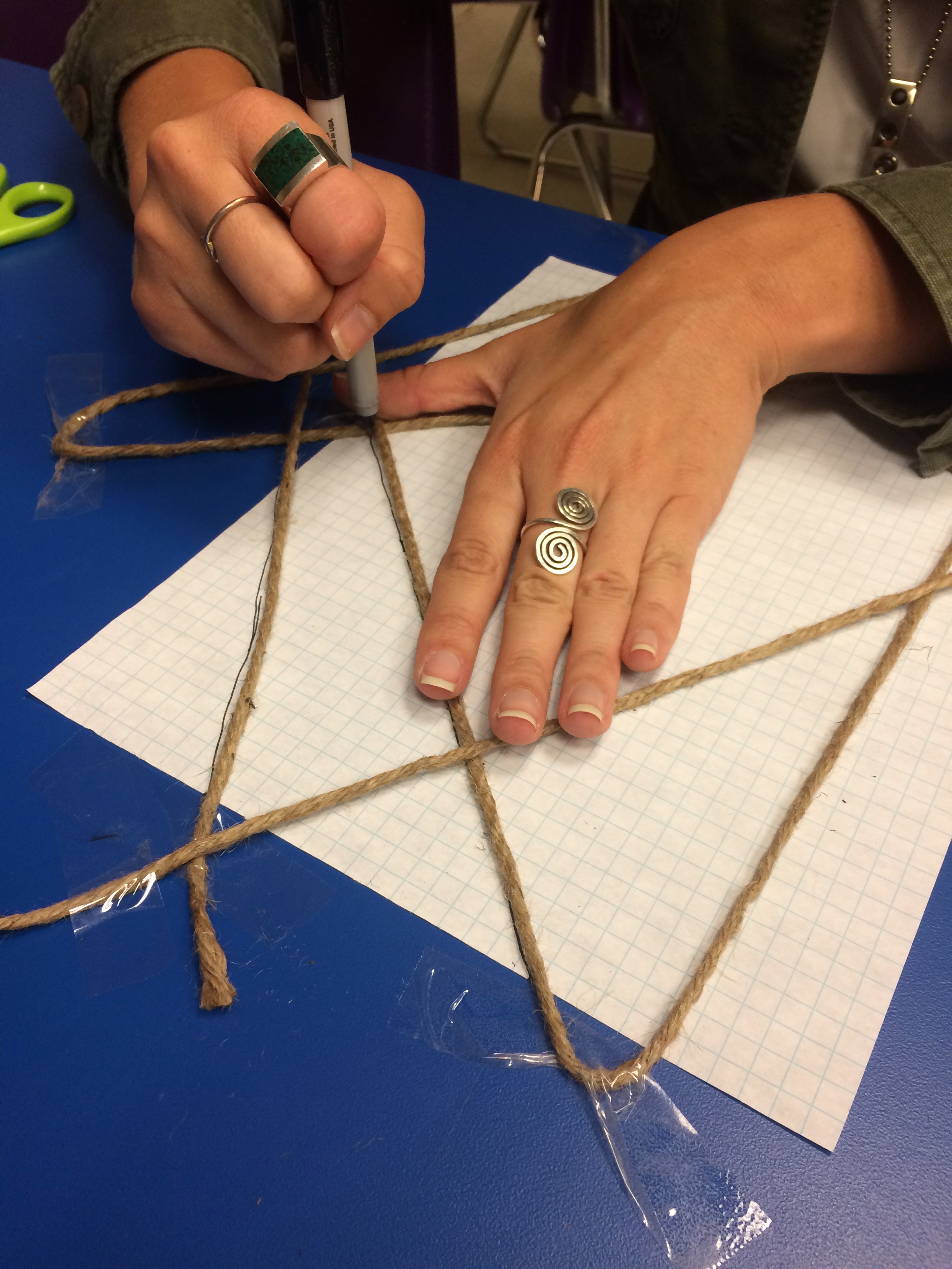
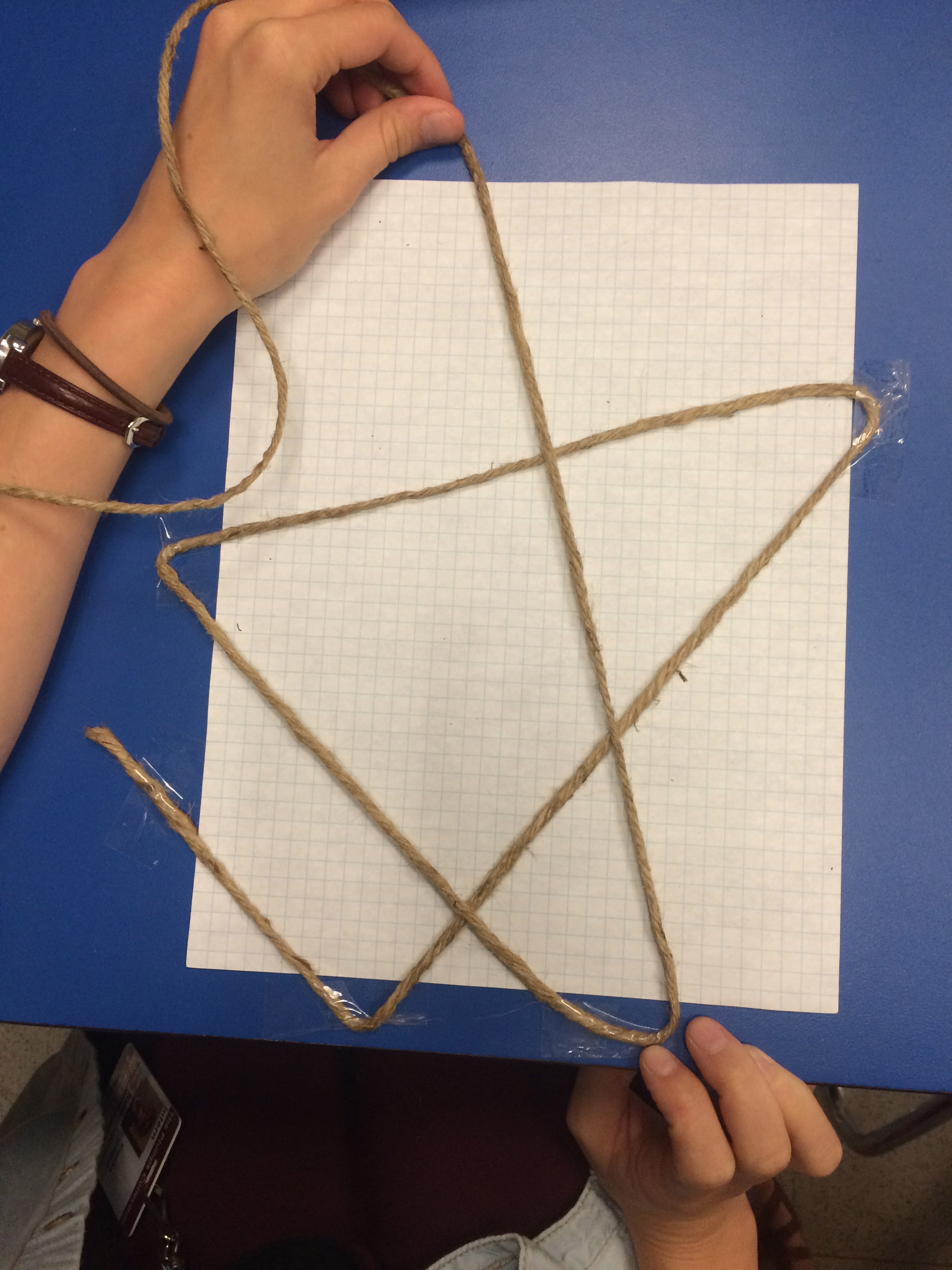
1. Tape the back of one piece of graph paper (Graph Paper A) to a flat, solid surface. This will be your art-making surface. Your graph paper can either be horizontal (like a window) or vertical (like a door).
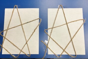
2. Cut a piece of string the length of your arms—you will need a friend for this step!
3. Tape one end of the string somewhere along the edge of your paper.
- Tip: Attach the piece of tape to your art-making surface, not your artwork.
4. Pull the string taut diagonally across your paper and secure with tape along the edge of the paper. Repeat 5–10 times. Your last diagonal should meet at the same point where you started! How many lines did Lichtenstein use in his artwork?
“The idea is that you can start with the line anywhere, and follow the line along, and draw all the shapes in the painting and return to the beginning.” – Roy Lichtenstein
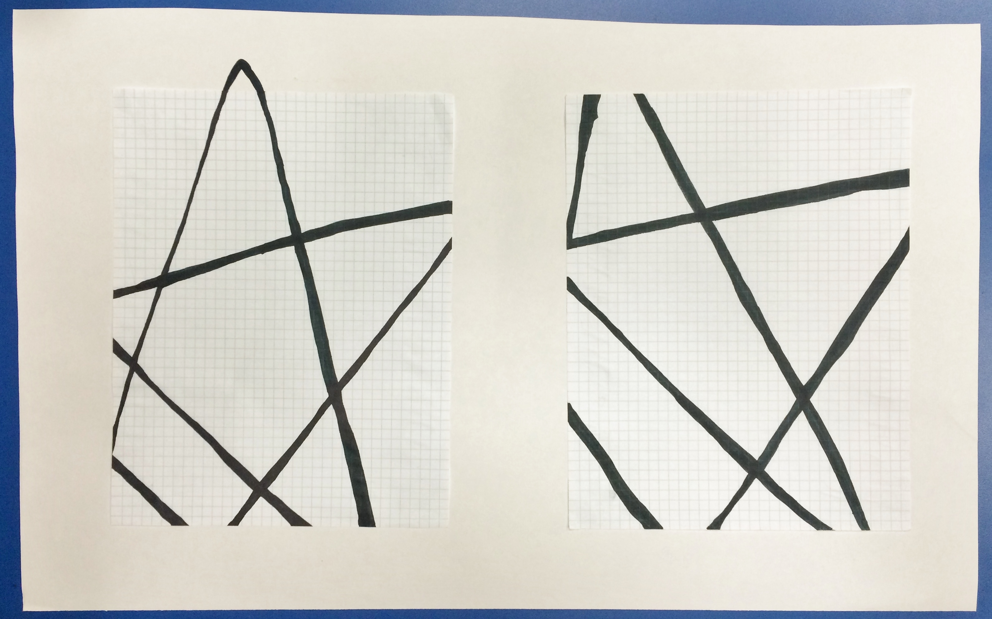
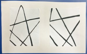
5. Trace the lines created by the string with a black sharpie (thick sharpies are recommended). Make sure the string is securely taped down so it will not move as you trace! The string should help you draw a precise and straight line. You can choose to trace one side of the string (as seen in Example B) or both sides of the string (as seen in Example A)

Step 5

Step 4
6. Trace a few lines more than once to make some lines slightly thicker than others.
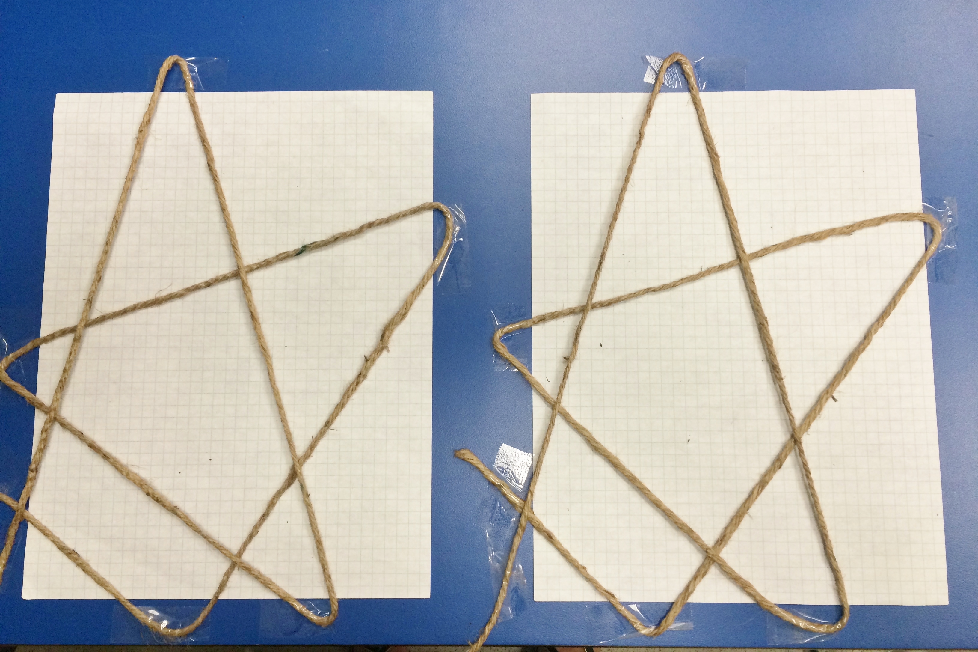
7. Securely tape your second sheet of graph paper (Graph Paper B) on a flat workspace nearby.
8. Using the same piece of string, repeat steps 3 & 4
- Tip: Use the graph paper to help you create the same diagonals. Counting the number of squares between lines will ensure that graph paper A and B are the same.
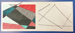
9. Time to change things up! Remove one of the pieces of tape on Graph Paper B and alter its location slightly. You can move it left, right, or further outside the bounds of your paper. Watch how the shapes and lines you have created change as you move this point.
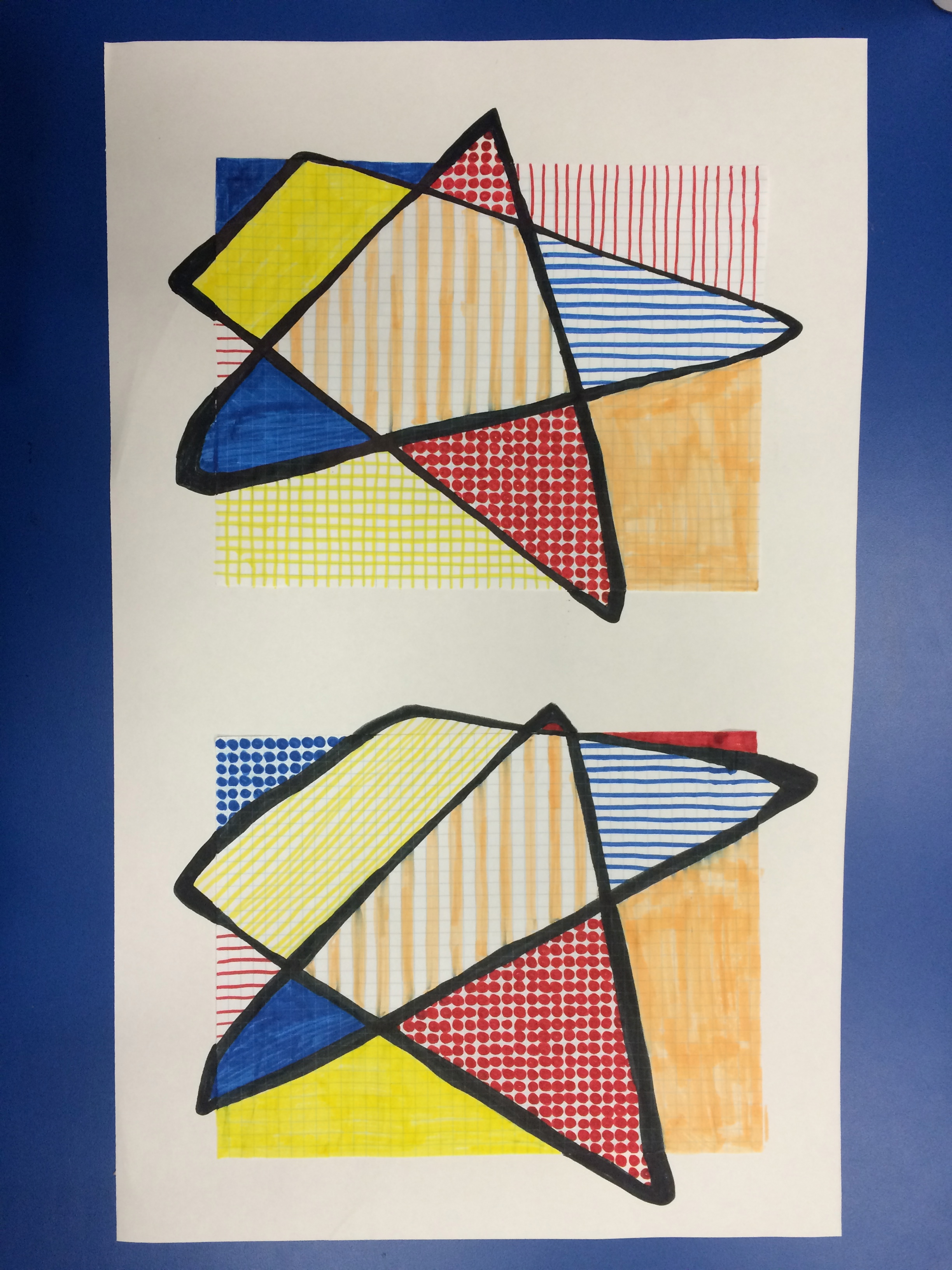
10. Repeat step 9 with at least three of your points on Graph Paper B. One line should extend beyond the bounds of the paper just like in Roy Lichtenstein’s Imperfect artworks. Once you are happy with your alterations, trace the lines with a black sharpie.
Step 8
Step 10: Notice how the lines on Graph Paper B (right) are slightly altered from their original position
“In the Imperfect paintings, the line goes out beyond the rectangle of the painting, as though I missed the edge somehow.” – Roy Lichtenstein
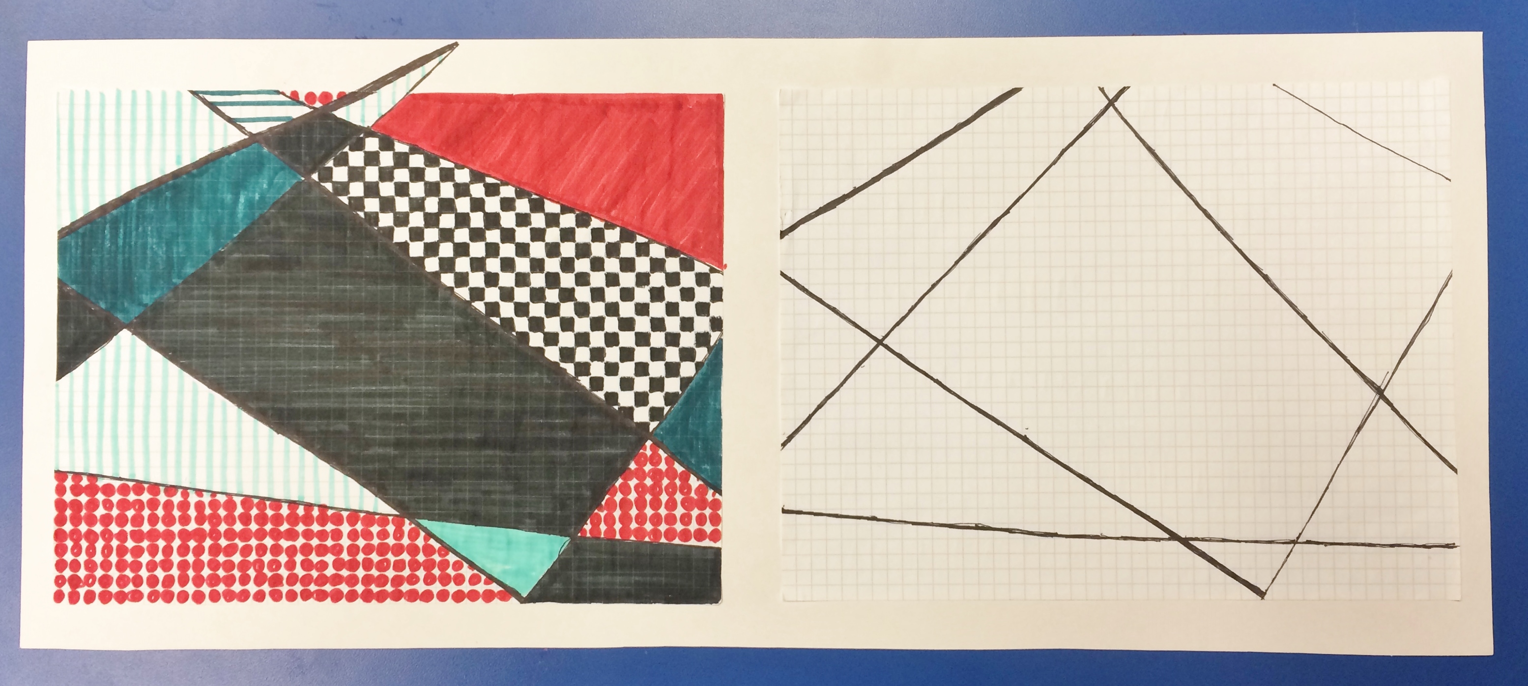
11. Use a glue stick to attach Graph Paper A and Graph Paper B side by side on a larger piece of paper. Maintain a 1-2’’ border around each piece of paper to create a framing effect.
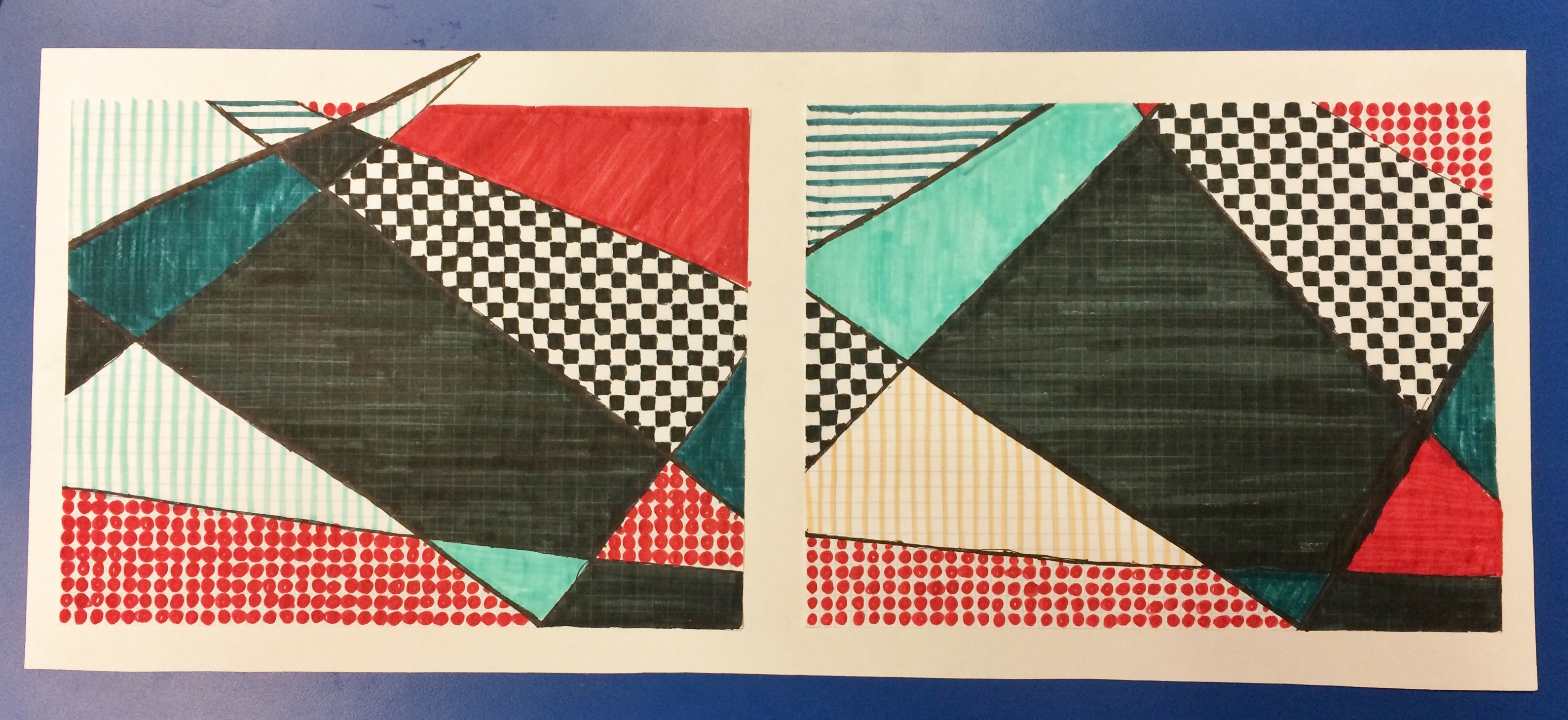
12. Using a medium of your choice (markers and sharpies are recommended because their colors are more vibrant), fill in the quadrants created by your line on Graph Paper A. Each section can be one color, multiple colors, or a pattern.
13. Now color Graph Paper B. Try to keep some of the sections the same colors and patterns as Graph Paper A, but just like you changed the lines a bit, you can also feel free to change some of the colors and patterns. Have fun and make your artwork your own!
Step 12

Step 13: Can you spot the changes? Artwork by Hayley Prihoda
When you are finished with you artwork, trade with a friend or family member. How many changes they can identify? Did you make big changes or little changes? Are they hard to find?
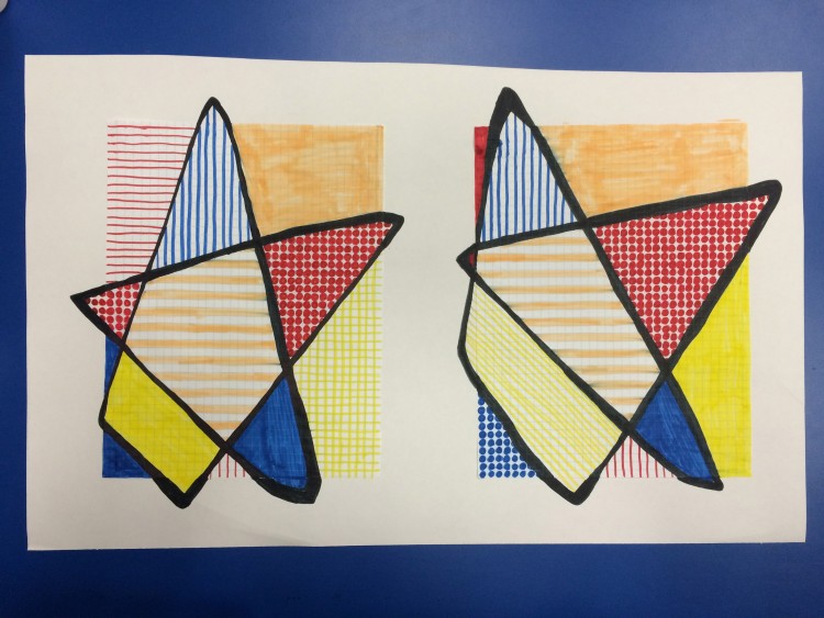
Example 2: Julia chose to expand all of her lines beyond the edge! Her artwork is reminiscent of a star. Artwork by Julia Kron
Thank you for participating in our latest Phillips-at-Home Summer Series project! We hope you found beauty in “imperfection.”
Hayley Prihoda, K12 Education Intern