2022-23 Makeba Clay Diversity Fellow Xin Zheng explores how Duncan Phillips and the Phillips Memorial Gallery worked to promote the diversity of American art in the decades following WWII.
“I believe fervently that art is international, a universal means of expression extending across boundaries and overcoming the barriers of trade, race, and language.”–Duncan Phillips, Foreword to Exhibition, The American Paintings of the Phillips Collection
Founder and first director of the Phillips Memorial Gallery (today known as The Phillips Collection) Duncan Phillips had a clear vision when he turned his private collection to the public: to promote American modern art. The museum, however, was never intended to show only one perspective because Phillips believed that “the distinctions in our [American] painters both of the past and of the present gain significance by being mingled and compared with what is best in the painters of other lands.”[1] Not long after the museum debuted to the public, the Great Depression and the Second World War ravaged the entire world, but the arts survived amidst all of the suffering from these two devastating events. Phillips participated in the Roosevelt administration’s Public Works of Art Project (PWAP), which was part of the New Deal’s work-relief package that encouraged and supported unemployed artists. The program supported countless artists who would later have successful careers including Willem de Kooning, Mark Rothko, Loren Maclver, Philip Guston, and Adolph Gottlieb.[2] Phillips was also responsive to WWII; he financially supported European artists who were in exile and raised awareness of the war at home. Art, in the mind of Phillips, is profoundly powerful in times of crisis, and the Phillips Memorial Gallery was the pinnacle of showcasing the power of art. As Duncan Phillips entered the last two decades of his directorship post-WWII, he became increasingly conscious in his attempt to make art transcend “barriers of trade, race, and language” not only through supporting diverse artists but also in his participation in various international exhibitions that aimed to display American values of freedom and democracy.[3]
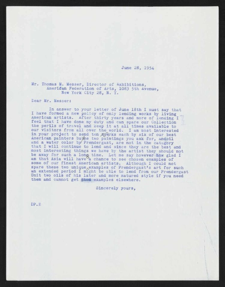
While the United States suffered grimacing events in the decades leading up to and during the war, the American art scene post-WWII was rather promising. Duncan Phillips’s nephew, Gifford Phillips, recalled that “a lot of American servicemen had been abroad and had developed more sophisticated tastes in art…[so] in about the…50s, the Phillips started to become quite famous.”[4] Marjorie Phillips was of the same opinion, noting that the 1950s was “a wonderful period” for the museum because “public enthusiasm for the arts in America…was increasing by leaps and bounds.”[5] One major shift in Phillips’s approach to collecting art post-WWII was that he became quite a patron of younger artists, and he was often excited when he was able to spot a rising star. Marjorie recorded that Phillips was eager to share the story that he had just “purchased a remarkably fascinating little canvas…by [Nicolas] de Staël, whose work [he had] not seen before.”[6] Recognition from an established and prestigious critic like Phillips would have carried a special meaning for all artists, especially for those who were still early in their careers. De Staël, for example, was 35 when Phillips first purchased his work in 1950, and the Phillips Memorial Gallery was the first museum in the United States to display his paintings. Furthermore, Morris Graves was 32 when Phillips first purchased his work, and Theodoros Stamos was only 27.[7] Phillips’s new approach to collecting art is perhaps best summarized by his response to the American Federation of Art (AFA)’s request to borrow ten paintings from the Phillips Memorial Gallery in 1954: “In answer to your [request] I must say that I have formed a new policy of only lending works by living American artists.”[8]
Duncan Phillips, Duncan Phillips to Thomas M. Messer, June 28, 1954, from The Phillips Collection Archives, Directorial Correspondence: The Correspondence of Duncan Phillips, https://tpcarchives.lyrasistechnology.org/repositories/2/archival_objects/3082
On one hand, Phillips was worried that prolonged lending of important older pieces would hinder visitors’ experience at the gallery, but undoubtedly it also marked a shift in Phillips’s emphasis to “contemporary American painters who need to be better known throughout the country.”[9]
The American post-war era also saw a group of immigrant artists who escaped the war from Europe. In the 1944 catalogue of the Phillips Memorial Gallery, for example, Phillips included naturalized citizens from Russia, Hungary, Spain, Romania, Italy, and Japan, among others.[10] Furthermore, artists like Stamos belonged to a group of artists that have come to be identified as the New York School. The composition of the group aligned with Phillips’s vision for art’s diversity: Stamos was a Greek American, Willem de Kooning was Dutch, Kenzo Okada was Japanese, and Mark Rothko was born in Latvia.
While American art was becoming more international, it was also becoming more interracial. African American studies scholar Nathan Huggins claimed that “compared with the 1920s [Harlem Renaissance], the 1960s…saw far more improvements in Black art.”[11] Phillips was a forerunner in the movement toward recognizing Black artists in that sense. In 1942, Phillips engaged in an intense negotiation with Edith Halpert’s Downtown Gallery and the Museum of Modern Art in New York regarding the split-purchase of Jacob Lawrence’s 60-panel Migration Series. The two parties ultimately decided to split Lawrence’s panels into odd and even numbers, with Phillips getting the odd numbers and MoMA getting the even numbers.[12] In 1946 the Phillips Memorial Gallery welcomed an exhibition titled “Three Negro Artists,” which introduced the works of Lawrence, Horace Pippin, and Richmond Barthé to Washingtonians. Phillips’s enthusiasm for Black artists dated even prior to what Huggins called the golden age of Black art, and the exhibition was a testament to the gallery’s inclusive approach to collecting and displaying art. Artist David Driskell later recalled in an interview that “even though [he] was…very race conscious, having been brought up in the South…[he] still felt accepted at the Phillips [in the 1950s]… [and he] did not feel that way at every place.”[13] Keep in mind that during this period Washington was a very segregated city. With that being said, the Phillips Memorial Gallery had its limitations. When art critic Gertrude Stein visited the gallery in the 1940s, she criticized the Phillips for not having any Native American artists, and Phillips’s purchases from Black artists were disproportionally less than other works that he acquired.[14] The gallery, for instance, only purchased two works from Pippin and one from Barthé. Phillips undoubtedly supported disenfranchised artists when others were slower to react, but admittedly, he could have done more.
Phillips’s support of a young and diverse group of American artists attested to what he wrote in the 1952 catalogue of the Phillips Memorial Gallery that works in the gallery are “evidence of new life springing up from old roots.”[15] While American art was becoming more diverse with the influx of immigrant and minority artists, the international community, in general, was also becoming more receptive to American art. In the post-war era, Phillips increasingly lent works abroad to showcase the best of American art to the rest of the world. “As we move into a future menaced by evil forces of tyranny and total war,” Phillips remarked in 1952, “we must cling to our faith in art as the symbol of the creative life and as the stronghold of the free and aspiring individual.”[16] The increasingly international art scene coincided with the rise of American artists, and in Phillips’s eyes, artists like John Marin were “too great for America alone,” thus propelling Phillips to present American art on a bigger stage.[17]
Phillips worked tirelessly with the American Federation of Art in the post-war era to host an array of international exhibitions that disseminated American culture abroad. In 1952, Venice held the 26th International Biennale Art Exhibition, and the United States was represented by Edward Hopper, Stuart Davis, Yasuo Kuniyoshi, and Alexander Calder. At the start of the show, a New York Times correspondence proclaimed: “Of all the competing exhibitions of modern art, the Biennale of Venice takes easy first place…for comprehensiveness, for international variety, [and] for the sheer number of paintings and sculptures on view.”[18] To this important international exhibition, the Phillips Memorial Gallery lent Edward Hopper’s Approaching a City and Stuart Davis’s Egg Beater No. 1.[19] Post-war international exhibitions like this almost always had a political undertone, but the United States government was rather slow to realize the power of art. When discussing the works that would be shown at the Venice exhibition, the AFA complained that the United States was “the only country sending out exhibitions that are not aided by [the] government,” whereas the Soviet Union was reportedly spending over a million dollars per year on cultural propaganda.[20]
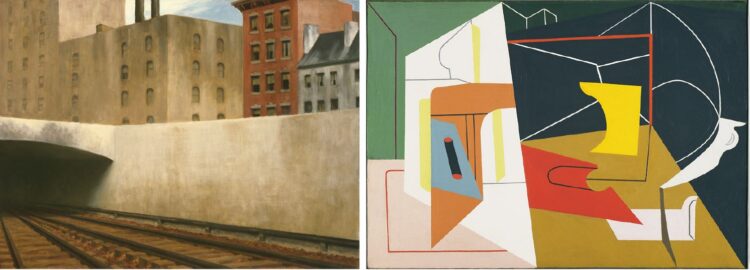
Edward Hopper, Approaching A City, 1946, Oil on canvas, 27 1/8 x 36 in, The Phillips Collection, Acquired 1947; Stuart Davis, Egg Beater No. 4, 1928, Oil on canvas, 27 1/8 x 38 1/4 in, The Phillips Collection, Acquired 1939; Art © Estate of Stuart Davis/Licensed by VAGA, New York, NY
The criticism toward the U.S. government was felt. The following year, the U.S. State Department cooperated with the AFA to design an exhibition to be held in West Germany. In letters exchanged between Phillips and the AFA, the AFA stressed the importance of this exhibition:
This is an exhibition of first importance and that it will be given an immense amount of publicity in Germany, where American art has unhappily been poorly represented in the face of the intensive Russian propaganda efforts to make us appear a nation of technocrats and second-rate imitators of European culture.[21]
Compared to the “up-to-date” exhibition of the Venice Biennale, the exhibition in West Germany asked for a more reserved choice, so the AFA requested two time-tested 19th-century painters, John Bradley and Albert Pinkham Ryder, from the Phillips.
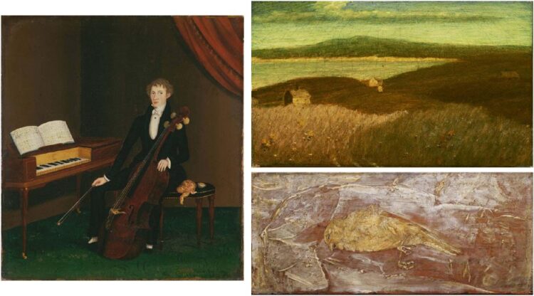
John Bradley, The Cellist, 1832, Oil on canvas, 17 3/4 x 16 in, The Phillips Collection, Acquired 1938; Albert Pinkham Ryder, Gay Head, Oil on canvas, 7 1/2 x 12 1/2 in, The Phillips Collection, Acquired 1924; Albert Pinkham Ryder, Dead Bird, c. 1890, Oil on wood panel, 4 3/8 x 10 in, The Phillips Collection, Acquired 1928
The same year, the Phillips also lent Georgia O’Keeffe’s Large Dark Red Leaves on White to another international exhibition in New Delhi.[22] Two years later in 1955, President Dwight Eisenhower claimed in his State of the Union address that:
In the advancement of the various activities which will make our civilization endure and flourish, the Federal Government should do more to give official recognition to the importance of the arts and other cultural activities. I shall recommend the establishment of a Federal Advisory Commission on the Arts within the Department of Health, Education, and Welfare to advise the federal government on ways to encourage artistic endeavor and appreciation.[23]
Eisenhower’s recognition of the value of art was part of a larger culture war that the United States waged against the Soviet Union, so American art was increasingly connected to values of diversity and freedom in America. In the forward to the exhibition Modern Painters & Sculptors, Phillips asserted: “The critics and the public should welcome and relish the diversities which affirm our freedom and our invigorating open-mindedness.”[24]
With the support of the federal government and Phillips’s long dedication as an internationalist, domestic exhibitions were also becoming more mindful of the international community. In 1959, the Yugoslavian Committee for Foreign Cultural Relations partnered with the AFA to host a tour of modernists from Yugoslavia, and the Phillips Memorial Gallery was one of the stops.[25] The same year, the Art Institute of Chicago held a special “Pan-American” exhibition as a part of the Festival of the Americas, and Phillips lent Rufino Tamayo’s Carnival to this exhibition to “greatly aid in the promotion of [the] inter-American relationship.”[26] The following year, the National Museum of Modern Art of Mexico (MAM) asked for Jack Levine’s The End of the Line, and the MAM’s language made the loan irresistible: “The exhibition is important…not only in the presentation of the works of one of our most distinguished contemporary painters, but also in furthering a bond between these two countries.”[27] The language of art exhibitions during this post-war era was centered around international cooperation. In that sense, the Phillips Memorial Gallery also greatly contributed to cultural exchanges and foreign relations between the United States and other countries.
Rufino Tamayo, Carnival, 1941, Oil on canvas, 44 1/8 x 33 1/4 in, The Phillips Collection, Acquired 1942; Art © Tamayo Heirs/Mexico/Licensed by VAGA, New York, NY; Jack Levine, The End of the Line, 1948, Oil on canvas, 36 x 24 in, The Phillips Collection, Acquired 1949; Art © Susanna Levine Fisher/Licensed by VAGA, New York, NY
In 1961 Duncan Phillips expressed his concern that it might be the last year that he would be the director due to his declining health. When the Addison Gallery asked to exchange 25 paintings from their collection for an equal number of American paintings in the Phillips Memorial Gallery, Phillips regretfully rejected the request, saying, “During what may be my last season as director I need to keep the unity in variety–the international mixture as before.”[28]
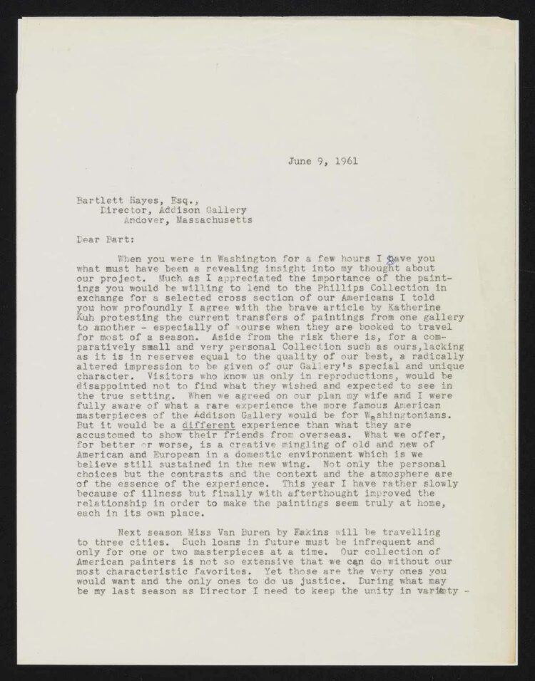
Duncan Phillips, Duncan Phillips to Bartlett Hayes, June 9, 1961, from The Phillips Collection Archives, Directorial Correspondence: The Correspondence of Duncan Phillips,
https://tpcarchives.lyrasistechnology.org/repositories/2/archival_objects/2819
Duncan Phillips, Duncan Phillips to Bartlett Hayes, June 9, 1961, page 2
In the same letter, Phillips outlined the philosophy of his gallery almost like a synthesis at the end of his directorship: “What we offer, for better or worse, is a creative mingling of old and new of American and European [art] in a domestic environment…Not only the personal choices but the contrasts and the context and the atmosphere are of the essence of the experience.”[29] Phillips drafted a statement of his wish in 1964, in which he stressed that “the Phillips Memorial Gallery was a home for a wide diversity of paintings with a unity in all the diversity.”[30] In 1966, after 45 years of tirelessly working to fulfill his vision of the museum, Duncan Phillips passed away peacefully. He left behind not only his gallery, but more importantly his philosophy of finding unity in variety.
Notes
[1] Duncan Phillips, “The American Paintings of the Phillips Collection,” in Duncan Phillips: Writings on Art, ed. Klaus Ottmann (Thompson: Spring Publications, 2023), 329.
[2] Eliza E. Rathbone, “American Art After the Second World War,” in The Eye of Duncan Phillips: A Collection in the Making, ed. Erika D. Passantino (New Haven: Yale University Press, 1999), 550.
[3] D. Phillips, “The American Paintings,” 329.
[4] Gifford Phillips, interviewed by Donita M. Moorhus, California, March 3, 2004, transcript, The Phillips Collection, Washington D.C., 9.
[5] Marjorie Phillips, “The 1950’s,” in Duncan Phillips and His Collection (New York: W.W. Norton & Company, 1982), 236.
[6] Cited in M. Phillips, “The 1950’s,” 239.
[7] Rathbone, “American Art,” 549.
[8] Duncan Phillips, Duncan Phillips to Thomas M. Messer, June 28, 1954, from The Phillips Collection Archives, Directorial Correspondence: The Correspondence of Duncan Phillips, https://tpcarchives.lyrasistechnology.org/repositories/2/archival_objects/3082.
[9] Duncan Phillips, Duncan Phillips to Daniel Catton Rich, November 8, 1954, from The Phillips Collection Archives, Directorial Correspondence: The Correspondence of Duncan Phillips, https://tpcarchives.lyrasistechnology.org/repositories/2/archival_objects/3338.
[10] D. Phillips, “The American Paintings,” 331.
[11] Nathan Irving Huggins, Harlem Renaissance (Oxford: Oxford University Press, 1971), 302.
[12] Elsa Smithgall, “One Series, Two Places: Jacob Lawrence’s Migration Series at The Museum of Modern Art and The Phillips Collection,” in Jacob Lawrence: The Migration Series, eds. Leah Dickerman and Elsa Smithgall (The Museum of Modern Art, New York, 2015), 41-42.
[13] David C. Driskell, interviewed by Donita M. Moorhus, Maryland, December 23, 2008, transcript, The Phillips Collection, Washington D.C., 7.
[14] G. Phillips, interviewed by Moorhus, 4.
[15] Cat., 1952: The Phillips Collection Catalogue: A Museum of Modern Art and Its Sources. New York.
[16] Ibid.
[17] William C. Agee, “Duncan Phillips and American Modernism: The Continuing Legacy of the Experiment Station,” in The Eye of Duncan Phillips, 380.
[18] Stuart Preston, “Vast Art Panorama: Shows at Venice Survey World Art Today,” New York Times, July 13, 1952, https://www.proquest.com/docview/112229014/D07A68D48A50481EPQ/2?accountid=11091.
[19] Burton Cumming, Burton Cumming to Duncan Phillips, April 30, 1952, from The Phillips Collection Archives, Directorial Correspondence: The Correspondence of Duncan Phillips, https://tpcarchives.lyrasistechnology.org/repositories/2/archival_objects/3098.
[20] “American Federation of Art News Release,” from The Phillips Collection Archives, Directorial Correspondence: The Correspondence of Duncan Phillips, https://tpcarchives.lyrasistechnology.org/repositories/2/archival_objects/3084.
[21] Burton Cumming, Burton Cumming to Duncan Phillips, from The Phillips Collection Archives, Directorial Correspondence: The Correspondence of Duncan Phillips, https://tpcarchives.lyrasistechnology.org/repositories/2/archival_objects/3098.
[22] “Paintings Lent For Exhibition of 19th Century American Painting for Germany, January to October 1953, Arranged by the American Federation of Art,” from The Phillips Collection Archives, Directorial Correspondence: The Correspondence of Duncan Phillips, https://tpcarchives.lyrasistechnology.org/repositories/2/archival_objects/3099.
[23] Dwight Eisenhower, “1955 State of the Union Address,” January 6, 1955, Ballotpedia, https://ballotpedia.org/Dwight_Eisenhower%27s_State_of_the_Union_Address,_1955.
[24] “Foreword,” in Federation of Modern Painters and Sculptors 1955-1956 (New York).
[25] Roy Moyer, Roy Moyer to Duncan Phillips, March 24, 1959, from The Phillips Collection Archives, Directorial Correspondence: The Correspondence of Duncan Phillips, https://tpcarchives.lyrasistechnology.org/repositories/2/archival_objects/3083.
[26] Allan McNab, Allan McNab to Duncan Phillips, May 14, 1959, from The Phillips Collection Archives, Directorial Correspondence: The Correspondence of Duncan Phillips, https://tpcarchives.lyrasistechnology.org/repositories/2/archival_objects/3339.
[27] Harris Prior, Harris Prior to Duncan Phillips, May 24, 1960, from The Phillips Collection Archives, Directorial Correspondence: The Correspondence of Duncan Phillips, https://tpcarchives.lyrasistechnology.org/repositories/2/archival_objects/3084.
[28] Duncan Phillips, Duncan Phillips to Bartlett Hayes, June 9, 1961, from The Phillips Collection Archives, Directorial Correspondence: The Correspondence of Duncan Phillips, https://tpcarchives.lyrasistechnology.org/repositories/2/archival_objects/2819.
[29] Ibid.
[30] Duncan Phillips, “A Statement of My Wish for the Future of the Phillips Collection,” in Duncan Phillips and His Collection, 304-5.