
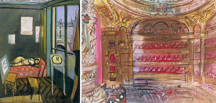
Henri Matisse, Interior with Egyptian Curtain, 1948. Oil on canvas, 45 3/4 x 35 1/8 in. Acquired 1950. The Phillips Collection, Washington, DC (Right) Raoul Dufy, The Opera, Paris, early 1930s. Gouache on paper, 19 3/4 x 25 1/4 in. Acquired 1939. The Phillips Collection, Washington, DC
Last Wednesday, I got the chance to attend a Spotlight Talk on Henri Matisse’s Studio, Quai Saint Michel, where we discussed the artist’s characteristic use of Fauvist color to define space. At first these color choices coupled with the skewed perspective can feel a bit aggressive (or in the words of a young Duncan Phillips, “unworthy of the mere ignorance of children and savages”), but after spending some time viewing the painting in person, I started to recognize the frenetic colors for the way they represent the experience of inhabiting the space; the light purple shadow cast by the curtain, vibrant red fabric that frames the reclining model, and rhythmic teal highlights on the walls throughout the room are in essence abstract gestures, but somehow they come together to create a vivid environment.
As I browsed the collection afterwards, I found myself recognizing the way other artists structure their color choices to manipulate the viewers’ perception of subject and space; Georgia O’Keeffe’s somber My Shanty, Lake George, Edouard Vuillard’s intimately composed Woman Sweeping, and Raoul Dufy’s intricate The Opera, Paris. Even works that are purely abstract seem relevant; Piet Mondrian’s Painting No. 9 uses primary color to visually dissect our three-dimensional world, while Mark Rothko’s Green and Maroon uses chromatic fields to envelop the viewer in atmospheric color.
Elaine Budzinski, Marketing Intern