
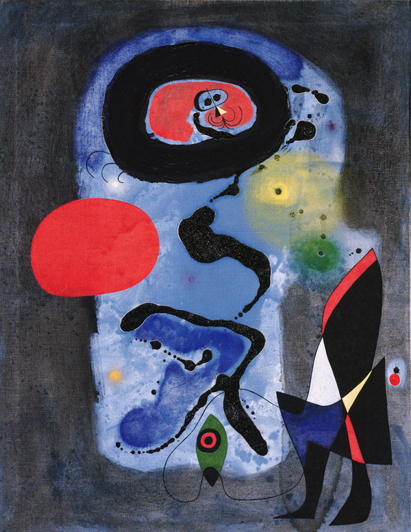
Joan Miró, The Red Sun, 1948. Oil and gouache on canvas, 36 1/8 x 28 1/8 in. Acquired 1951. The Phillips Collection, Washington, D.C.
When describing the work of Joan Miró, words like bizarre, cartoonish, surrealistic, and dreamlike immediately came to the minds of participants in one of last week’s Spotlight Talks, a weekly series devoted to examining one work in the Phillips’s permanent collection. The talk, led by Paul Ruther, Manager of Teacher Programs, focused on Miró’s The Red Sun (1948), currently on view in the first floor of the Goh Annex, and interestingly is the only work by Miró in The Phillips Collection. Up until this talk, I appreciated Miró’s work from a historical sense, but never actually liked it. This painting, however, gave me a new perspective on his work and artistic vision.
Ruther began by asking the group what words they would use to describe the general aesthetics of Miró’s work. His signature use of bright primary colors, surrealistic imagery, and cartoonish faces we found widely apparent in this painting, from the blood red sphere (which we assumed was the “red sun”) to the headless torso and the floating cat-like face at the top of the painting. Ruther concisely described his work as “art of the subconscious.”
As you can probably tell from my attempt at describing this painting, there was no clear consensus on the specific imagery it portrays but rather speculations on its possibilities. Upon first glance, I immediately saw the painting as the visual representation of our minds during a dreamlike state, which fits into Miró’s idea of “art of the subconscious.” In our examinations, we noticed that the blue background shape looks vaguely like a face and the shape on the far right resembles a torso. Ruther pointed out the various “floating eyes of observation” throughout the painting and explained that most art historians view the descending thick black curves as a representation of Miró’s melancholy, alleviated by his dreams and his art. While the wall label cites this work’s materials as oil on canvas, we learned that the lighter blue passage is actually watercolor.
Read part two tomorrow. . .
Hannah Hoffman, Marketing Intern