Our second project of the Phillips-at-Home Summer Series features the artist Juan Gris and his work Abstraction. For this art activity, you are going to create an abstract monoprint of a room focusing on the objects that make up that room. What is a monoprint? It is a single print made of an image from a printing plate.
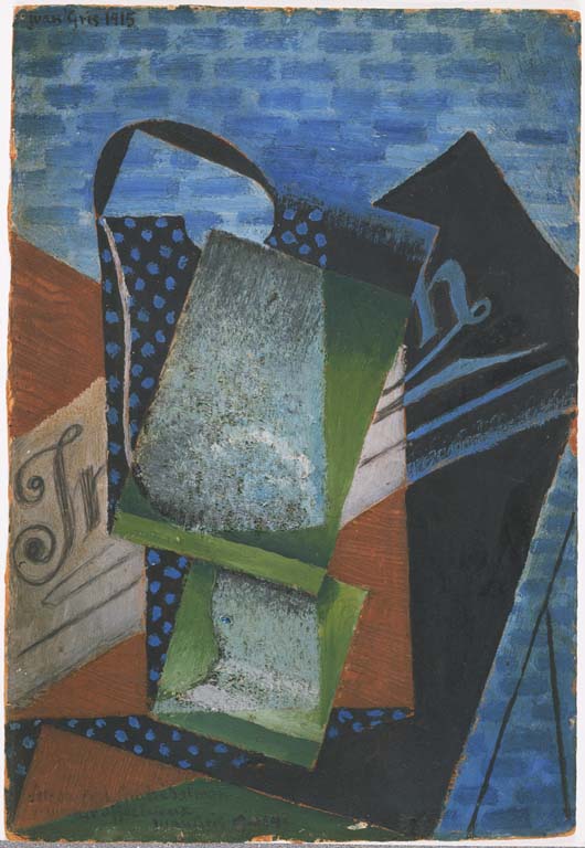
Juan Gris, Abstraction, 1915, Oil and oil with sand on cardboard 11 3/8 x 7 3/4 in. Acquired 1930. The Phillips Collection, Washington, D.C.
Look closely: What do you see when you look at this painting? How do the colors make you feel? What do you like about the composition of this painting?
About the Artist: Juan Gris was born Jose Victoriano Gonzalez on March 23, 1887, in Madrid, Spain. He began college in 1902 at the Escuela de Artes y Manufacturas to be an engineer but he left the school in 1904 to study painting with artist Jose Maria Carbonero. He started painting in the Art Nouveau style and then moved to Paris because he wanted to meet Pablo Picasso. In 1911, he created his first cubist paintings, which (as you can see above) have a very distinctive grid composition style. The Phillips Collection has two paintings by Gris in its permanent collection.
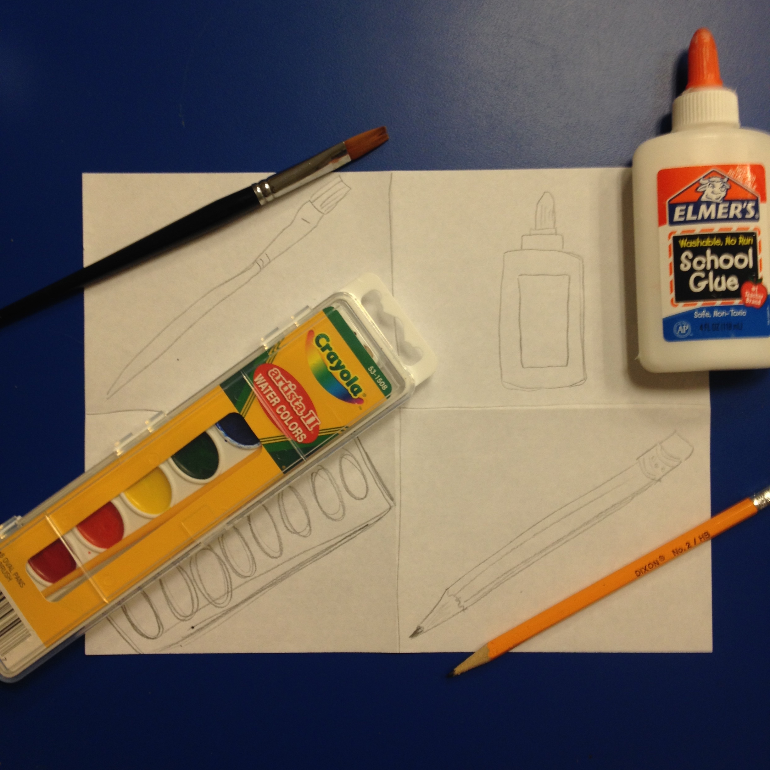
WHAT YOU NEED:
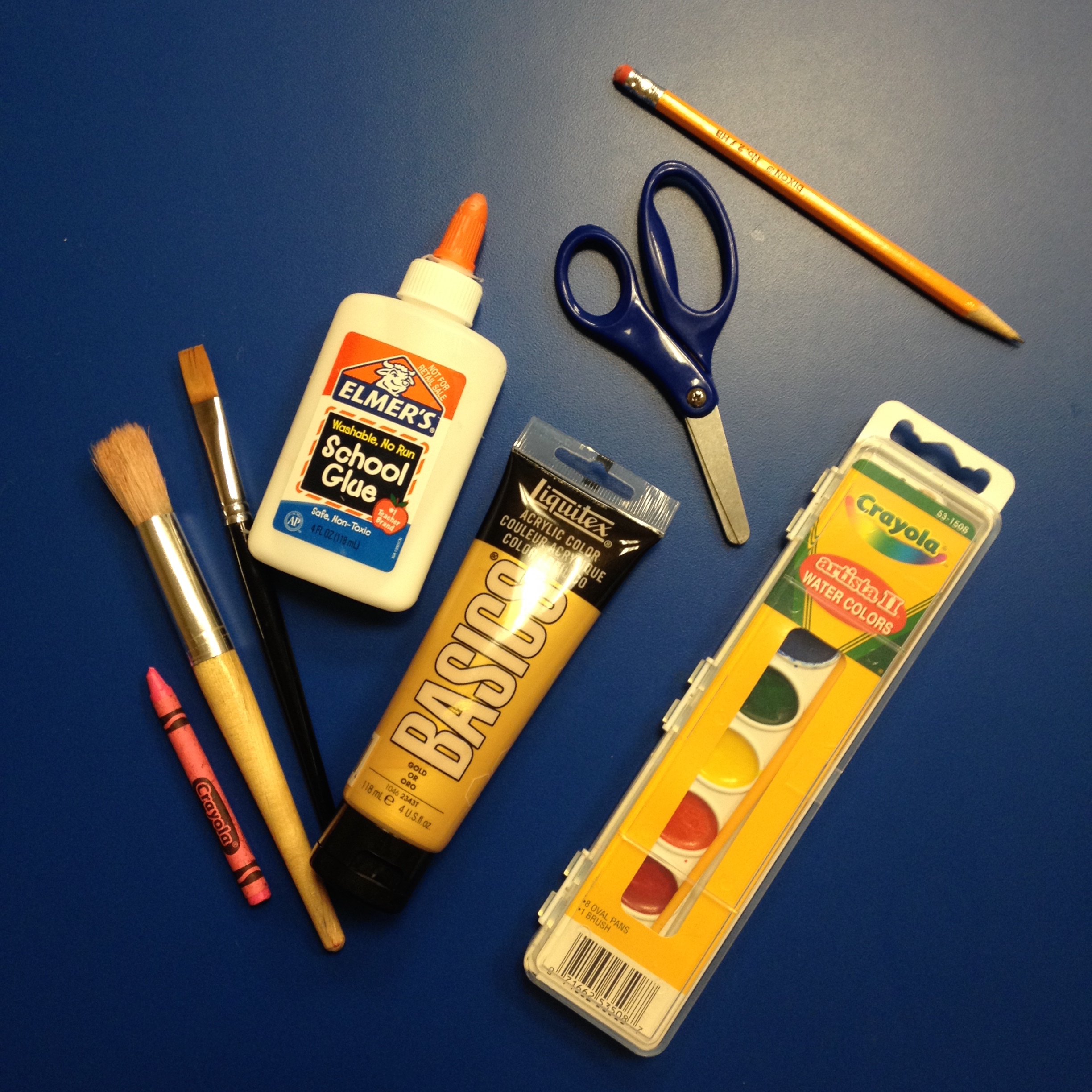
Here are the items I chose from our art workshop
- Items that represent any room of your choosing
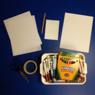
All supplies needed
- 2 (8.5” x 11”) sheets copy paper
- 1 (8.5” x 11”) sheet cardstock, or thick paper
- 1 Styrofoam (4” x 6”) plate
- Washable markers (permanent markers are not recommended for this project)
- Tape
- Scissors

SUGGESTED AGE:
- Ages 7 and up
TIME FRAME:
- 3-4 hours
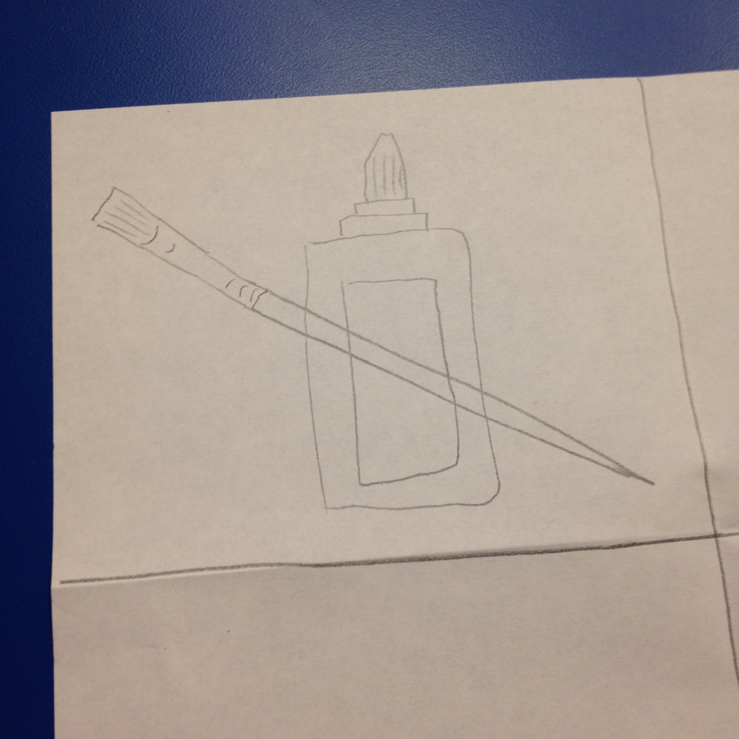
Step 2 example
STEPS:
1. Choose a room in your house or anywhere that gives you a sense of space. Collect objects in that room that symbolize the space for you.
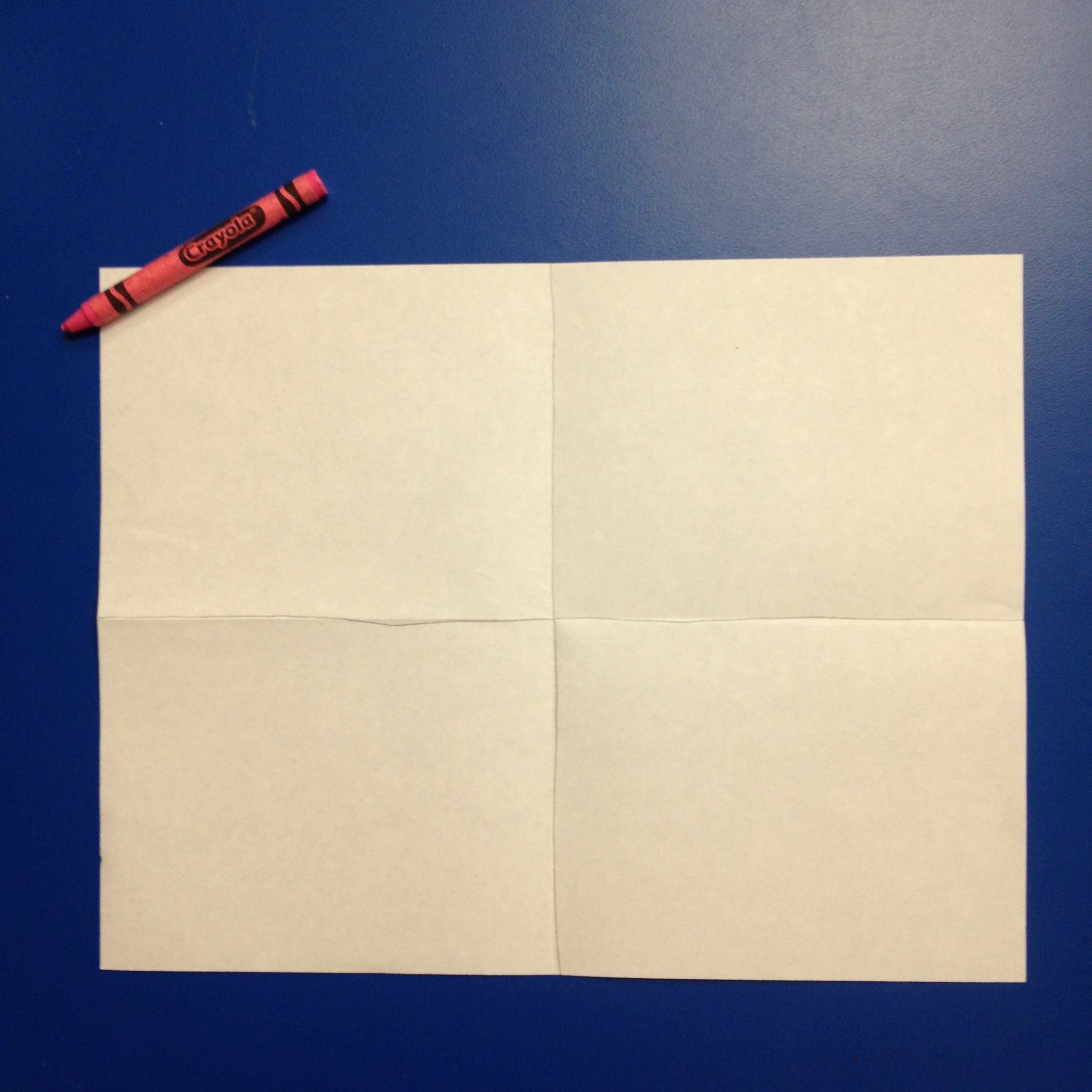
2. Fold your sheet of 8.5” x 11” copy paper in half and then in half again so you have 4 rectangles on each side.
- Tip: Draw along the folds so you can clearly see the boxes.
3. Sketch one object from your space in each rectangle of your sheet as a symbol. What is a symbol? A symbol is something that represents something else. It becomes simplified.
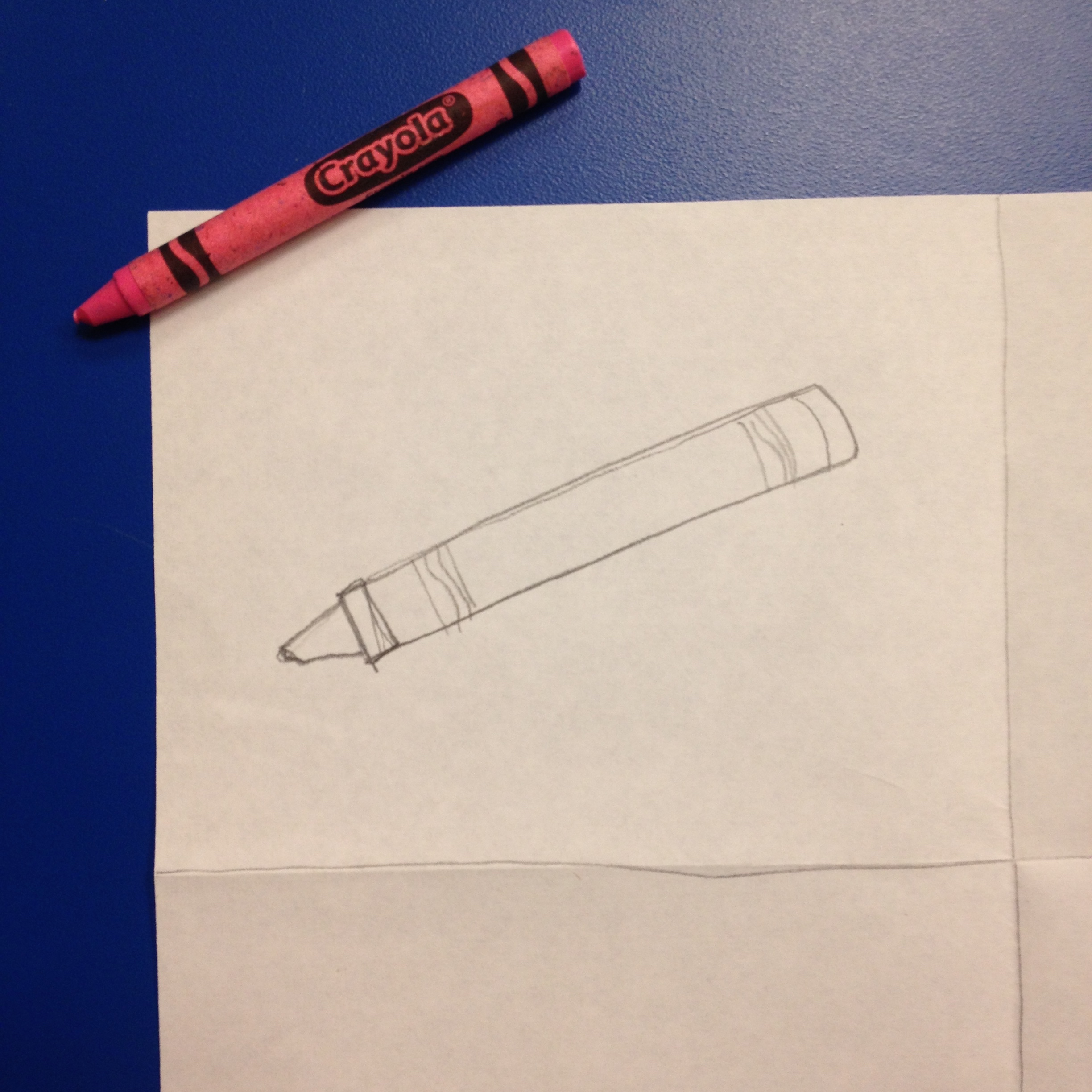
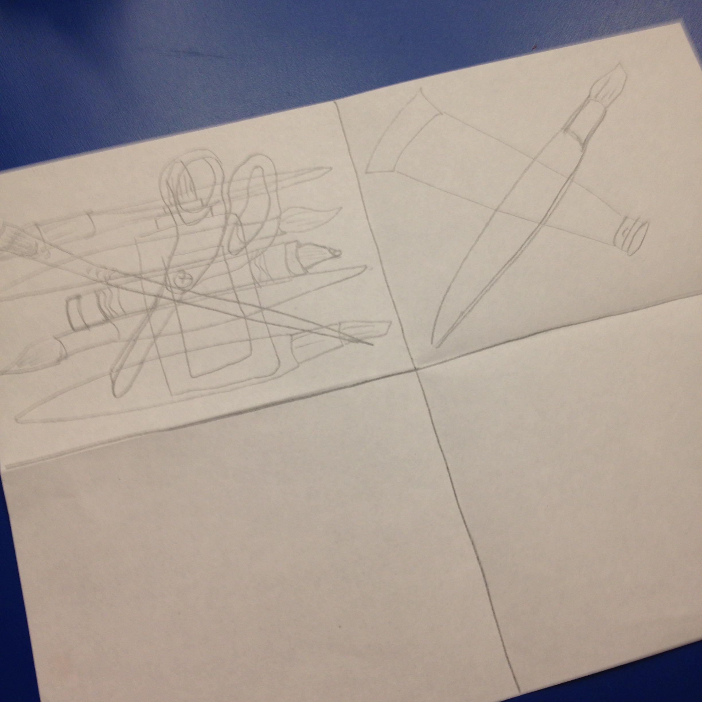
Step 3 example
Step 3 example
Step 3 example
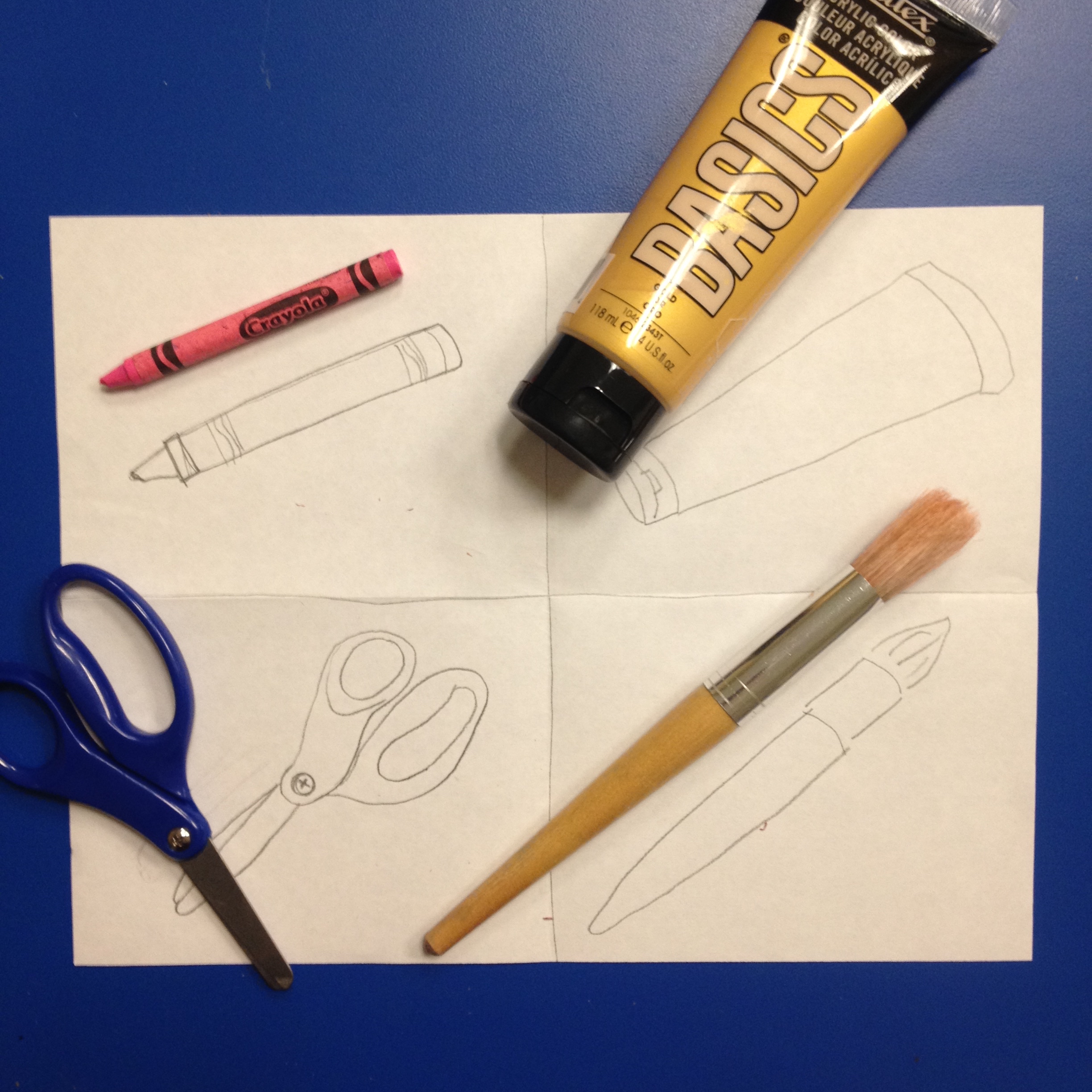
4. Fold another piece of copy paper into quarters. Draw one of your symbols in a rectangle, then move your paper around and draw another symbol on top of it. Rotate your paper while drawing your symbols until you can’t quite tell what they are. By doing this, you are creating an abstraction. What is an abstraction? Abstract is something that is real, but it does not quite look like it. Repeat this same process in the 4 rectangles on your paper, creating 4 different compositions.
Step 4 example
Step 4 example
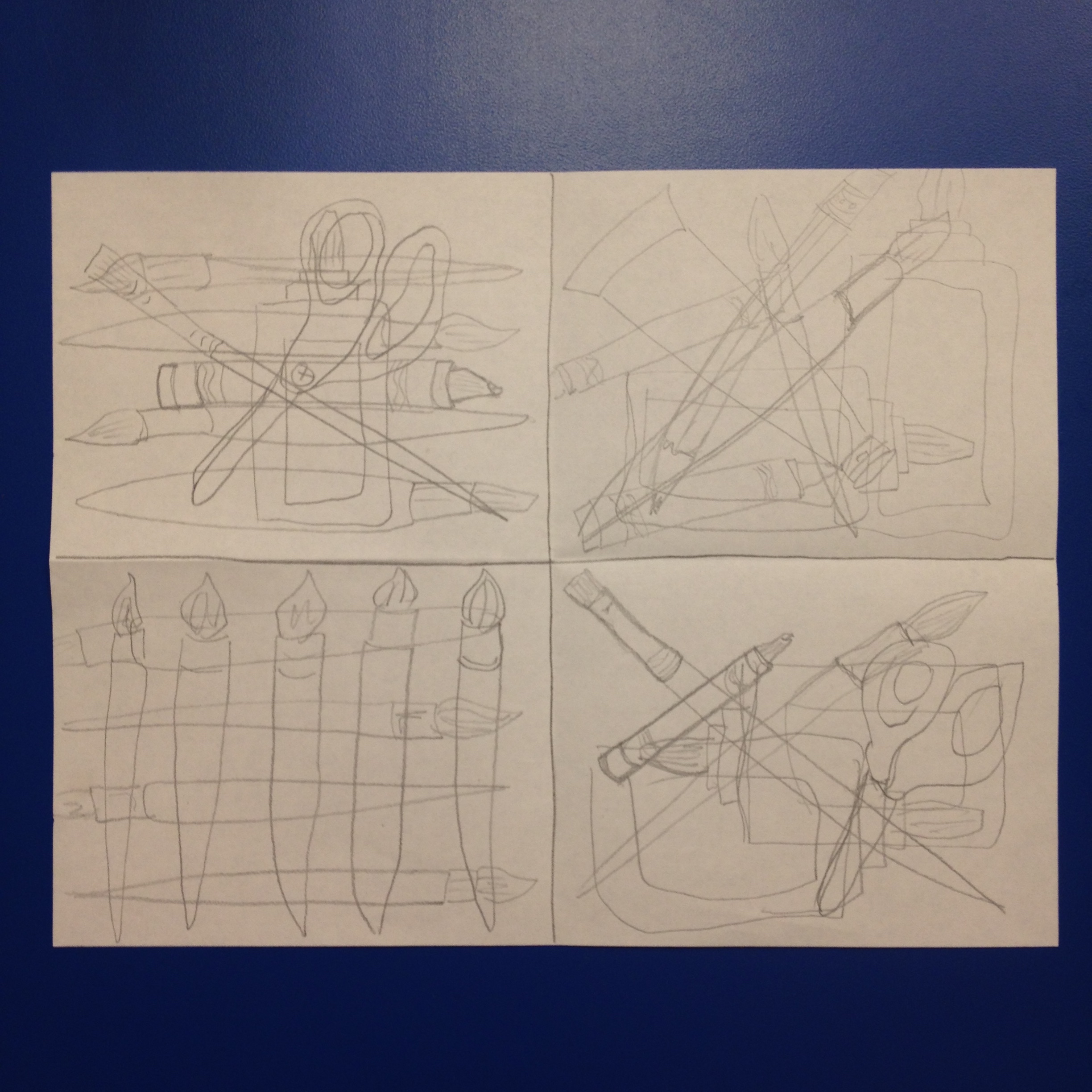
Step 4 example
5. Choose your favorite composition. Get your styrofoam plate and a pencil. Apply medium pressure as your draw your symbols from your favorite composition onto the styrofoam plate.
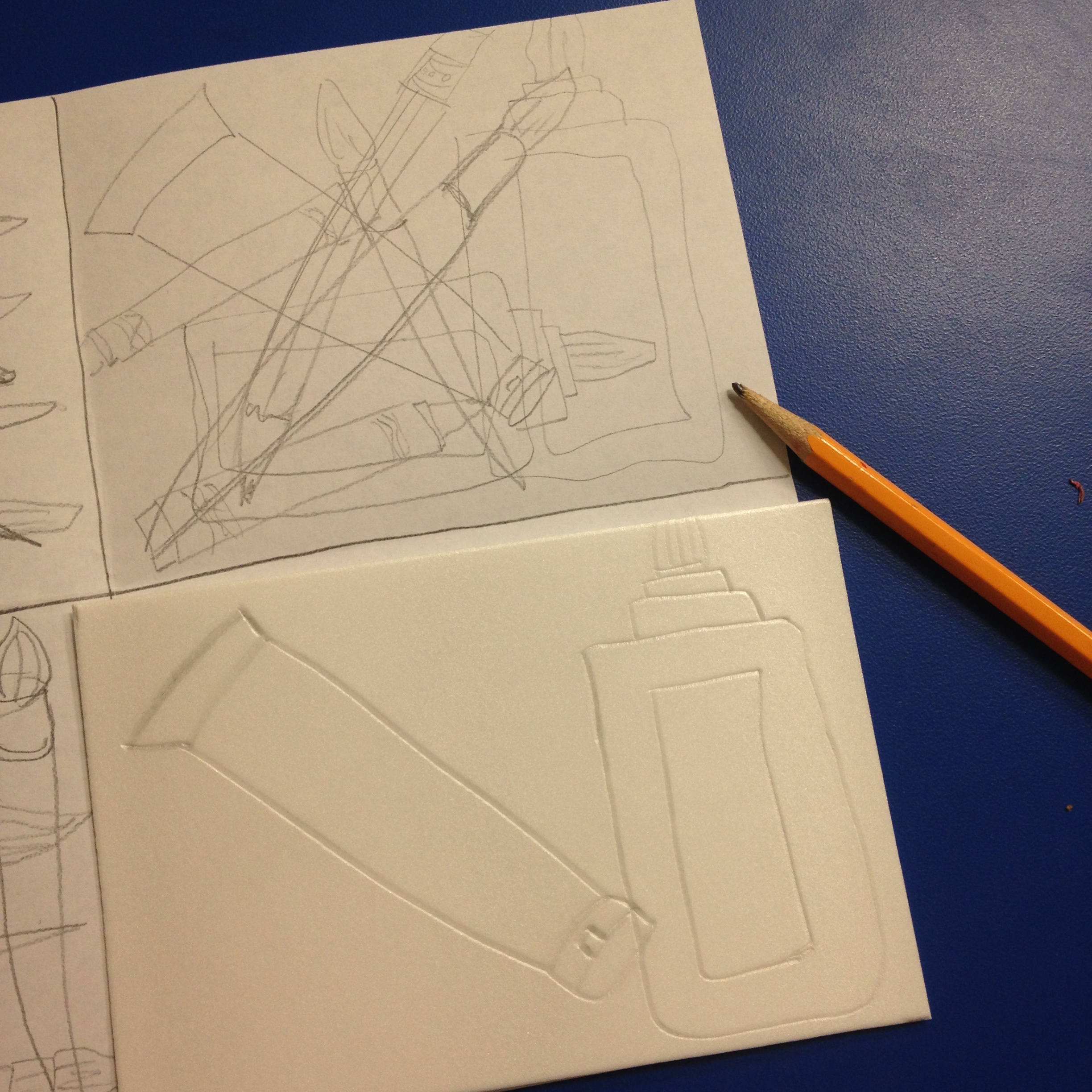
Step 5 example

Step 5 example
6. Fold the piece of Cardstock in half (hamburger-style), make a tape bubble (loop your tape to create a circle) to place on the back of your styrofoam plate and center it on one side of the inside of your fold (resembling a card).

Step 6 example
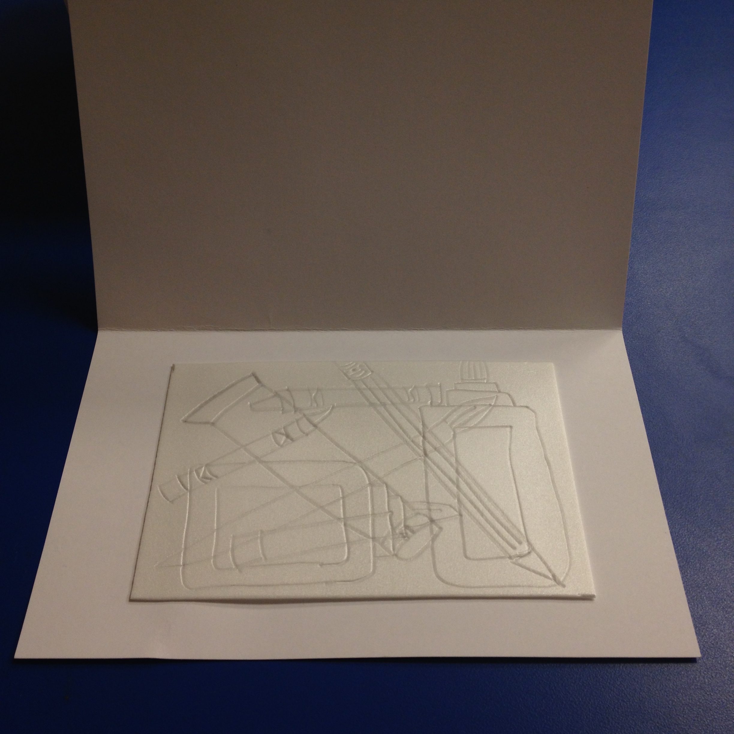
Step 6 example
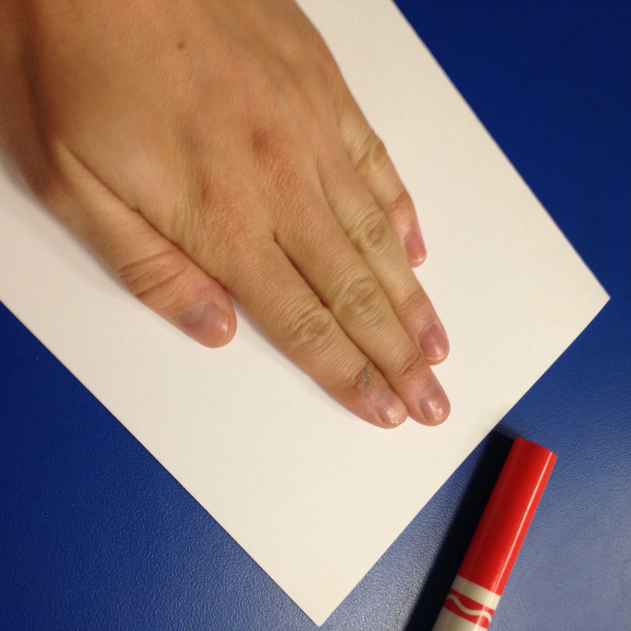
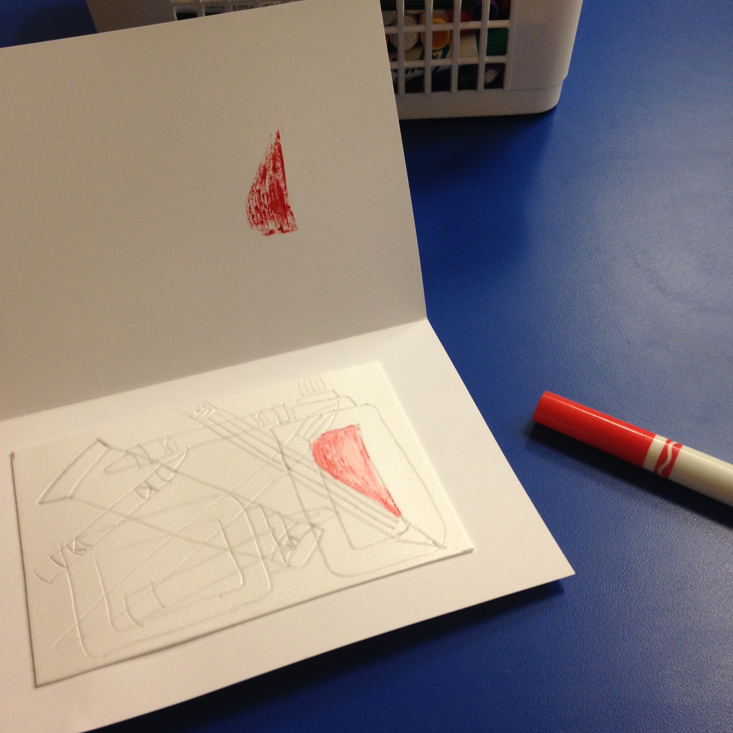
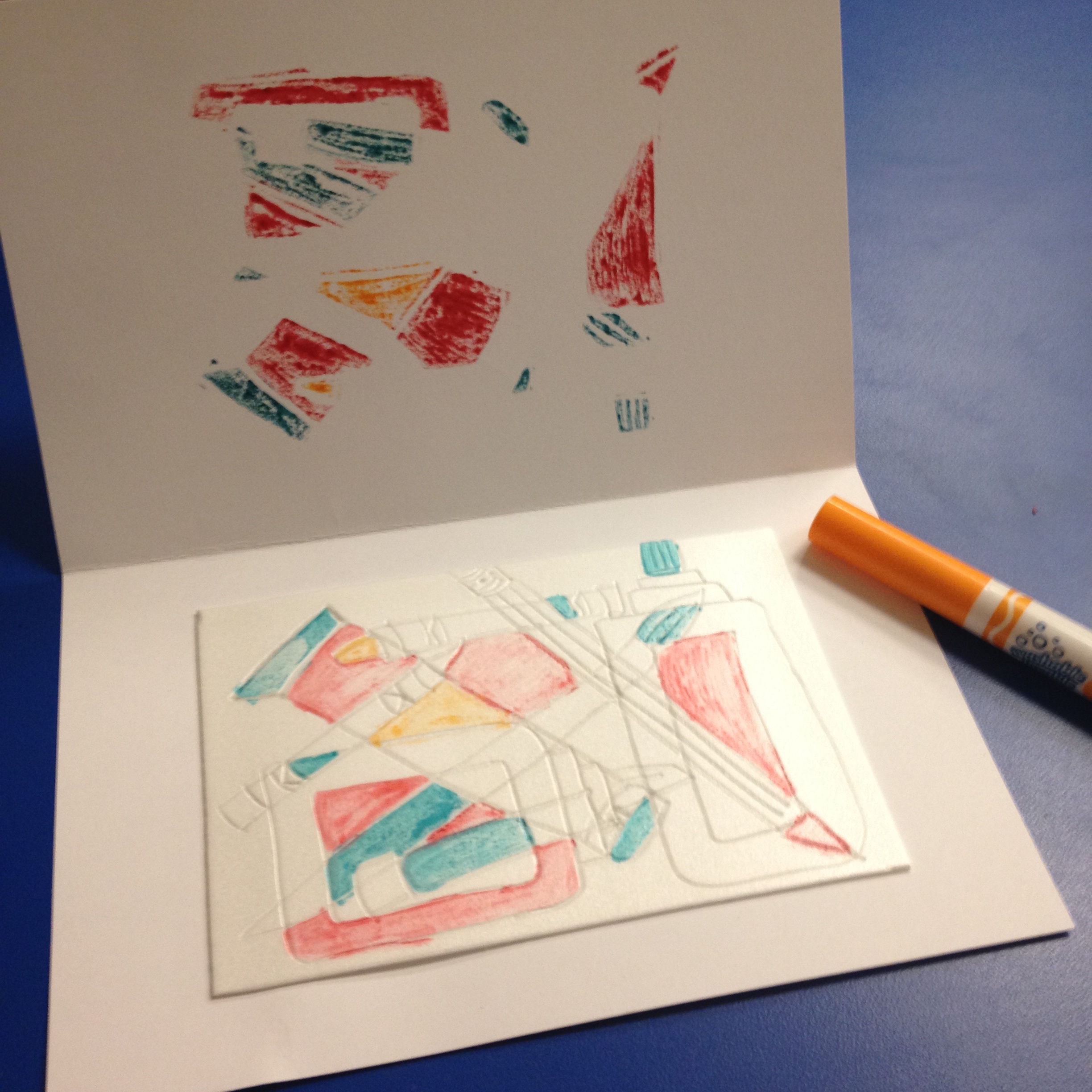
7. Time to get out your markers! Choose a shape to color in, put down the marker and quickly close the card. Gently rub the area where you applied the marker on the opposite side. Open the card to see how it looks. Depending on the color, you might have to apply marker onto your shape several times. As long as you begin to rub your paper immediately, you should not have to worry about the saturation.

Step 7 example
Step 7 example
Step 7 example
8. Continue applying colors to the different shapes that you created in your abstract composition.
Step 8 example
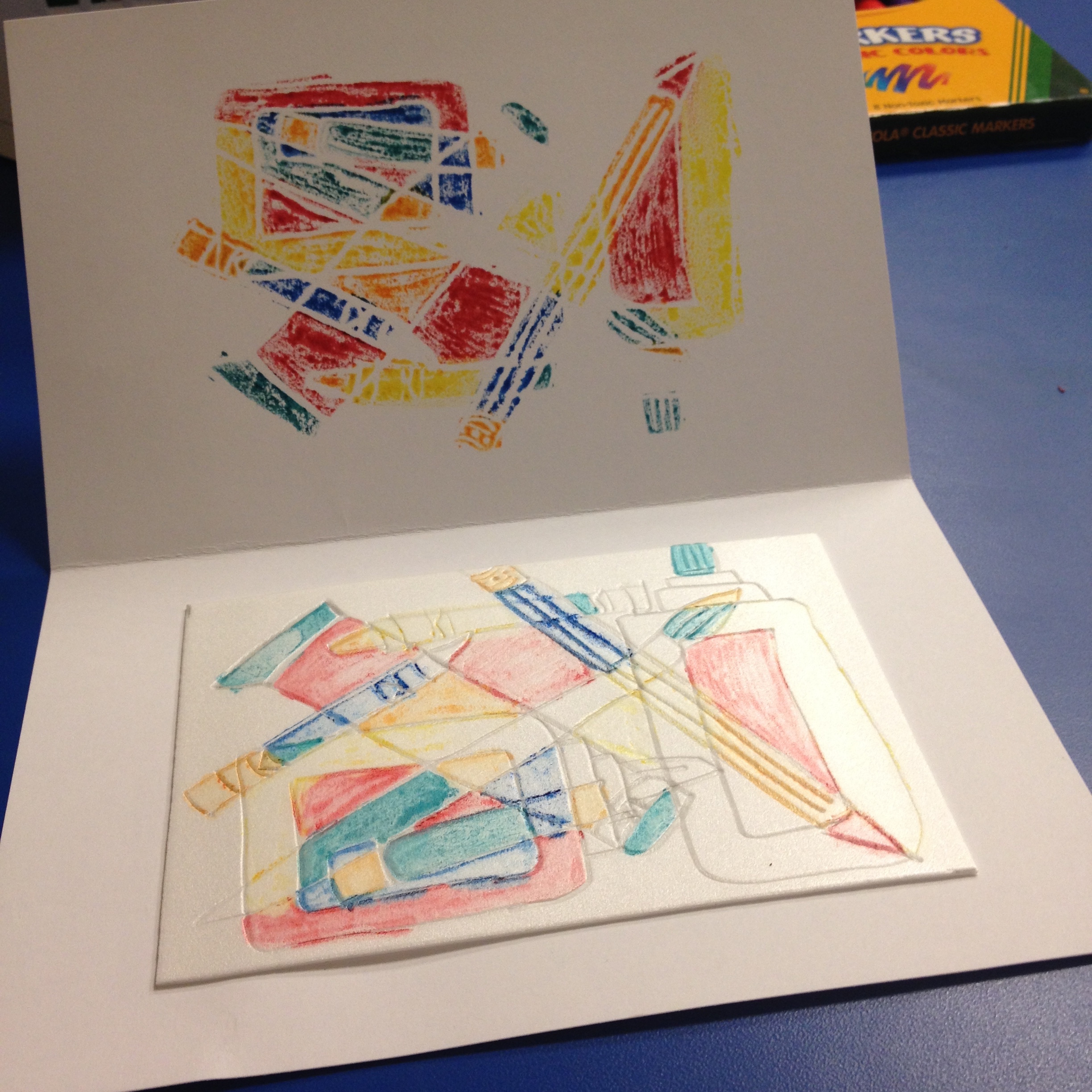
Step 8 example
Step 8 example
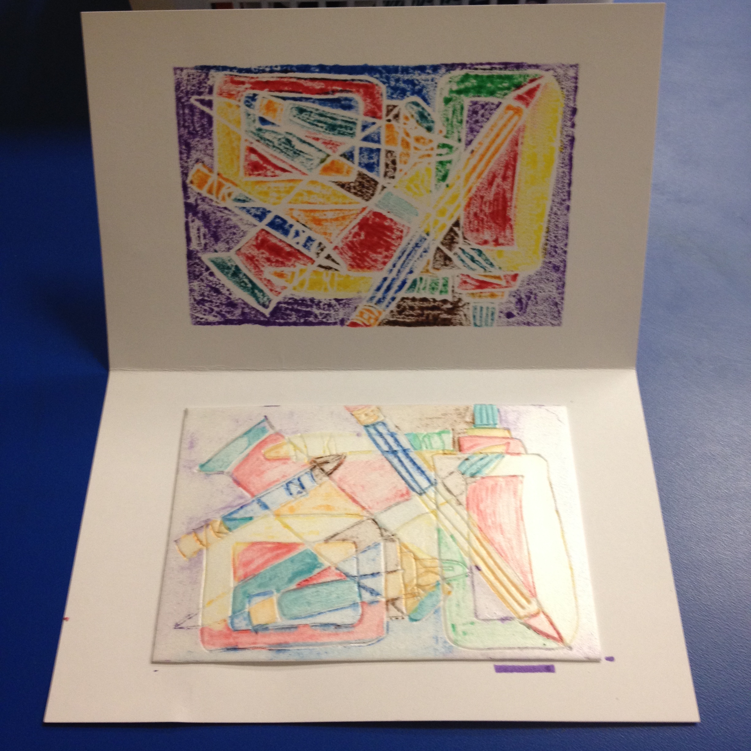
9. Once you have filled your styrofoam plate and transferred the colors, cut the cardstock along the fold. Now it’s time to label your monoprint. On the lower left side give your print a title; it could be something about the room or maybe something that you would like the viewer to focus on in your print. In the center below your print, write “1/1” because you only have one print. On the right side, sign your name because you are the artist!
Step 9 example
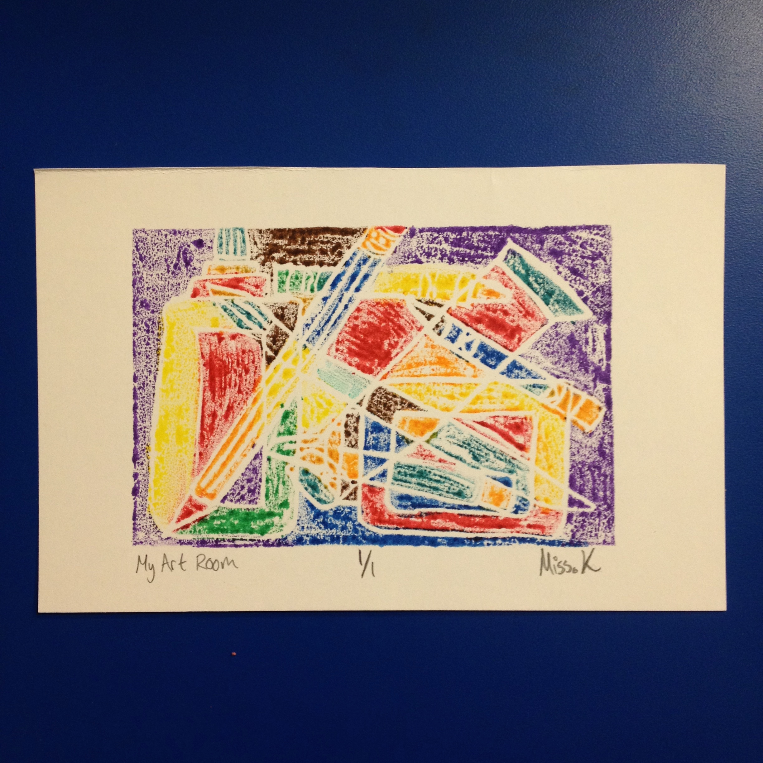
My Art Room Monoprint, Print: Julia Kron
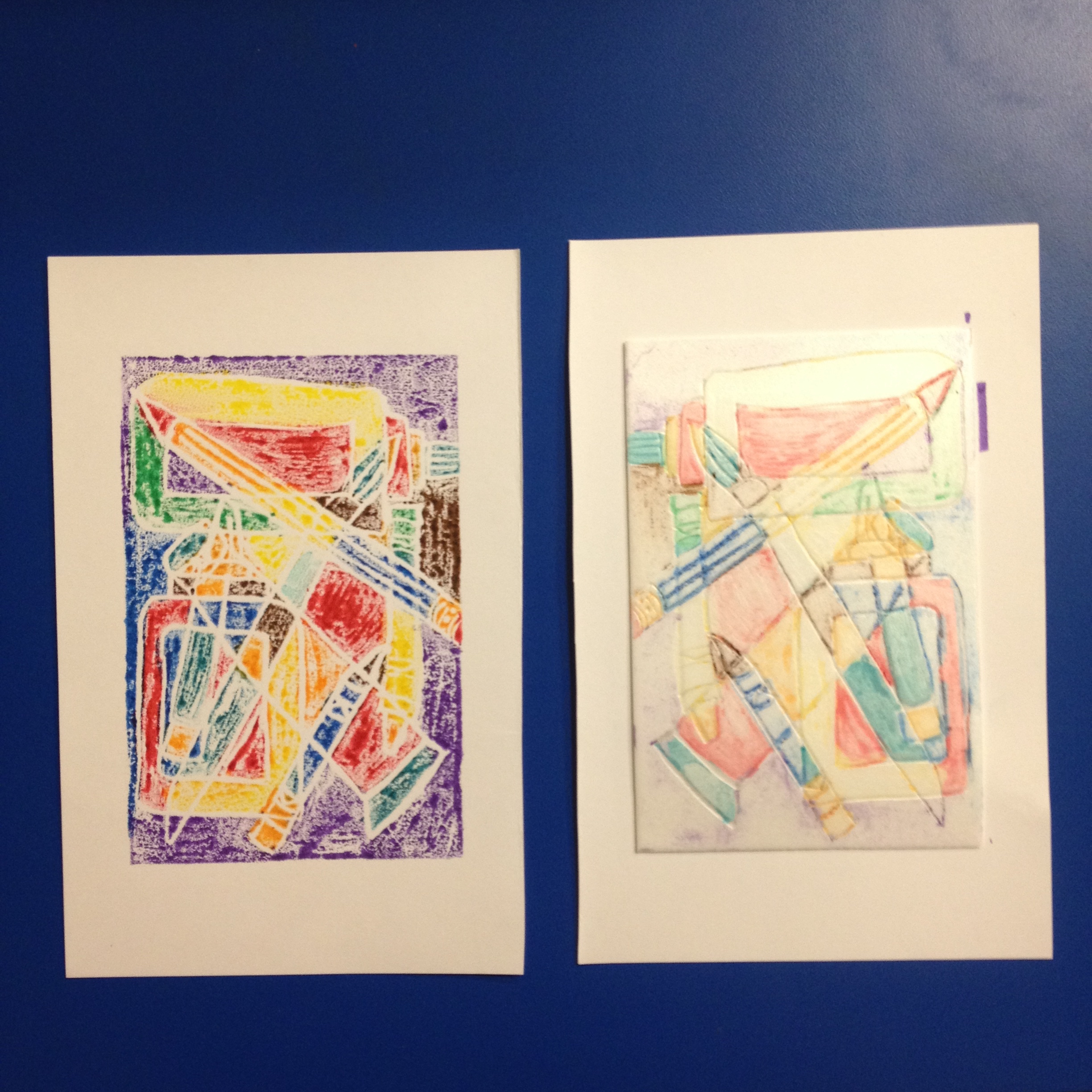
10. You have successfully completed your first print! Feel free to get a damp paper towel and wipe off the colors if you would like to create another monoprint on a new piece of cardstock paper.
Tune in regularly for another great art activity inspired by The Phillips Collection!
Julia Kron, K12 Education Intern